November 5, 2016
Unusual UI
I knew if I built my app exactly the way I wanted there was a chance it might not make it through Apple’s approval gauntlet.
The verdict arrived in my inbox on Monday.
Dear Adrian,
We’ve sent you a new message about your app, Textploder. To view or reply to the message, go to Resolution Center on iTunes Connect.
Regards,
App Store Review
Apple doesn’t reject your app outright, they send you to a Resolution Center where thy point out what rules your app violates.
I braced for the worst.
From the beginning I worried that my UI design might disqualify my app because my approach to the user interface started with an odd premise.
I wanted to make an app without words.*
It started as one of those personal challenges, a thought experiment that once it took root I couldn’t shake.
Is it possible to make an app without a single word?
I wanted to make something completely void of labels, explanations, or help screens.
No onboarding experience. No instructions. No tooltips.
No settings. No user-configurable customizations.
No ads. No marketing spin. No cross-promotion. No upsells.
No menus. No hidden navigation. I wanted the entire interface to be visible at all times like the cockpit of a fighter jet.
When you make an app there is an almost irresistible urge to point at everything. You want to beg people to use it. You want to hold their hand and make sure everything goes smoothly. If you aren’t careful you can overcompensate and your good intentions manifest themselves as visual cruft cluttering up the interface.
Open any app and you can see this clutter. When apps are built by large teams, you can often see the company’s organizational structure baked right into the interface. Study the screens hidden behind sub-menus. Notice where the ads appear. Which screens are polished and which look rushed? Observe the data to storytelling ratio. Question every word choice on every label. All these things represent battles that were fought in the app creation process. Dysfunctional organizations ship confusion. High functioning teams make minimalist art with a clarity of purpose.
As UI designers we have become very proficient at controlling the mess that results from competing agendas. You might say that this is our main job. We use hamburger icons, tabs, nested menus, popups and various other tricks to separate the signal from the noise.
The joy of a personal project like Textploder is that you can strip all that gunk away. And if it doesn’t work, that is okay. The only thing you lose is some time and a slice of pride. But maybe, just maybe you ship something that is truly unique.
Besides my fear of Apple’s rejection I also had my own self-doubt. Would people be able to figure out how to use it? Am I willing to sacrifice my own self-promotion? Why put all this effort into a free app anyway?
So like I said, when I got the email from Apple, I expected the worst. I opened the resolution center to see if my sins were forgivable.
I was in luck. My mistake was minor.
The only thing wrong with my app was the description that shows up in iTunes. I had left the app description as minimal as my app. It contained the four words, “an app by Adrian3.” All I had to do was write a more robust description and my app would be approved.
Here’s what I came up with:
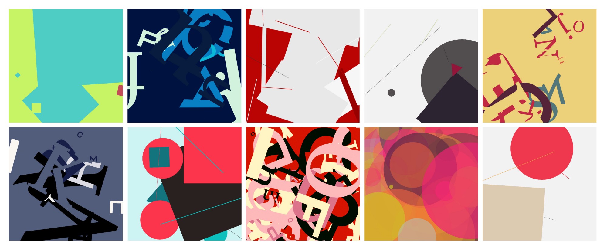
Textploder is a tool for creating two-dimensional compositions. Before you get the wrong idea, no, this is not an editor. You might even say it is an anti-editor. Here’s why…
Have you ever been defeated by a blank canvas? Has your creative output grown stale or repetitive? We all get stuck in a rut sometimes. Maybe you need a jolt of randomness. Perhaps an injection of chaos will break you out of your routine. Often all it takes to break the spell is a happy accident. That is what Textploder provides.
Each creation begins with an explosion that delivers an assortment of shapes onto your canvas. Your tools are a collection of loose controls. Each button injects a different set of randomness into the composition. You can randomize the color. You can remix the size or rotation of the shapes. Shuffle the opacity. Layer on additional shapes.
The goal is serendipity. As your composition morphs and evolves, eventually you will land on a design that is unlike anything you would have created had you tried to plan it out in painstaking detail. When you arrive at something beautiful, save it to your photo library then share it with the world.
I resubmitted my app and it was quickly approved. It has been in the store since Thursday. I would love for you to download it) and share your creations. Stay creative.
*The final app contains 3 words: “Textploder, by Adrian3”
Previous: I just want to make art, man.
Next: Evidence that Steve Jobs was aware of his reality distortion field