February 17, 2019

Boston's Evolution: 1897–2018
Boston Marathon Data Analysis, Part 3
This is my third story in a new series focusing on the Boston Marathon. If you missed it, you can catch up by reading how data illuminated The Boston Marathon qualification process and explained why so many Boston runners fail to PR on race day. Let's get to it…
Today my Boston Marathon dataset expands beyond the last 4 years to encompass the last 121 years. That is a ton more data and it means I can now tell a wider story about the Boston Marathon. With the benefit of another century of data, what will we learn?
First, let's try to put ourselves in the shoes of a runner from the early 1900's. No internet, no Strava, no name brand shoes. Roads were just beginning to adapt to cars. Running was a different thing back then. Marathons were a new concept, a sport for a handful of running enthusiasts, all of whom were men. It would be 75 years before the Boston Marathon resembled anything like the modern spectacle we think of today.
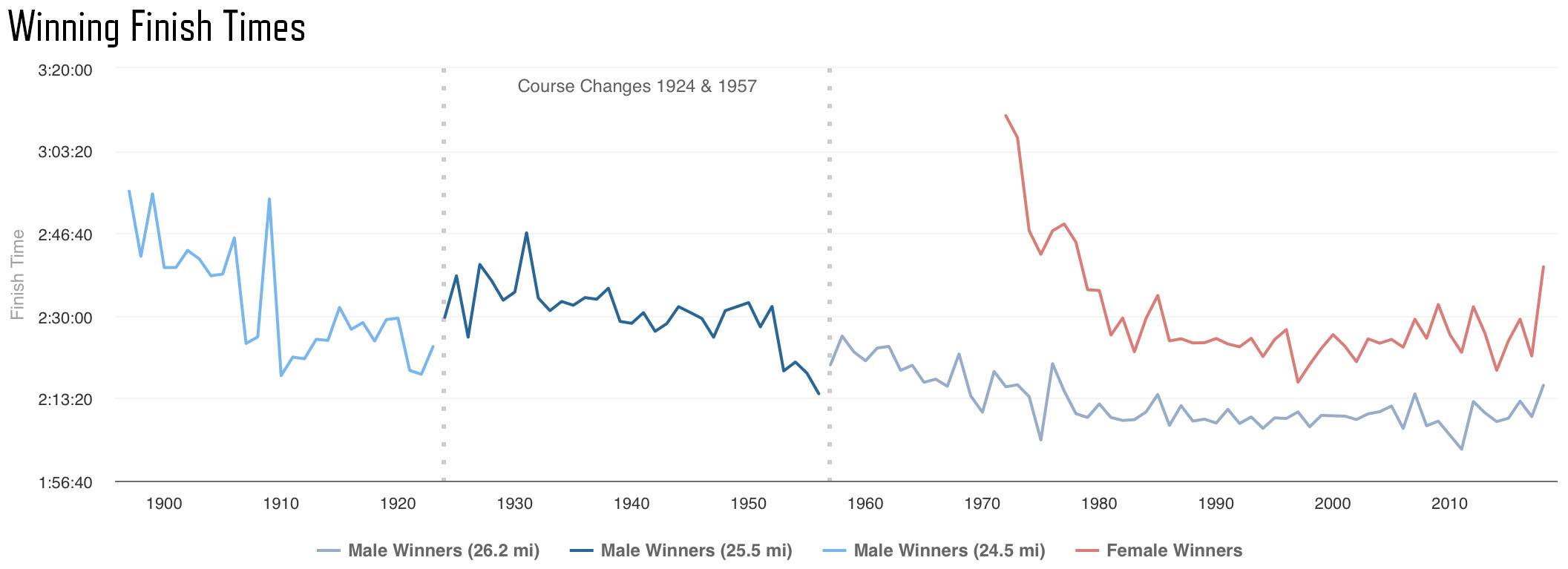
Varying Course Distance, 24.5–26.2 Miles
One of the surprising things about the history of the Boston Marathon is that the race distance wasn't always 26.2 miles. The best information I can find says that the distance from 1897–1924 was 24.5 miles. The Olympic standard of 26.2 miles was established in 1924 and that seems to be when Boston's course was lengthened to 26.2 miles.
Unfortunately, as roads improved and curves were straightened the course lost an unknown distance each year. By 1957 the course was about 2/3 of a mile short. The chart below shows winning finish times with the years the course was lengthened marked by dotted lines.
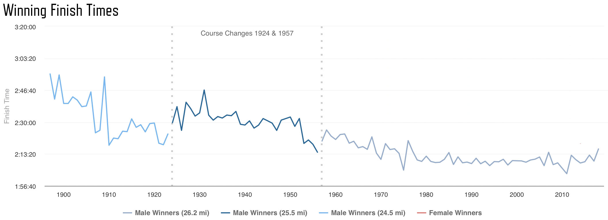
As you would expect, there is a spike where times slowed down as the course was extended in 1924 and 1957. In the span from 1924–1957 there is a general trend of getting faster that might be attributable to the roads getting straighter and the course getting shorter. I say "maybe" because it is just as likely that the extra speed comes from the increase of race participants and improving competition.
Based on my loose estimate of course distance I can figure out pace. For 1897–1923 I used a course length of 24.5 miles, for 1924–1956 I used a course length of 25.5 miles and for 1957–2018 I used 26.2 miles. Obviously guessing at course length is dangerous, so you should be a bit skeptical of the left half of the chart below. However, it does show a steady increase in winner's pace over the years.
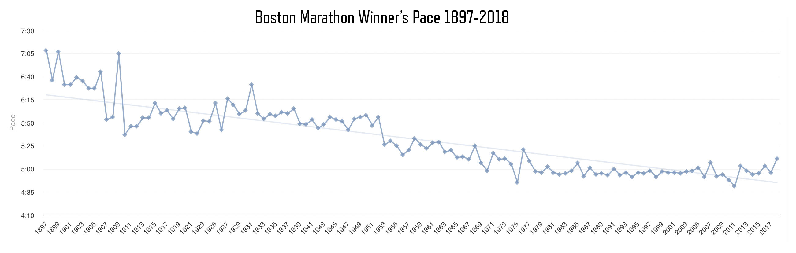
Humans seem to be getting faster. If you ignore how much the speed has leveled out in the last decades you might conclude that we still have a chance to break the 2 hour mark. You could also make a strong case that humans have pretty much maxed out our potential for marathon performance.
Now that we have looked at the speedy end of the spectrum, let's examine the averages. The chart below shows average finish times and you can see a trend similar to the winning times. The thing that stands out is that the average time gets steadily slower starting around 1975.
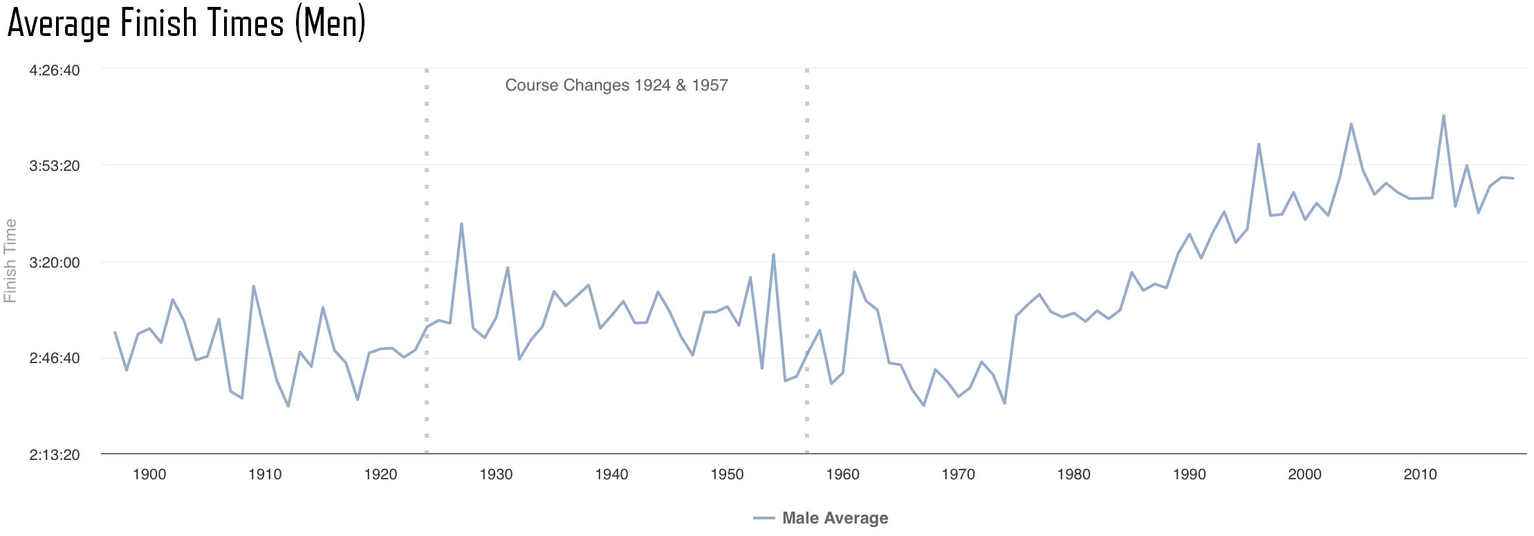
Why would average times get slower after 1975? Running changed in the 70's. It was becoming something that normal people did. More people were attempting the marathon distance and there was an ever-increasing pressure on Boston to allow more participants. With the doors opening to non-elite runners, the average times naturally got slower. While the times of the top 100 runners has been relatively steady since 1980, the overall average seems to get slower each year.
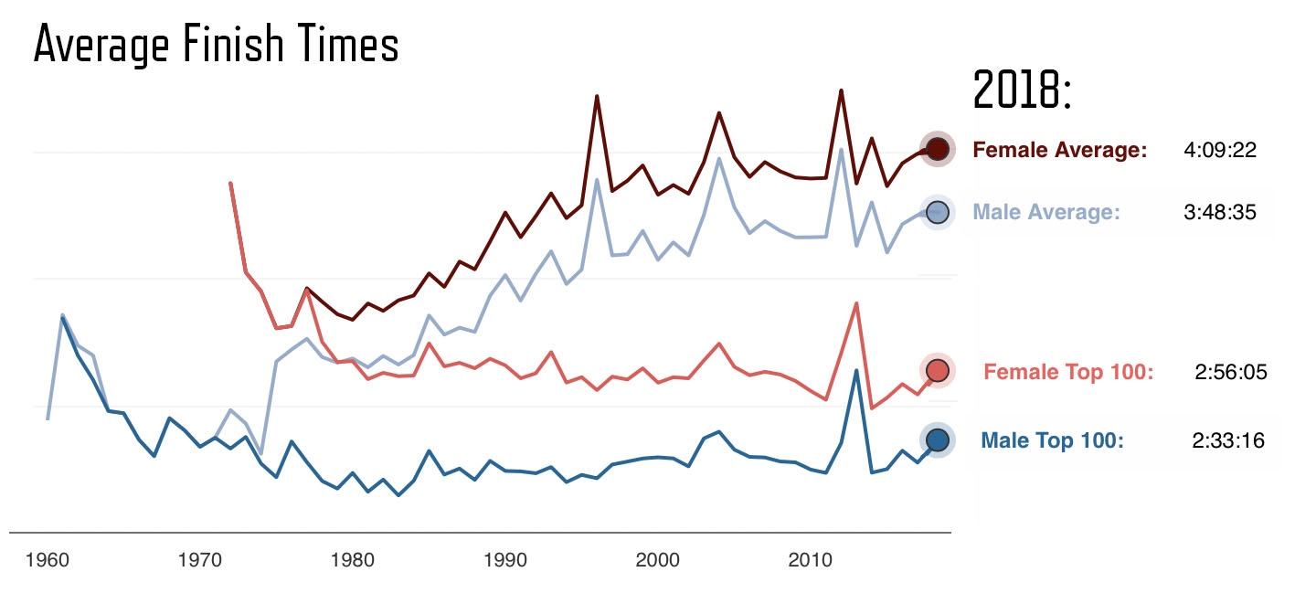
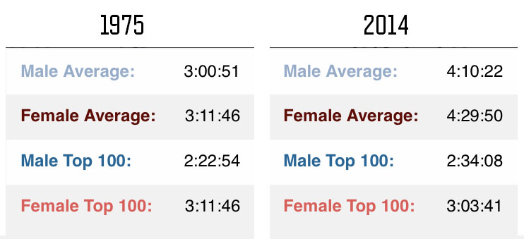
At the extremes, if you compare the averages of 1975 to 2014, today's runners spend more than an hour on Boston's course. Meanwhile, the elite runners aren't getting faster. Even with our fitness watches, our ever-improving shoes, our technology and data, we don't seem to have improved our average performance.
You can see why I called this story, "Boston's Evolution." In a century the race has transformed from a small race for a handful of elite men to an event where speed is only part of the story. Next, let's quantify just what it means to grow from 15 runners in 1897 to today's massive numbers.
From 30 finishers to 30,000+
In the first 75 years of the Boston Marathon about 3,500 runners crossed the finish line. They were all men. In the next 50 years more than 586,000 runners finished the race. Women account for over 200,000 of those participants. That is an amazing transformation.
Below is a chart showing the number of finisher's from 1897 to 1971. (You should be a bit skeptical of the first decade because the record keeping wasn't as reliable back then.)
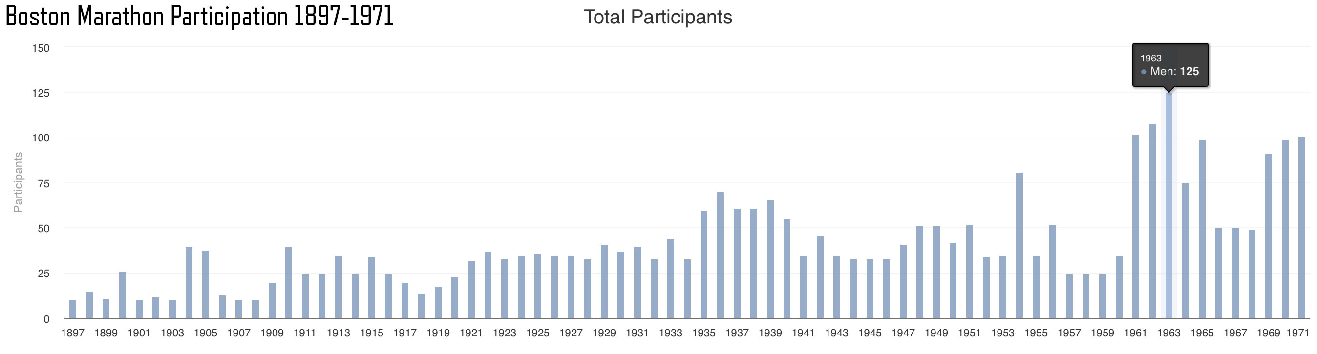 From 1897–1971 the maximum number of finishers was 125 in 1963
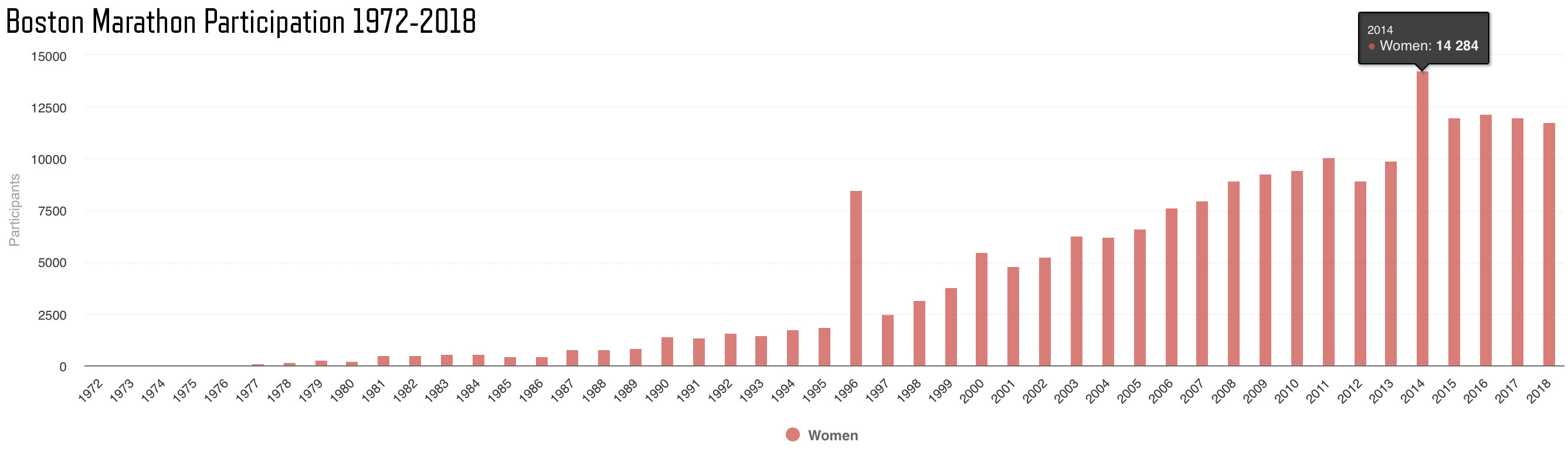
Now, let's look at the data from 1972 to 2018. As you study the chart below, notice the empty spots for 1975 and 1976. There are actually 150+ runners there but the scale of the chart renders them as sub-pixels. Note that the chart above maxes out at 125. You can see why I had to break the results into 2 charts. If drawn in a single chart, the first 75 years of the Boston Marathon wouldn't even be visible because the numbers are so small in comparision.
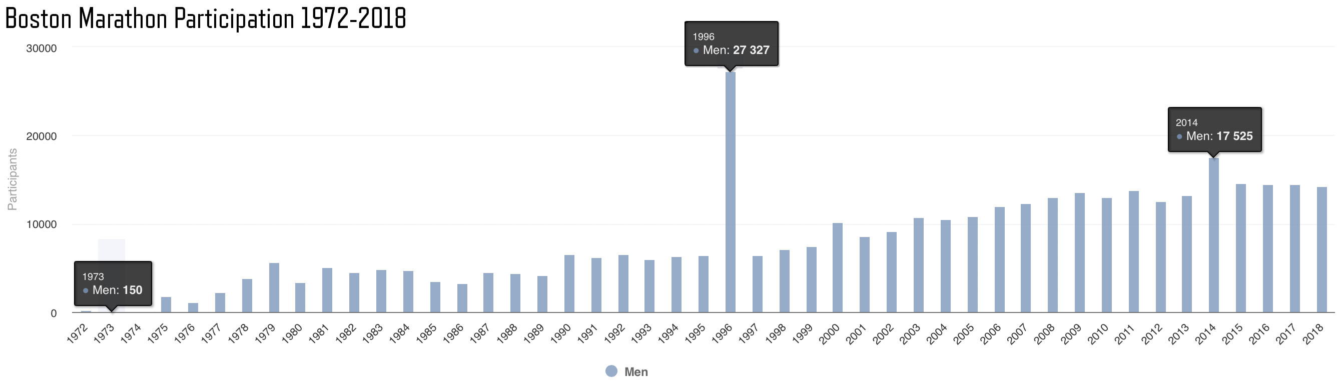
You might wonder why there is such a spike at 1996. This was the 100th Boston Marathon and it drew larger attendance than normal. This New York Times Article tells the story:
But for the 100th running of Boston, organizers made 5,000 spots available through a lottery, and another 6,000 runners gained entry through such methods as charity auctions and running clubs. What organizers had not counted on was that another 27,000 runners would run qualifying times. In a normal year, 9,000 runners qualify for Boston, and 3,000 bandits join during the race. What had been planned as an event for 30,000 registered runners has fattened considerably." –New York Times, April 14, 1996
The other reason I split the results at 1972 is that this is the first year women were officially allowed to enter the race. The number of women finishers has grown from 8 in 1972 to a high of 14,284 in 2014.
When you combine the charts to include men and women you can see that there have always been more men participants than women, although the gap has been closing.
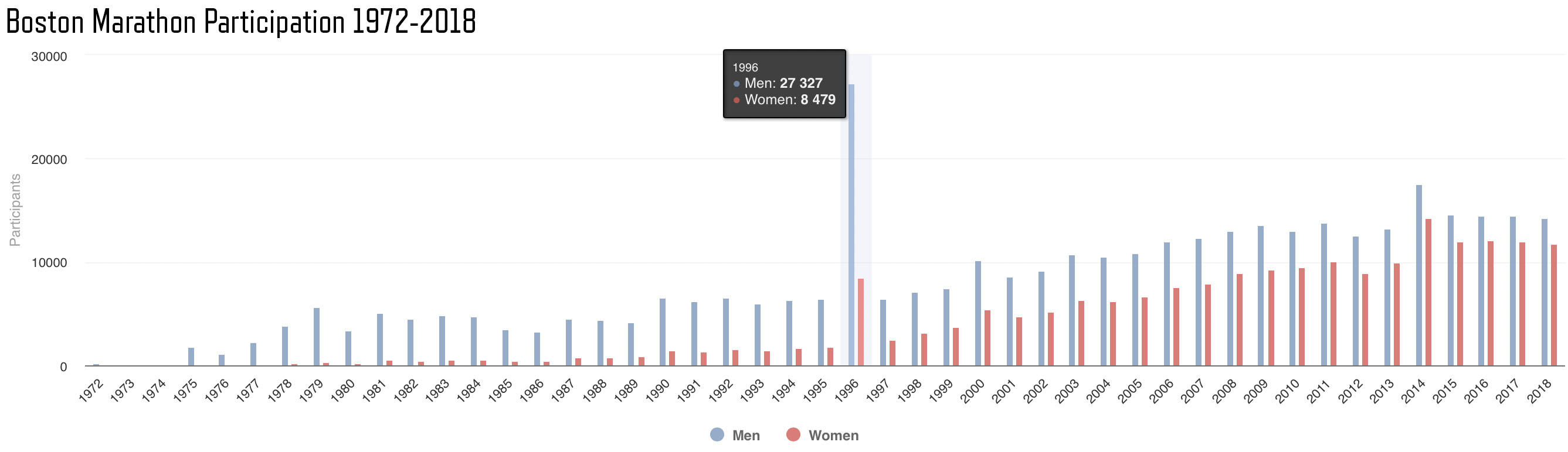
Unless Boston decides to allow more runners into the race, the total number of runners should remain steady for the foreseeable future. Participation seems to have peaked in 2014. After the bombing in 2013 it is reasonable to assume that the surge in 2014 was the collective response of runners eager to prove that we won't let evil discourage us from our dreams. Another factor might be that Boston waived the qualifying standards for 5,633 of the 2013 participants who ran at least half the race prior to the bombing.
Isn't it fascinating to see the evolution of the Boston Marathon played out in the data?
If you would like to explore this data further, I have 2 resources for you. The first is my Github repo containing Boston Marathon results from 1897–2018. The second is what I am calling The Boston Marathon Data Project, where you will find interactive versions of the charts from my articles plus much more data.
About Me
Thanks for reading. My name is Adrian Hanft. I am a runner from Colorado with a passion for data, design, and storytelling. You can follow my runs on Strava and my writing on Medium. If you enjoyed this analysis, please click the clap icon or share it with friends. Stay creative.