Defining the Athlinks User Experience
A Case Study by Adrian Hanft
Athlinks is the world’s largest collection of race results. Members of Athlinks are able to claim their historical results and build a profile that celebrates the highlights of their racing career. As a UX designer on a small cross-functional team I am able to contribute to a wide variety of projects. From user research to visual design to front-end code to website promotions, I touch it all. What follows is a sampling of my work along with brief explanations of the strategy and methodology behind the designs.
Part 1: Branding and Visual Design
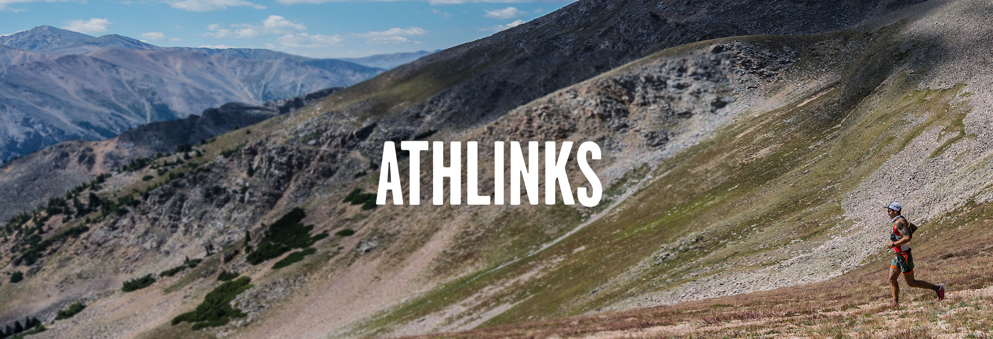
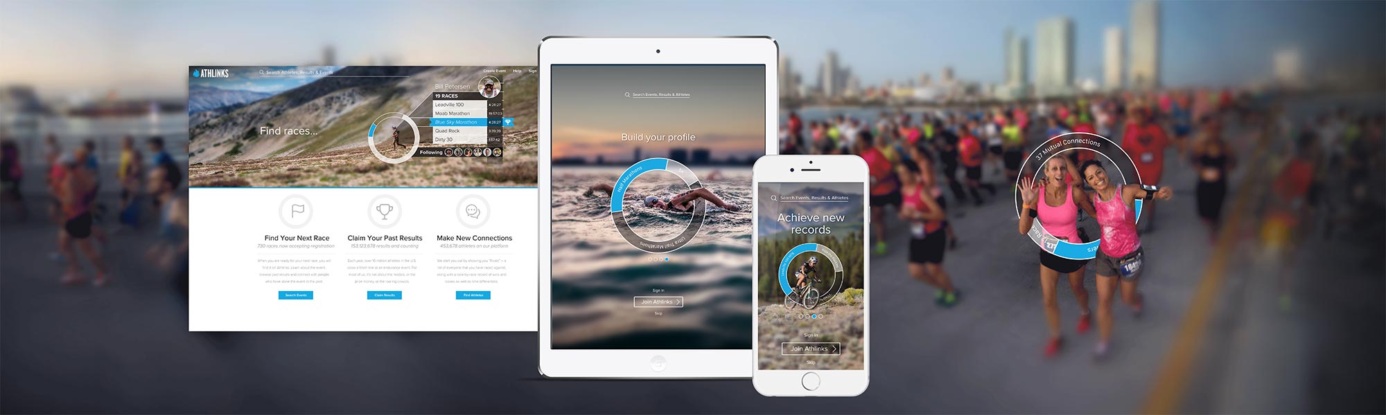
In early 2017 we began redesigning our website and app. This gave us the opportunity to create a new visual language and modernize our styles. The image at the top of the screen shows the first iteration of my designs. The “dial” graphic was a concept that used a circle to represent progress and visualize the data that users will be exposed to when they join.
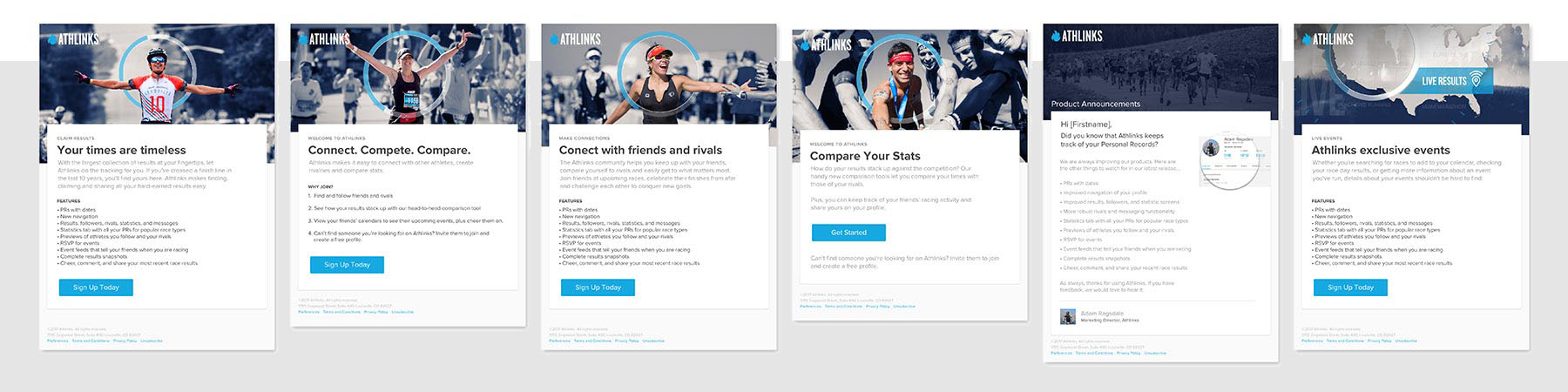
Email templates using the “dial” graphic element.
As we refined the concept, the brand elements have been updated and applied to other areas of our business such as advertisements, posters, and email campaigns. Email templates aren’t the sexiest of projects, but brand consistency is critical and emails play a huge role in establishing trust and generating brand loyalty. From transactional emails to onboarding campaigns, to product announcements we are striving to reinforce the messages on our website and echo the visual language that is defining our company.
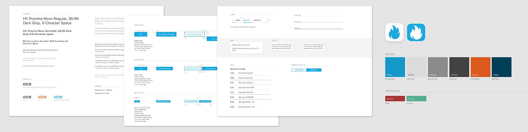
Style guidelines
Because we are a small team we need a simple solution for sharing our design system with people beyond our team. I created a living style guide that allows us to quickly make adjustments to our guidelines as we continue to evolve our identity. Our style guide is built with Sketch which allows us to leverage a library of components that we maintain. Changes made to symbols in our Craft library are automatically pushed to all documents linked to our library. This has the added benefit of allowing us to create quick prototypes because patterns can be reused rather than built from scratch.
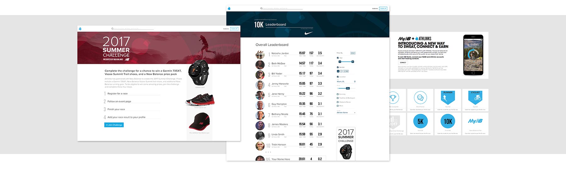
As we developed the website I also worked with our marketing team to develop ideas for partnerships and promotions. The design above shows a campaign in partnership with New Balance. The concept is based on a point system where users earn badges as they learn how to use more advanced features of our product. By “gamifying” our app through leaderboards we will be able to promote our partners and reward our users for completing tasks that align with our business strategy.
The long term vision for Athlinks is being able to mine our database of millions of race results so that we can deliver insights that will help athletes understand their past performances, compare themselves to people with similar capabilities, and plan for and predict future race milestones. Designing these features has been an exciting opportunity to explore an assortment of methods of displaying complex comparative data.
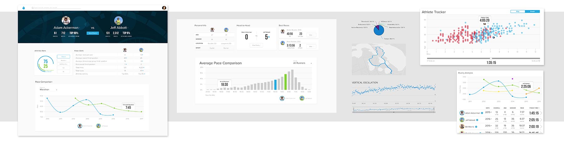
The design snippets above explore visualizations that will give athletes insights that they have never seen before. How do they stack up against other people in a race? How does their performance compare to their friends and rivals? How has their performance changed over the years? How is their pace affected by the map of the course? All these concepts hold promise but also depend on simple and well-executed designs. User testing is needed to upgrade these concepts from graphics that look pretty on screen to working features that delight users.
Part 2: User Research and Testing
Beyond defining the elements of our brand, I strive to design experiences that resonate with users. To help our team understand the variety of needs and motivations of people who use our products we have created three user personas. User personas are important because they force us to put ourselves in someone else’s shoes as we solve problems.
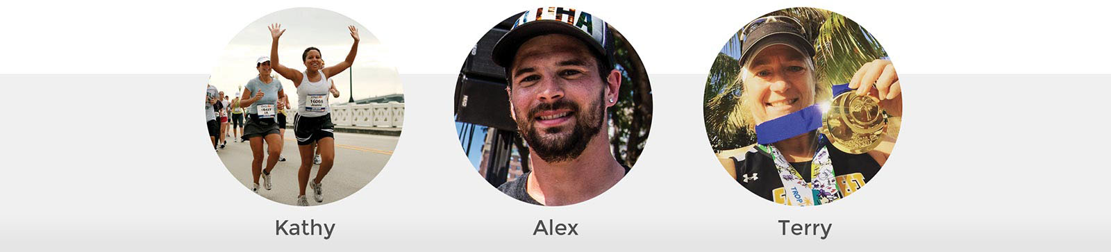
Athlinks’ three different user personas: Kathy, Alex, and Terry
Athlinks serves three types of people. First is “Kathy,” an athlete who races for fun and is motivated by the social interactions of race day. Second is “Alex,” an athlete who enjoys training for a destination race with the hope of setting a personal best on race day. Third is “Terry,” a competitive racer who regularly stands on the podium and is motivated by beating her rivals.
With user personas in mind, the early phase of the design process is a mix of whiteboards, sketches, wireframes, and data gathering. I like to use Balsamiq for wireframes because it has a rough, sketchy format which helps keep the team in the conceptual phase without jumping to visual solutions too quickly. Once there is consensus around what we are building I move to higher fidelity designs.
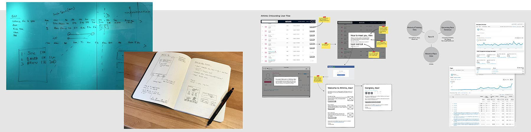
Whiteboards, sketches, wireframes, diagrams, and analytics research
Putting ideas in front of users as early as possible is the best way to validate designs before too much effort is spent pursuing potential dead ends. Below are three variations of a screen that I designed to display race split times. This is data that nobody in our industry displays so there aren’t established patterns to rely on. I tested a table view of the data against two visual representations of the same information.
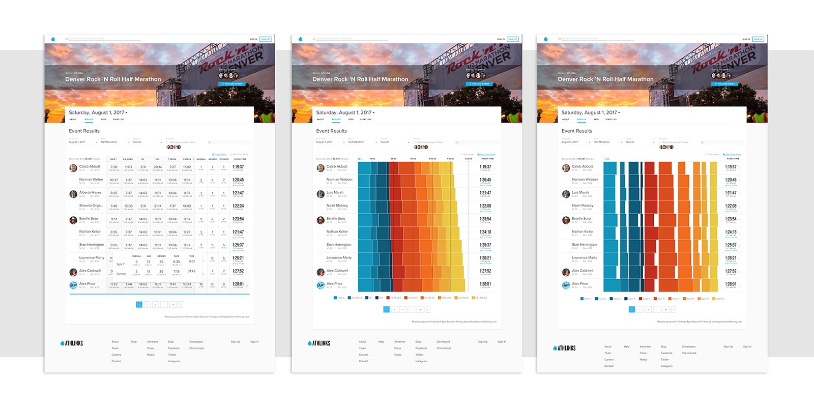
For this test I created a clickable prototype using InVision. In other situations I might build an HTML prototype or even test lower fidelity wireframes. We brought users into our office and three of us conducted the tests. One person used a script to guide the user through the test. The second person transcribed the user’s words into a spreadsheet that aligned with the script. The third person’s role was to observe the user, listen, and absorb the interview without the distraction of typing or reading from a script.
Results of the tests were leaning toward the table view, however, several users were captivated by the visual view. This feedback lead me towards an iteration of the design where the display defaults to the table view but still allows users to toggle to the visual bar charts when they want an alternative way to read the data.
While in-house testing is valuable, sometimes you can learn even more by going to your customers. Talking to users and observing them in action is sure to reveal new insights and uncover flaws in your designs because the real world is so different from a controlled office setting.
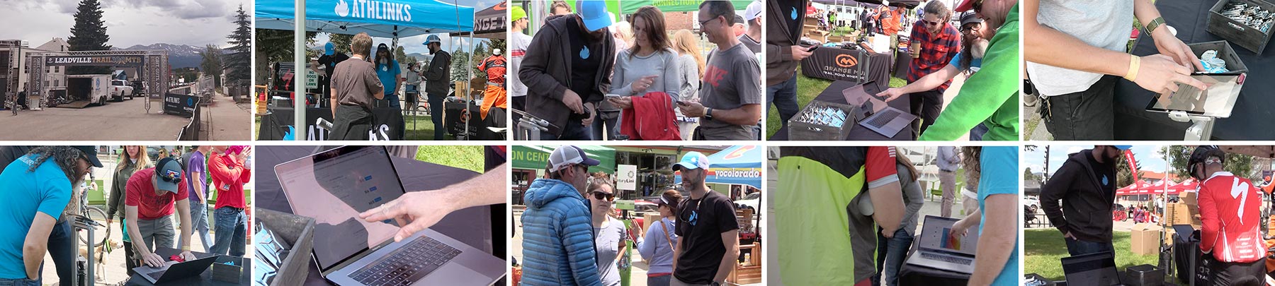
I took the photographs above showing my teammates in Leadville, Colorado where we spent the day with our target audience of runners and cyclists. We observed users as they interacted with our products on a laptop, iPad, and on their phones. If people weren’t in a hurry we gave them a sneak peek at in-progress designs to get their feedback on future product ideas.
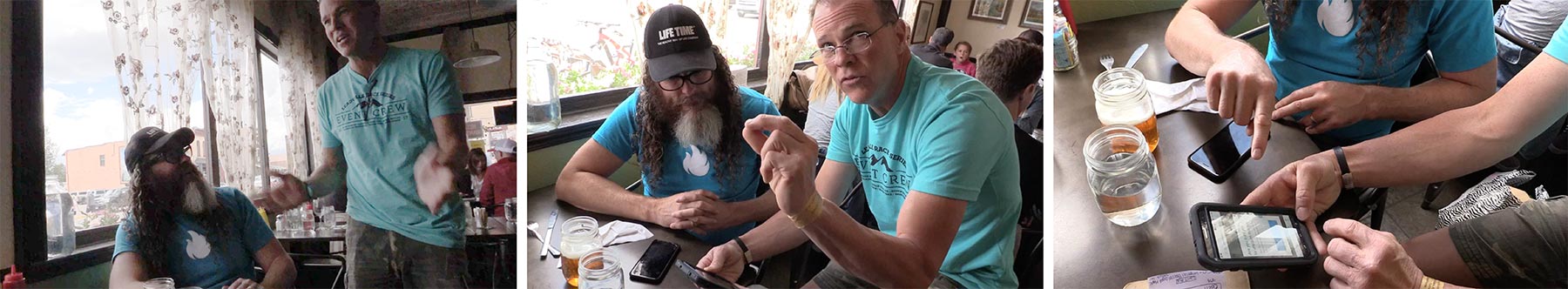
Max was a passionate user who sought us out just to request a feature.
Meeting people who use your product puts a face to the problems you are trying to solve. One user, Max, was so excited about our product that he introduced himself when he saw us at wearing Athlinks shirts at a restaurant. When we asked him what he thought of our app he showed us something that frustrated him. He wondered why he had to search for himself when he was logged in. Since the app knew who he was, couldn’t it just display his races automatically? While this is an enhancement we have been working towards already, it confirmed that we’re on the right track and it gives us motivation to ship this enhancement. Being able to say, “we need to fix this for Max” adds urgency and a sense of responsibility to tasks that might otherwise be shrugged off.
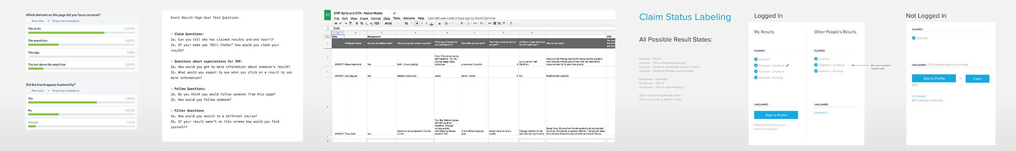
1. Usability Hub test results, 2. User interview script, 3. Spreadsheet capturing comments from user testing, 4. Summary of research recommendations
User testing takes many forms and the artifacts of the process are also varied. The image above shows the script of a user test, results of a Usability Hub survey, notes from user interviews, and documentation of recommendations after a test. I am not religious about the user research process, instead tending to prefer loose systems that give me the data I need with as little friction as possible.
The projects I have described here are small steps towards the ultimate goal of delighting customers. Athlinks’ products are far from perfect and there is plenty of work to do to get things to where I want them to be. This is the endless job of a user experience designer, always pushing for better experiences, always advocating for the user.
Thank you for taking the time to read this case study. I hope that my enthusiasm for design and commitment to my craft comes through. If you have any questions I welcome the opportunity to talk more. You can contact me at designer@adrianhanft.com.