
Run The Edge App Redesign
A Case Study by Adrian Hanft
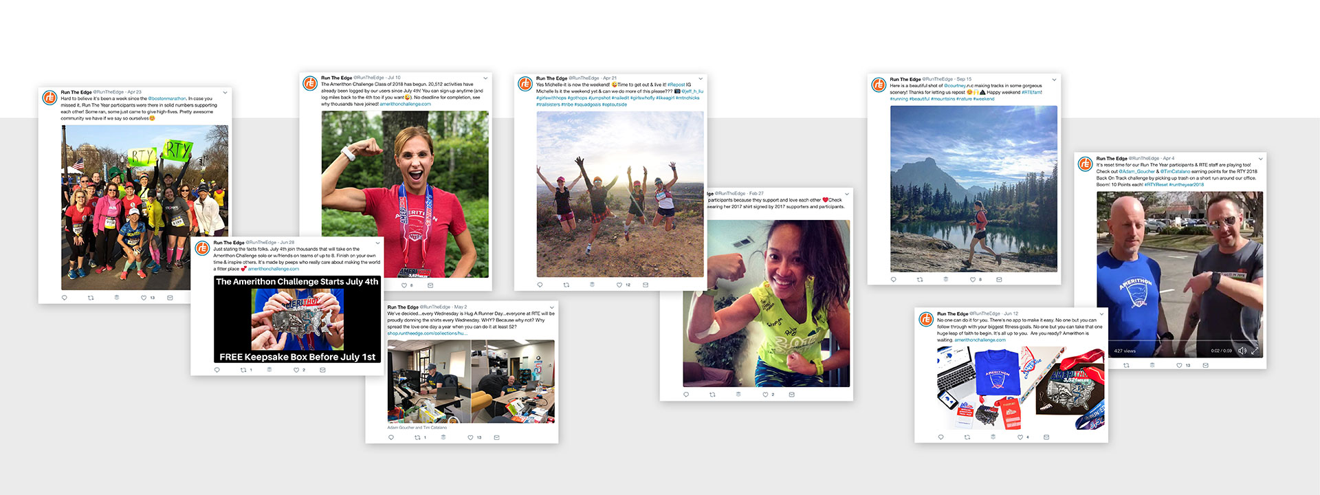
The energy and passion for running shared by the Run The Edge team is inspiring and contagious. I jumped at the opportunity to help transform their products into beautiful, well-branded applications. Centered in Boulder, Colorado, a team of 3-5 Run The Edge employees has managed to support thousands of runners who have joined their challenges.
As a runner, how could I NOT want to help Run The Edge's mission?
The enthusiasm runners share for Run The Edge begins with two ambitious questions. Can you run 2,018 miles in 2018? Can you run the equivalent of running across the United States? These challenges, Run The Year and Amerithon respectively, are the main products Run The Edge offers. Runners who accept the challenge are supported by a system of maps, medals, stickers, rewards, and social incentives.
Part 1: Run The Edge Login Consolidation
The first thing I wanted to address with the redesign was a branding question. As Amerithon and Run the Year grew in popularity over the years the companies brand hierarchy had lost clarity.
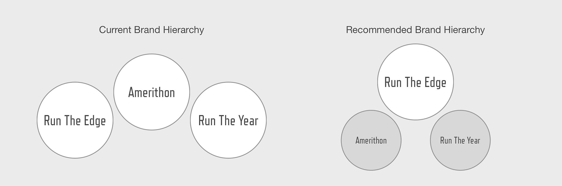
Users were confused. It wasn't uncommon for participants of Run the Year to be unaware of the existence of Amerithon. In some cases they were even unaware of the parent brand, Run The Edge.
Rather than having each challenge continue living at separate websites, I recommended that all challenges be accessed through the main Run The Edge website. This allowed us to consolidate and reduce the cognitive load users were carrying. Now users only had one account, one password, one set of billing details, and one address where they could access everything.
Clarifying the brand confusion opened the door to improved sales because it exposed users to the other challenge and increased the size of the overall community. The consolidation set the groundwork for longterm growth because Run The Edge has plans to add more challenges in the coming years.
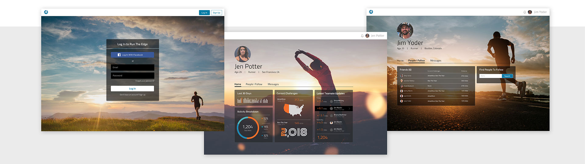
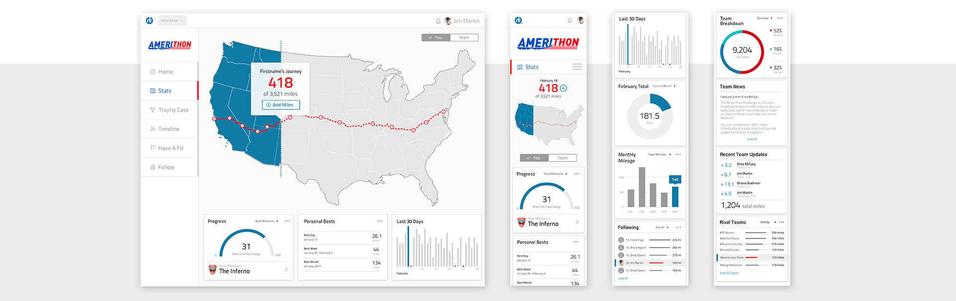
Login and Run The Edge Dashboard
The designs above shows the login and account management screens that users would see with the consolidated login flow. From their dashboard, users can see at a glance their progress in the challenges they are participating in. They can also see the activity of their friends.
Here, at the global Run the Edge level, is where each user's profile lives. This is also where you manage the friends you follow, send messages, and where you access your account settings.
Part 2: The Interactive United States Map
Each challenge has its own dashboard. A pitfall I wanted to escape in the design of Run the Edge's dashboards was avoiding data paralysis. While charts, graphs, and statistics were a requirement of the dashboard I didn't want the dashboard to feel like analytics software. I wanted to capture the enthusiasm users felt when they first accepted the challenge to run across the USA or to run 2,018 miles.
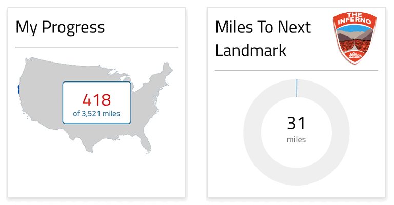
I decided that the first thing you see when you log in to the Amerithon Challenge should be a large empty map of the United States that fills with color to reinforce your progress with each visit.
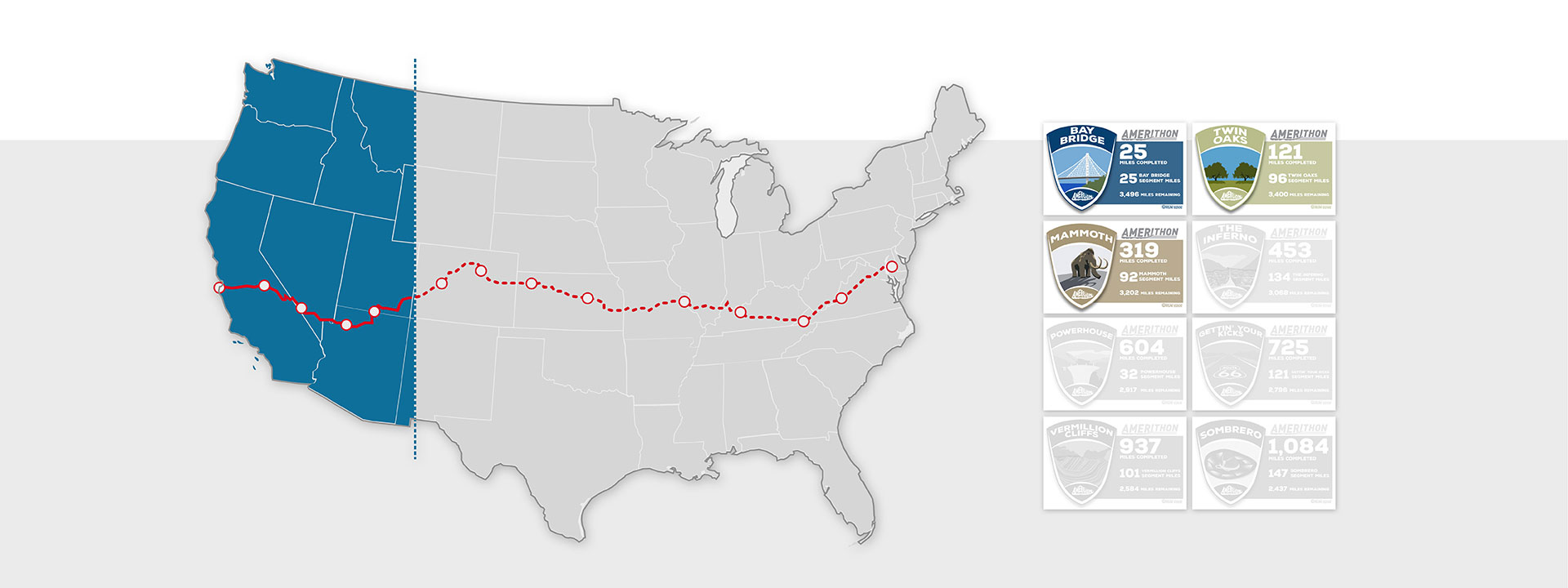
Amerithon Map and Badges
The route across the US is dotted with points that mark milestones. Each milestone represents a badge that the user will earn and is accompanied by a video.
As you can see from the animation above, I used the map element as a progress bar when the page loaded. I created the animations from SVGs and javascript.
Part 3: Design Guide, Component Library, and HTML Prototypes
In addition to designing the new Run The Edge app, I also helped build HTML components for the app. This rapidly sped up the development process because I was in perfect sync with the developer who took my components and wired them up to live code. It also helped me make decisions on the fly rather than delaying progress when the ambition of my designs comes in contact with the constraints of code.
Our process consisted of a combination of Gulp, Sass, Foundation, and Babel. The result was reusable, self-contained components that the developer could easily insert into his project without fear of having them conflict with other parts of the app.
The added benefit of our process was that my project essentially worked as a design guide and pattern library. Each component is defined and referenced from a main index page.
Desktop and Mobile Versions of the Dashboard
Because HTML components are so easy to use, it makes it easy to build HTML prototypes. By leveraging the responsive Foundation framework, I can quickly build a working HTML prototype to test a new idea. User tests become more realistic because you aren't limited by more static design prototype methods.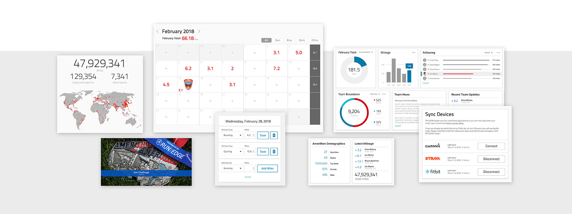
Components Used Across Run The Edge Apps
Part 4: A Successful Launch and Next Steps
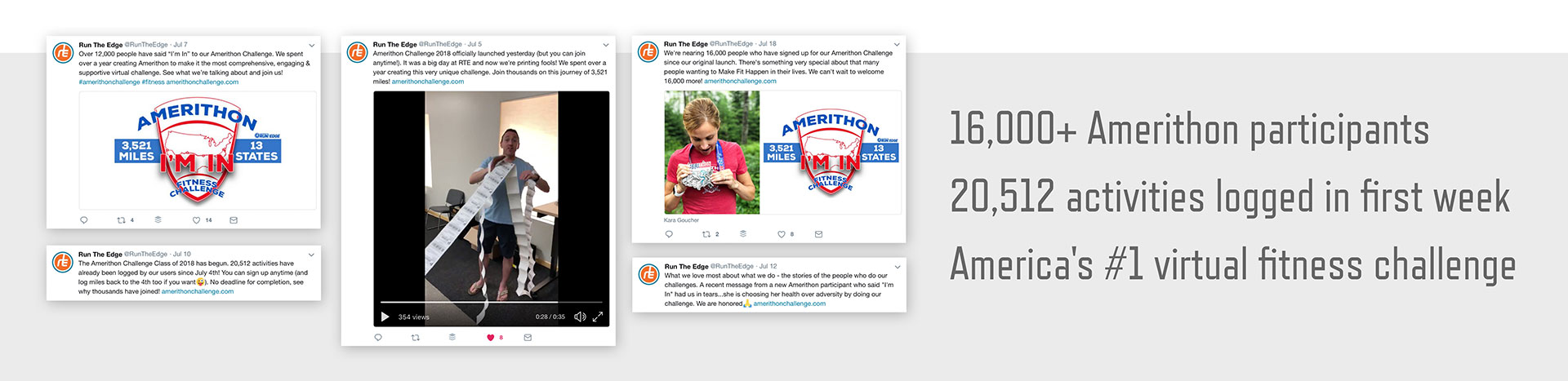
When Amerithon launched on July 4, 2018 it quickly became the most successful challenge in the company's history.
The New Amerithon App Launched July 4th
While I would like to take credit for the success, the biggest factor was the goodwill that Run The Edge has tirelessly earned over the years. And to be honest, the final product fell short of my hopes. Like any small, ambitious team, often your vision exceeds your ability to execute. Luckily, there are always opportunities to iterate and improve.
After Amerithon launched, the dust settled and we were able to work on items that had been neglected. One project on that list was Run The Edge's website. Below are some of the designs that the team is considering as the next version of the website gets underway.
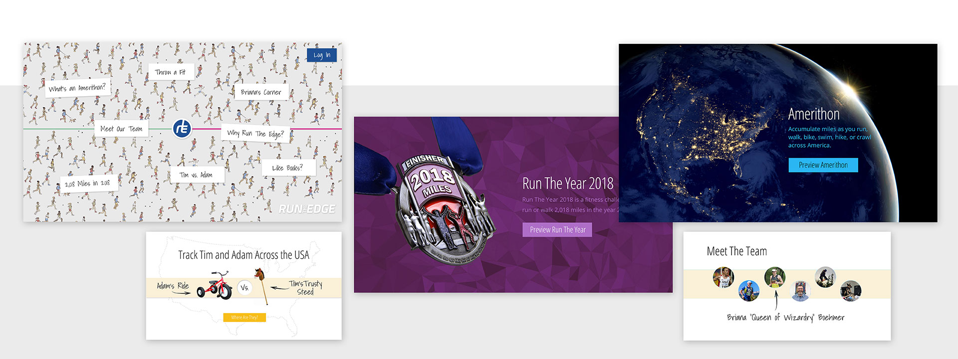
Run The Edge Website Designs
Additionally, the team is improving the messaging system that allows participants to communicate from within the app. Below are some of the wireframes demonstrating the improved messaging flow.
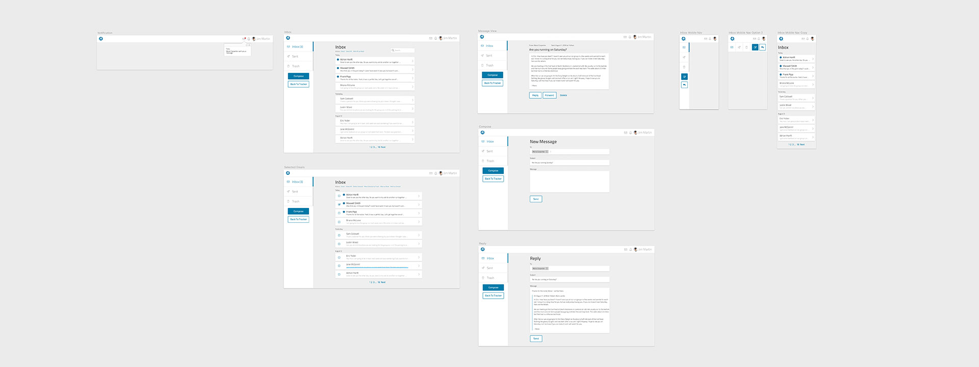
Wireframes for Run The Edge messages
Finally, I am helping the team build an app for syncing data from Apple Healthkit. Unlike other services like Strava, syncing from Apple currently requires a native app to access healthkit data. The team named the app "Trackery" and it is currently in development.
![]()
Healthkit Syncing App, "Trackery"
The Trackery app will be the team's first iOS app and it will open the door to bringing Run The Edge's challenges beyond the web. I believe that many products suffer when they jump to multiple platforms too soon. I applaud Run The Edge's restraint as they have chosen to refine their products on the web before tackling Android and iOS apps.
I feel privileged to have worked with the passionate people at Run The Edge and I hope that I can continue to help them as they grow into new markets and ecosystems.
Thank you for taking the time to read this case study. I hope that my enthusiasm for design and commitment to my craft comes through. If you have any questions I welcome the opportunity to talk more. You can contact me at designer@adrianhanft.com.