
Reimagining Runcoach
A Case Study by Adrian Hanft
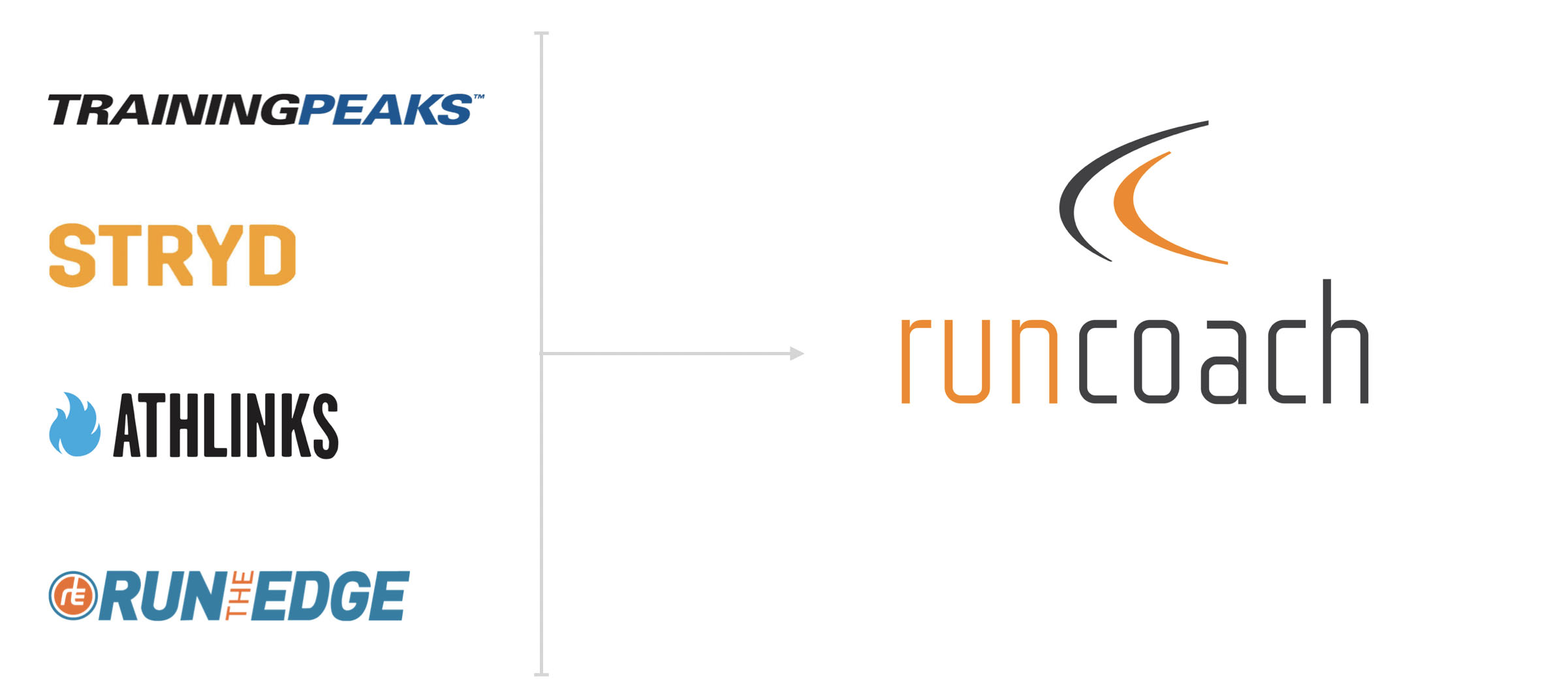
The invitation to lead design at Runcoach was a great opportunity. The team was small, the product was full of potential, and there was a need in the industry for an app that could adjust to the busy lives of runners. I brought with me a toolkit full of skills and knowledge I had gained from collaborations with TrainingPeaks, Athlinks, Stryd, and Run the Edge.
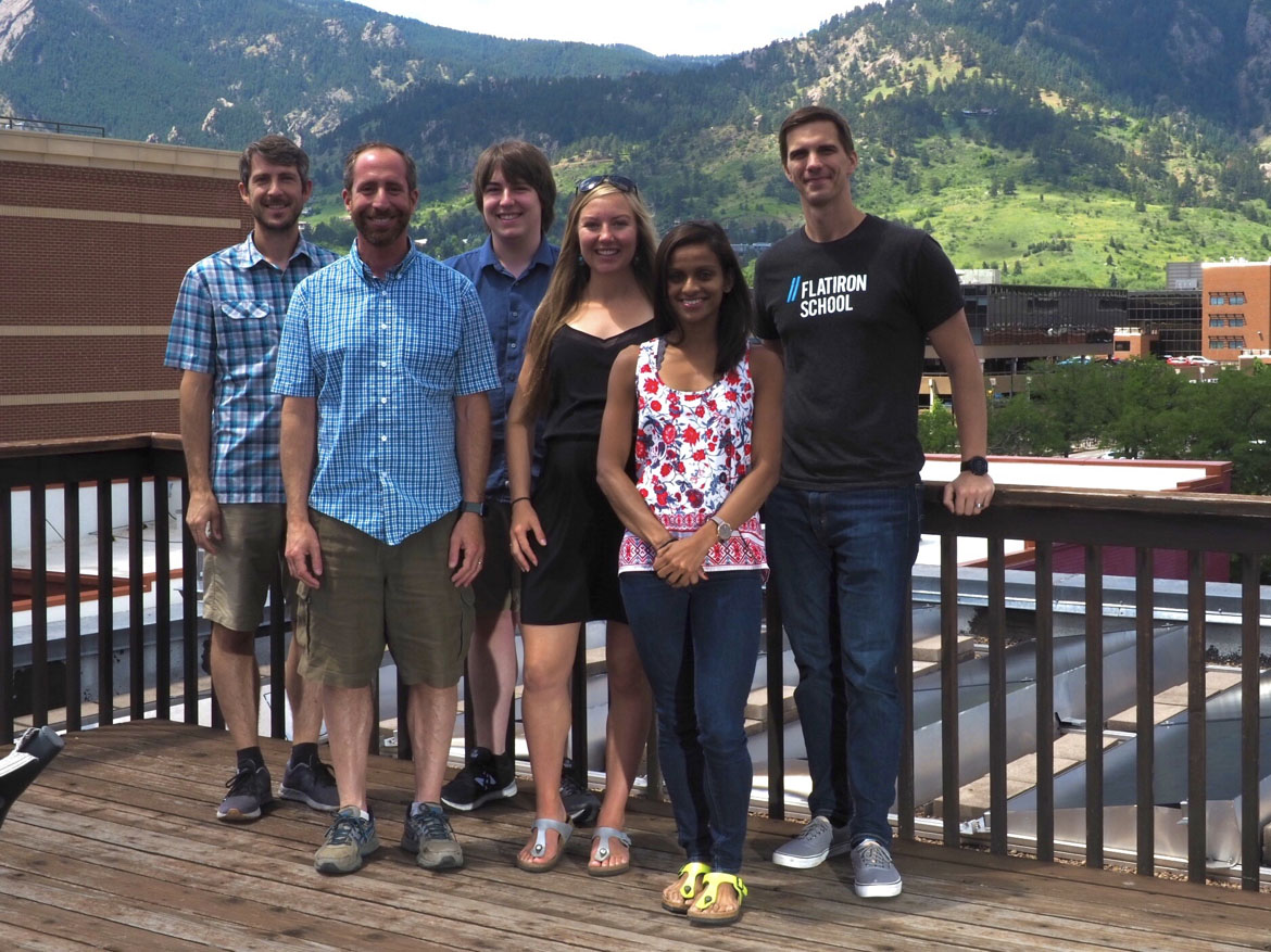
The photo below shows the members of Runcoach's Boulder team. We also had 3 additional developers (iOS, Android, and backend) who worked remotely. Because our team was so small, we moved fast and wore many hats.
Being the sole designer on the Runcoach team I lead the entire design process. As the researcher I conducted interviews and built relationships with our users. I built and tested prototypes to validate the direction of our products. I established a new design direction and improved the design standards for our company. I worked with stakeholders to build alignment on the direction of new features. I collaborated with developers to ensure that the intention of the designs became shippable products.
With this case study I would like to show you how I approached the reimagining of Runcoach. You will see my deep sympathy for the needs of our users, my passion for evangelize design thinking, and how that all came together in the design of a major feature (a calendar redesign). Let's get started...
Part 1: Product Positioning
Runcoach is an app that helps runners achieve their goals. Powered by a training engine that adapts to user’s needs and supported by a team of world-class coaches, Runcoach fills a unique need in the fitness technology space.
Runcoach is an app that helps athletes achieve their goals on race day. Powered by a training engine that adapts to user’s needs and supported by a team of world-class coaches, Runcoach fills a unique need in the fitness technology space.
My first initiative at Runcoach was to help the product transition from a pay-to-use app where everything lived behind a paywall to a "freemium" product that anyone could use indefinitely with the option to upgrade at any time. For a monthly fee, users could have unlimited access to our world-class coaches.
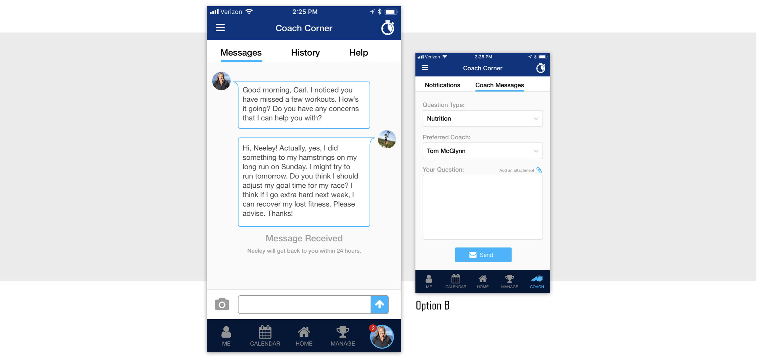
The challenge of the freemium transition was to find a minimum viable product that separated the free features from the premium coach services. The image below shows a chat concept where an athlete's coach is accessible via a tab in the main navigation.
To enhance the value of a paid subscription, I worked to elevate the presence of our coaches within the app. In places where users encounter information that I could transform into "coachable moments" I redesigned the interaction so that a coach's voice could come through.
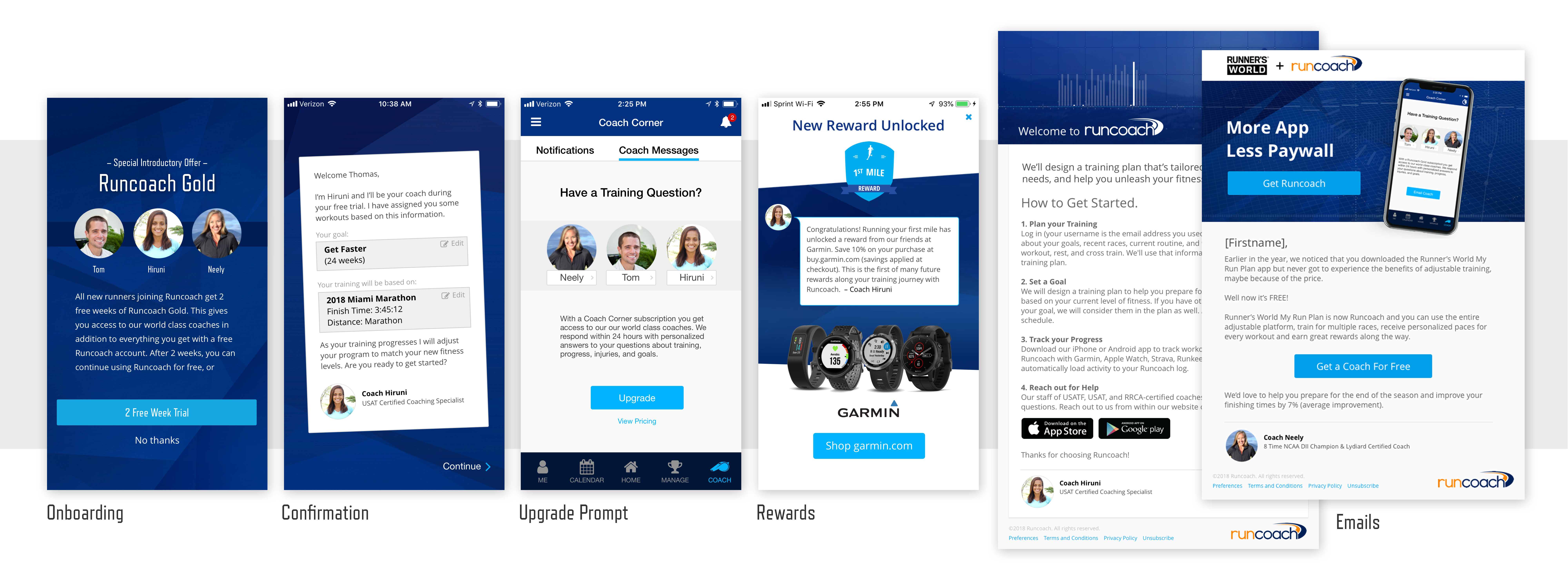
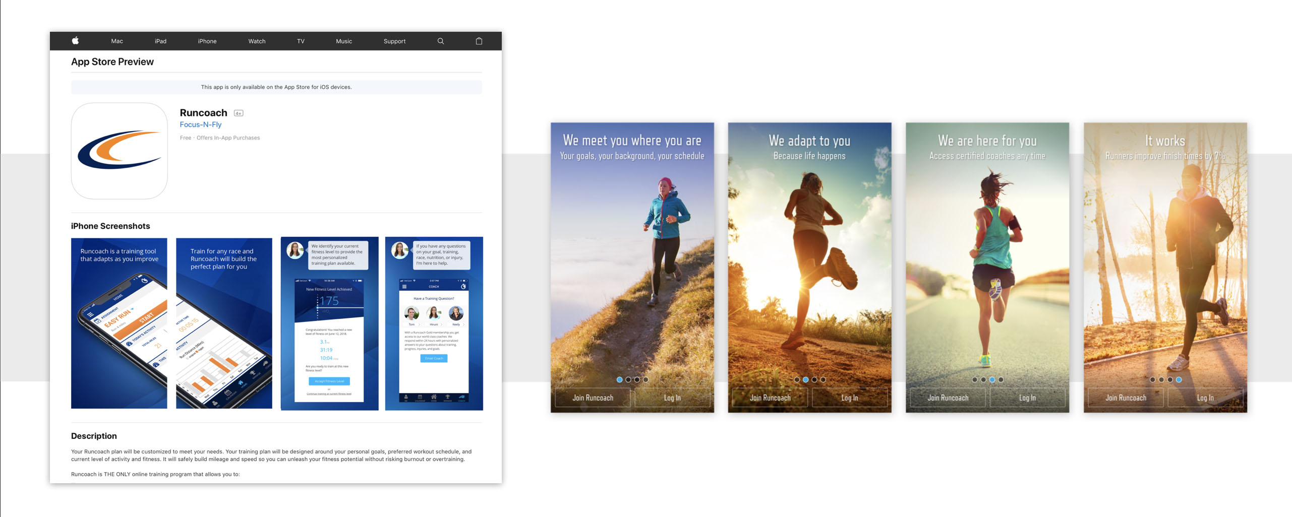
Above you can see some of the places where I brought the coach into the foreground. From the initial onboarding, to all email correspondence, to in-app achievements, through to support requests, anything that could benefit from a more human voice became an opportunity to introduce the real people that power Runcoach. Even our app store screenshots received the coach's voice and the first images a new user sees when they open our app explain the value that coach access provides.
Part 2: Building Empathy for Users
As a runner I naturally can relate to Runcoach's users. This is both a blessing and a curse. On one hand I can usually trust my gut to tell me how our users will think about our product. On the other hand it is tempting to get lazy and then end up blindsided when I inevitably discover that users are different than me.
To keep my bias in check I have curated a group of a dozen users that allow me to ask questions, get feedback on work in progress, and keep my pulse on the needs and trends of our users. For example, I can send members of the group a simple survey asking for feedback on something as simple as enhancements to a graph.
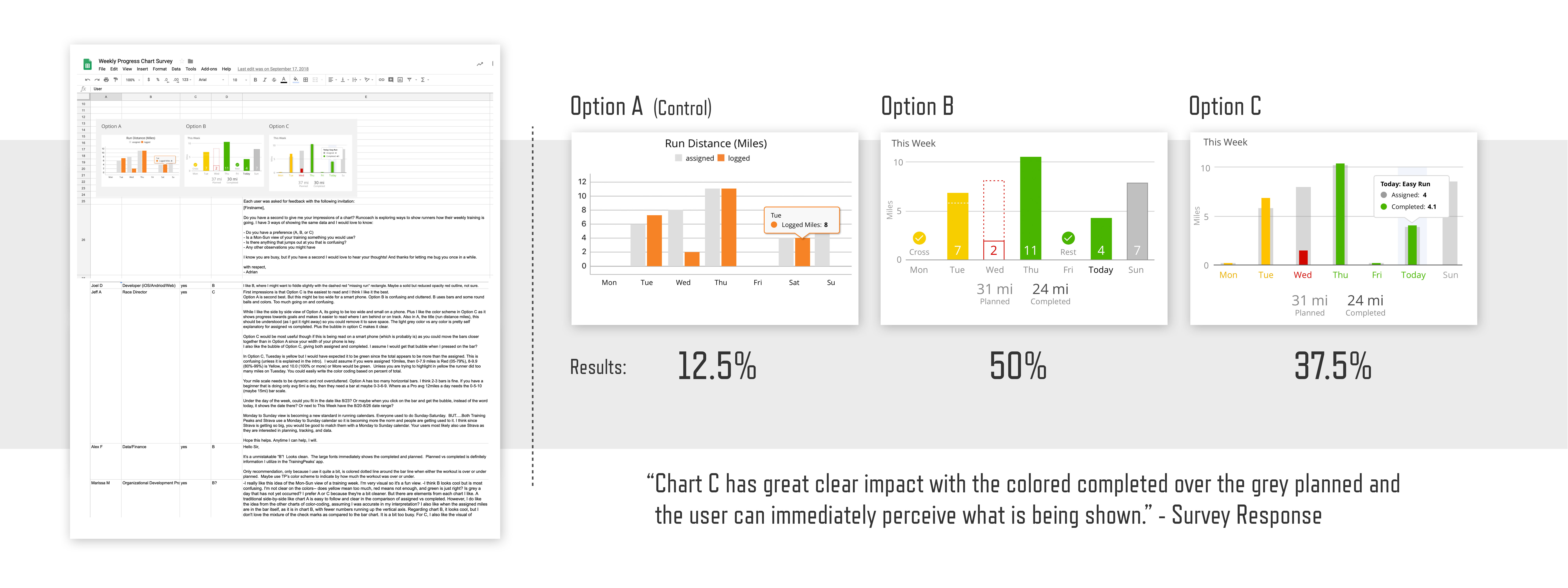
As you can see in the image above, these users are so engaged that they willingly provide me with hundreds of words detailing why they do or do not like the direction of my designs.
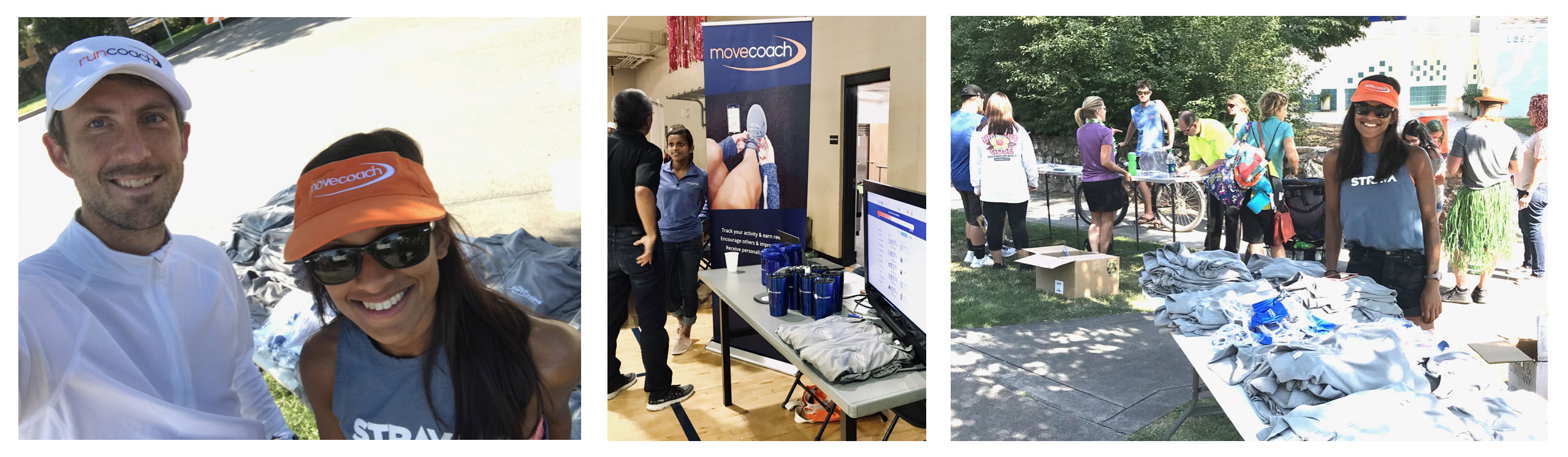
Another method I use to increase empathy for users is to get outside the office and meet people. The photos below are from events where I was able to connect with users, evangelize about our product, and hear first-hand the struggles and desires of people who use our app.
A common theme that arose was friction within the account creation flow of our app. After convincing someone to try Runcoach, I would watch as they struggled to navigate through our onboarding screens. Based on this field research I could return to the team armed with ideas and motivation to improve our app.
When you try to envision the pains that your users experience, the fidelity of your imagination only gets you so far. When you observe people in the real world you come face-to-face with problems that you couldn't have predicted. For example, race day is the climax of the journey for Runcoach users. By participating in races, I am able to experience first-hand what our users are going through.
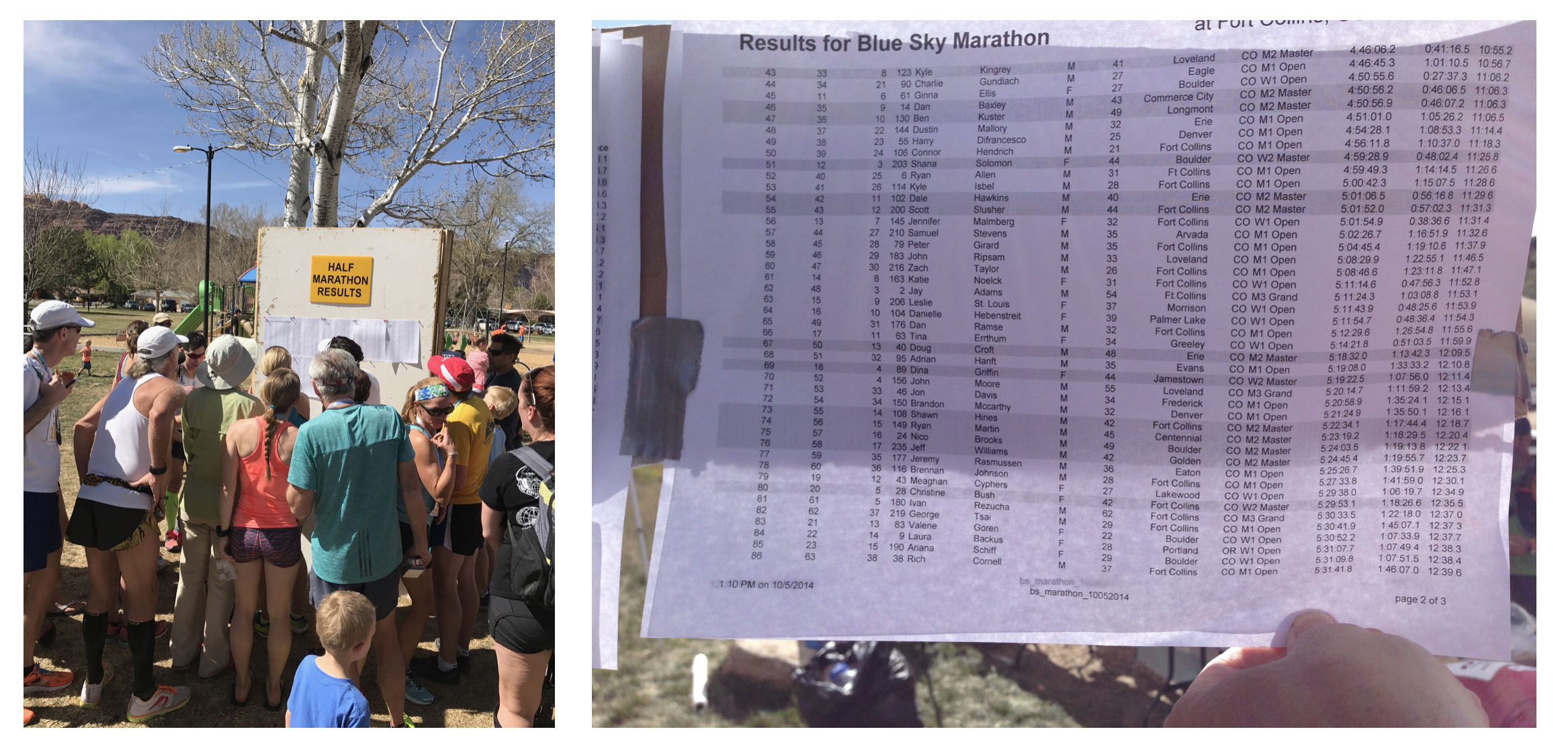
A common post-race experience involves finding the official results. Finishing times are typically printed in tiny fonts and posted on whatever wall is available. Crowds form to squint at the paper as it blows in the wind. This is user pain. It represents an opportunity that, if solved, can connect users to our product in a way that we wouldn't have thought of had we not escaped the comfort of the office.
As I work to create alignment within teams about the features we should enhance or develop, I often create simple diagrams that serve as conversation starters. The image below shows an idea that our team embraced about the primary engine of our app.
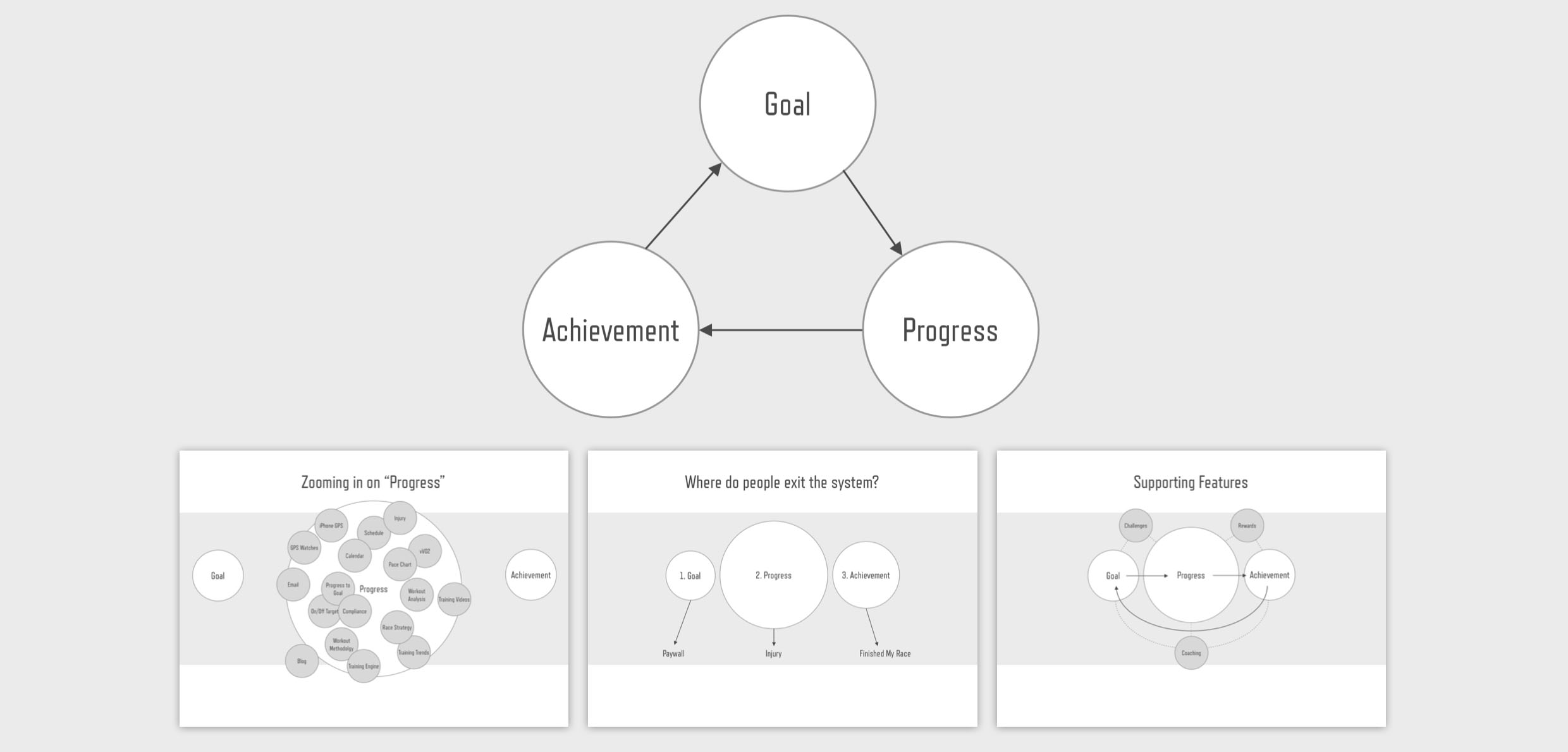
The goal/progress/achievement loop became a concept that informed feature development. It helped us identify the core features that make our app sticky and gave us the courage to abandon ideas that contradicted our main mission.
Part 3: User Journeys
I believe stories are the most potent way to motivate and align teams around a common mission. If you can put a real face and name to the problems of a user, the impact of that story gains momentum.
To create compelling stories about users, I use a simple journey format. At the start of the journey we meet the person and learn what their motivations are. Then I highlight 2 or 3 struggles that the user encounters. Finally, I end with a question. Will the user overcome their obstacle because of the action we take to improve our product?
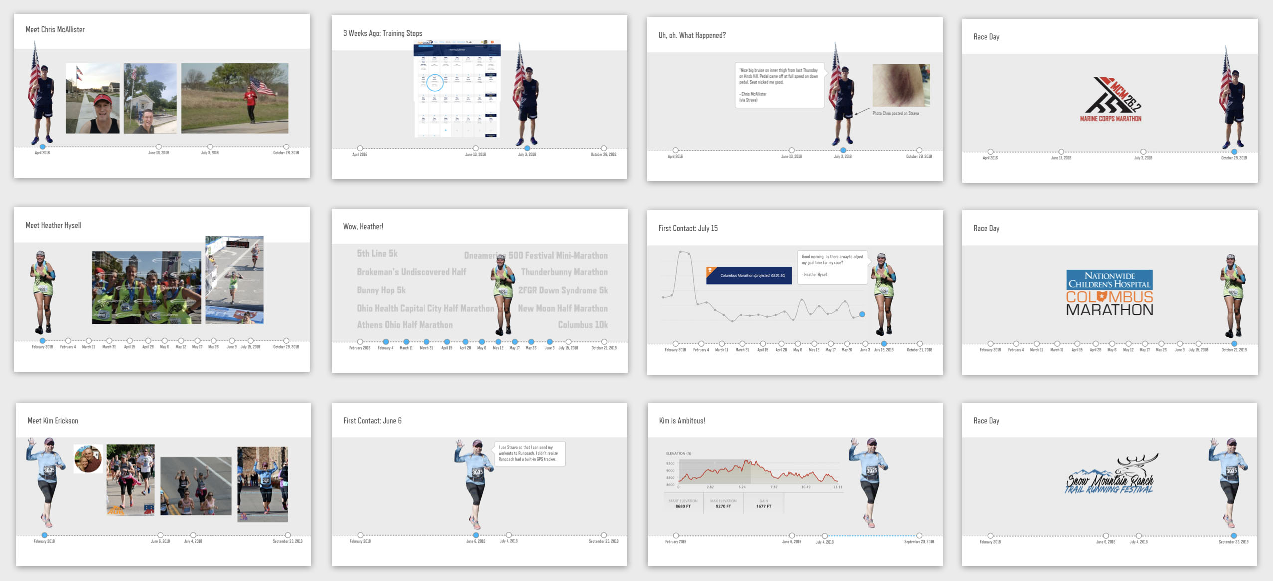
Examples of three user journeys
In the stories above we meet 3 users. Chris stopped training after being injured in an accident on his bike. Heather has ran a dozen races in the past year, but has never set a goal in our system. Kim is training for a trail marathon at high altitude, but our app doesn't take terrain or elevation into account when it assigns workouts. You can see how these stories naturally lead to new features, product enhancements, and deeper analysis.
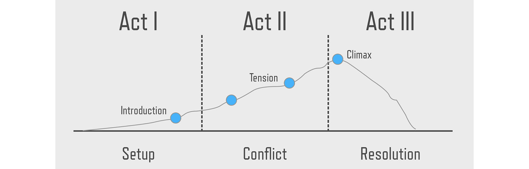
The simple format of my user journeys is not accidental, and you might recognize the method from your highschool writing class. It is the hero's journey as represented in the typical 3 acts of a play.
A great source of inspiration for this type of user journey is customer service. If you have access to support tickets, you can identify reoccurring themes. Once you see a theme it is just a matter of finding a user who exemplifies the problem and zoom in on his or her situation. For example, consider Chris, below.
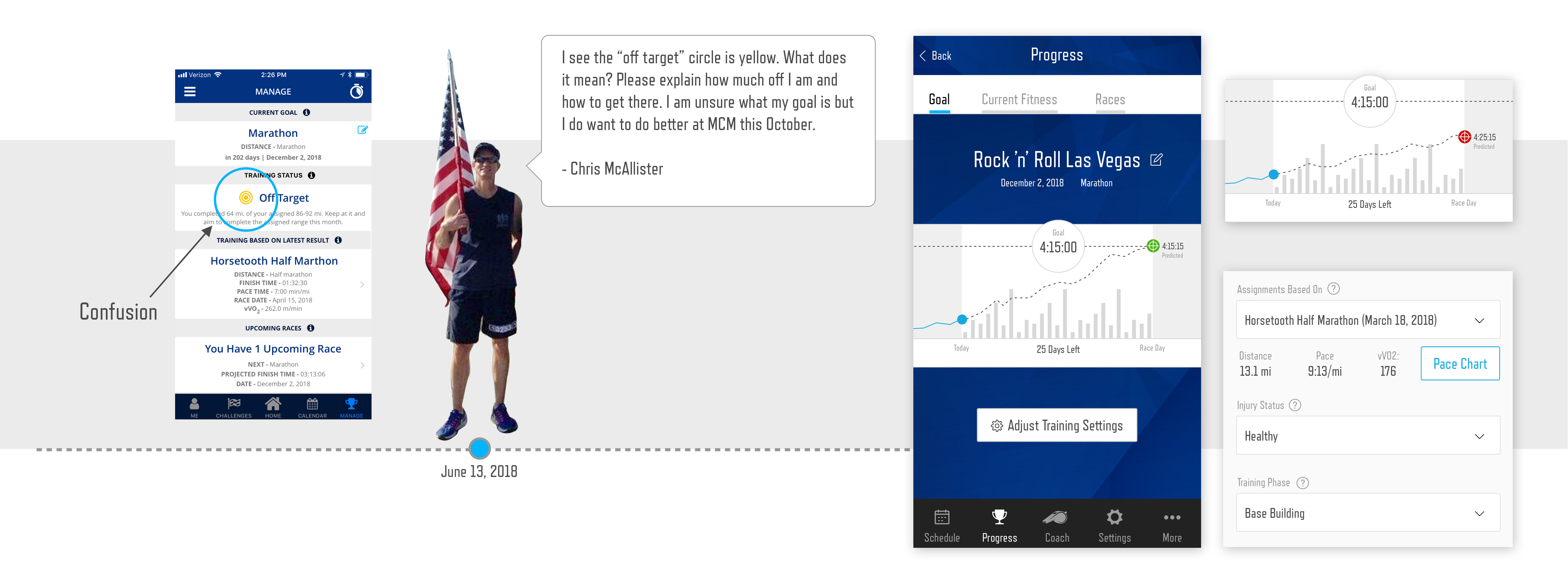
Chris is runner who is training for the Marine Corp Marathon. He contacted customer service with a question about a target icon within our app. While I had already identified this feature as an experience that could be vastly improved, the illumination of Chris' story helped our team buy-in to the enhancement. I quickly designed a proof-of-concept that the team used to explore ways to improve Chris' training.
Part 4: Calendar Redesign
Armed with empathy for our users, team alignment, and a clear picture of some of our user's pain, I will conclude this case study with the design of a specific feature, the redesign of Runcoach's calendar.
The first step in the redesign of a feature is an evaluation of what you currently have. The experience of the existing calendar had several areas that could be improved. The image below shows UX notes that I wanted to address with the calendar redesign.
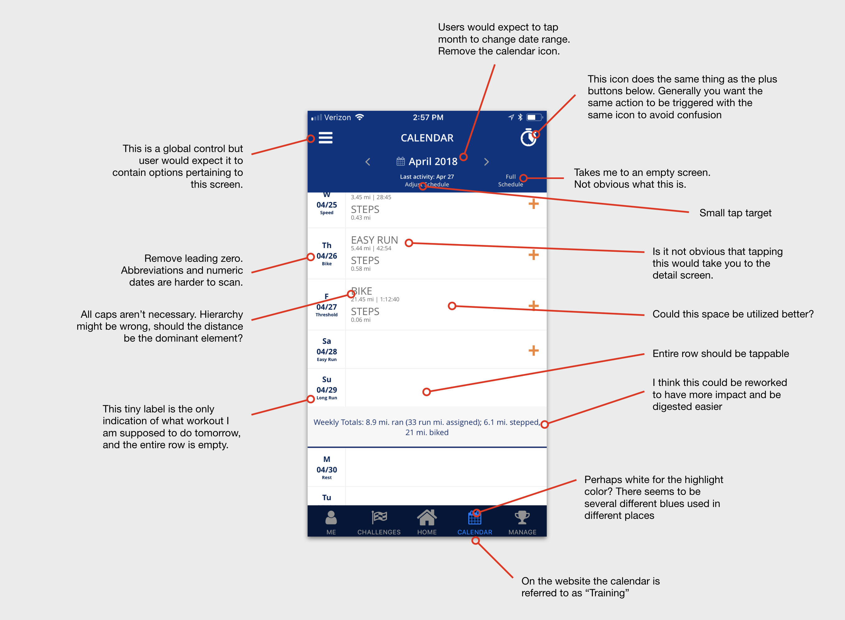
UX notes evaluating old experience
My second step was to survey the competitive landscape to identify trends and themes that other apps used to display calendar-like information. I took screenshots of over 20 apps and studied different approaches to calendars.
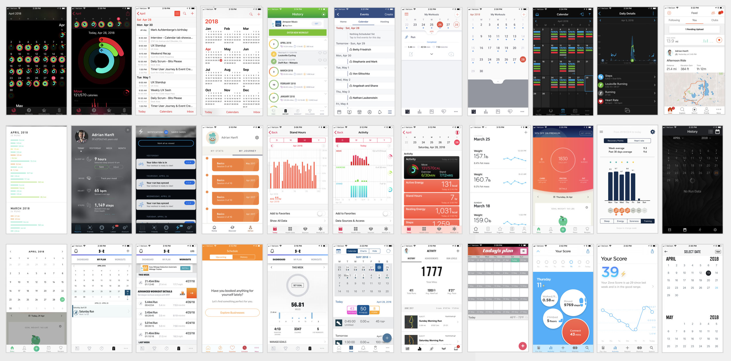
Screenshots of 20+ competitor calendars
Based on the research I documented the common design patterns and presented the findings to our team. Earlier I described the goal/progress/achievement loop. Now you can see how the fruits of these conversations manifested themselves in the designs of the calendar.
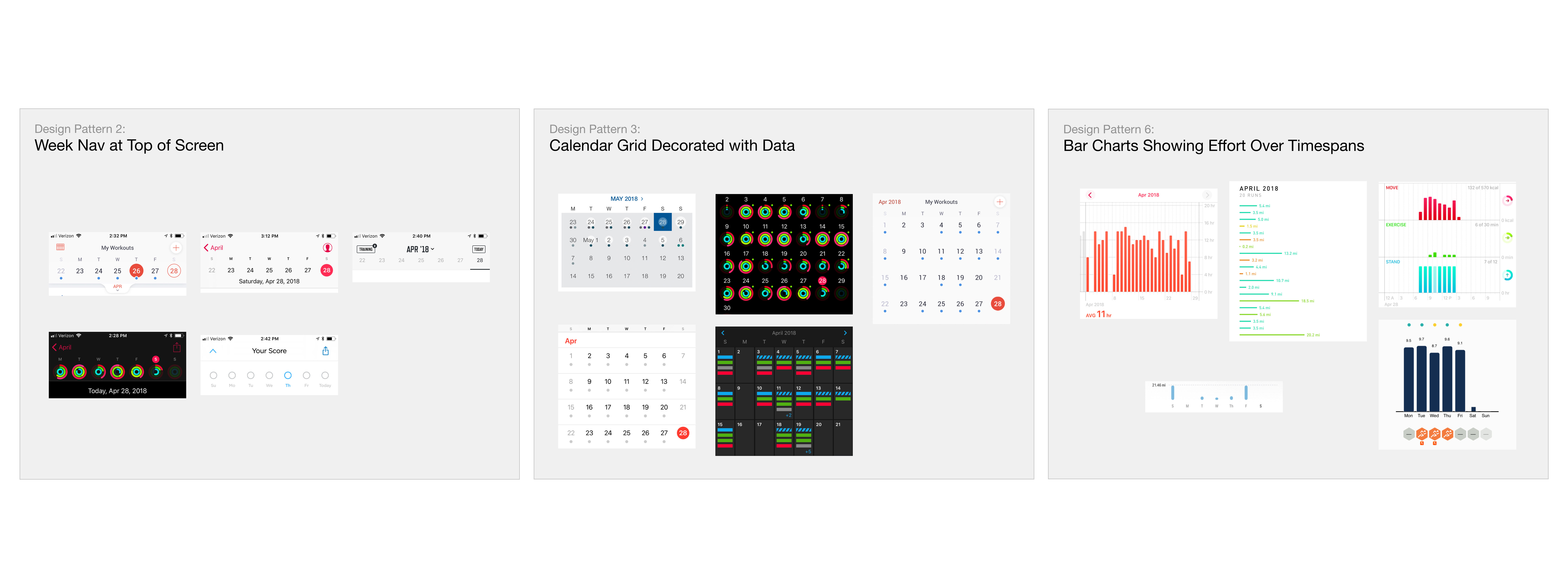
Perhaps surprisingly, the typical grid that you think of with a calendar ended up not being the main pattern we employed. Instead, our app would present three views. First and foremost will be a "today" screen that shows the workout assignment for the day. Second is the weekly view which gives insight into the most recent workouts and upcoming assignments. Third is the monthly view which shows the cumulative training load of the month.
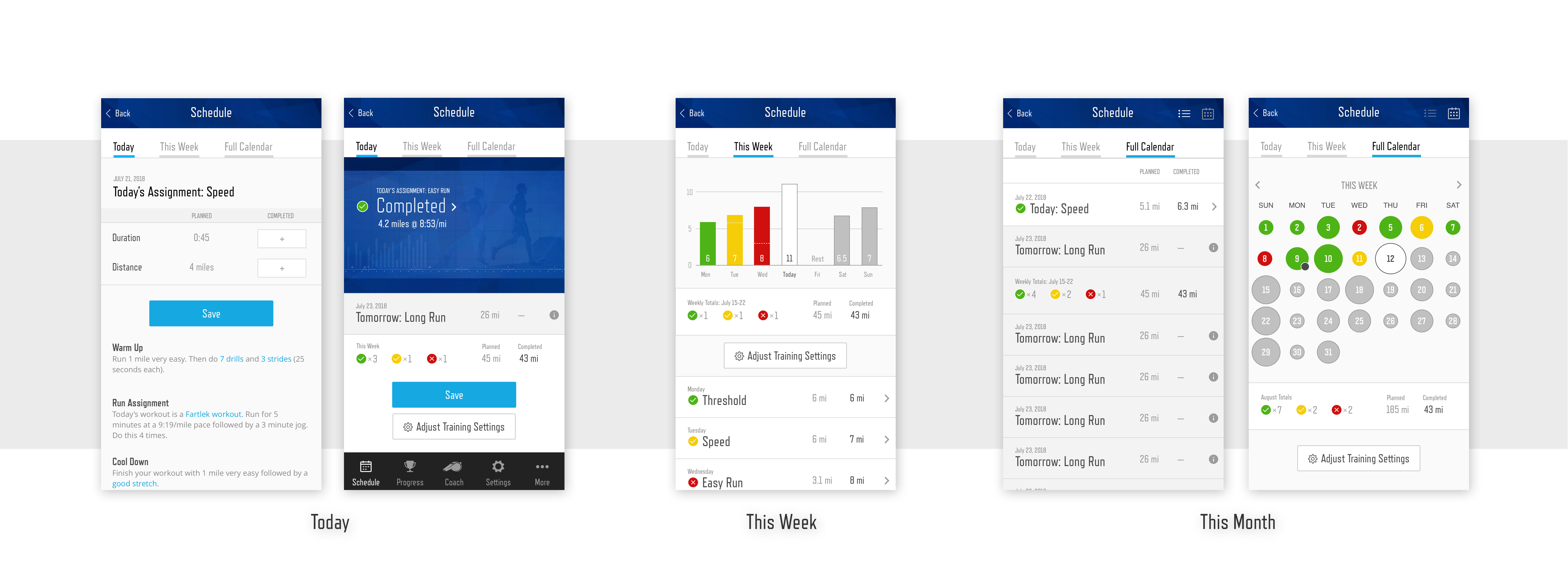
With growing team consensus around the design of the calendar that we wanted to build, and with prototypes informed by the trends and patterns within our industry, the calendar could start to take shape.
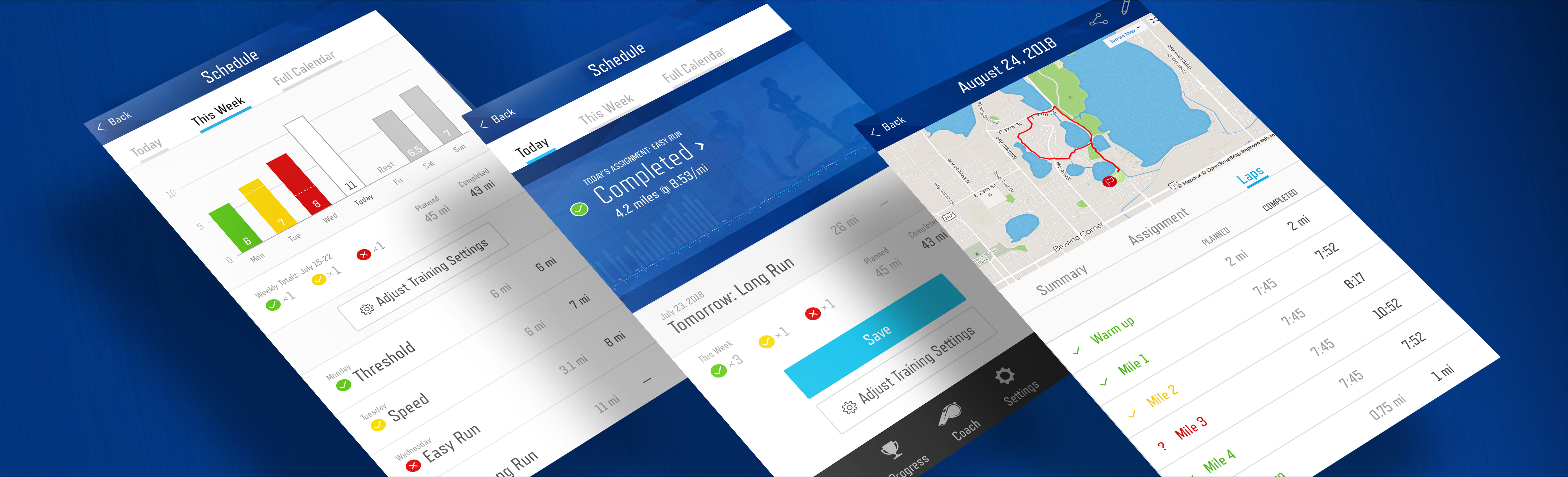
The first step of implementing my calendar redesign was identifying a minimum viable chunk of work that we could deliver. Because we already had something similar to the "Today" view we started by enhancing that screen with an improved chart. You might recognize the chart from the user testing I described earlier.
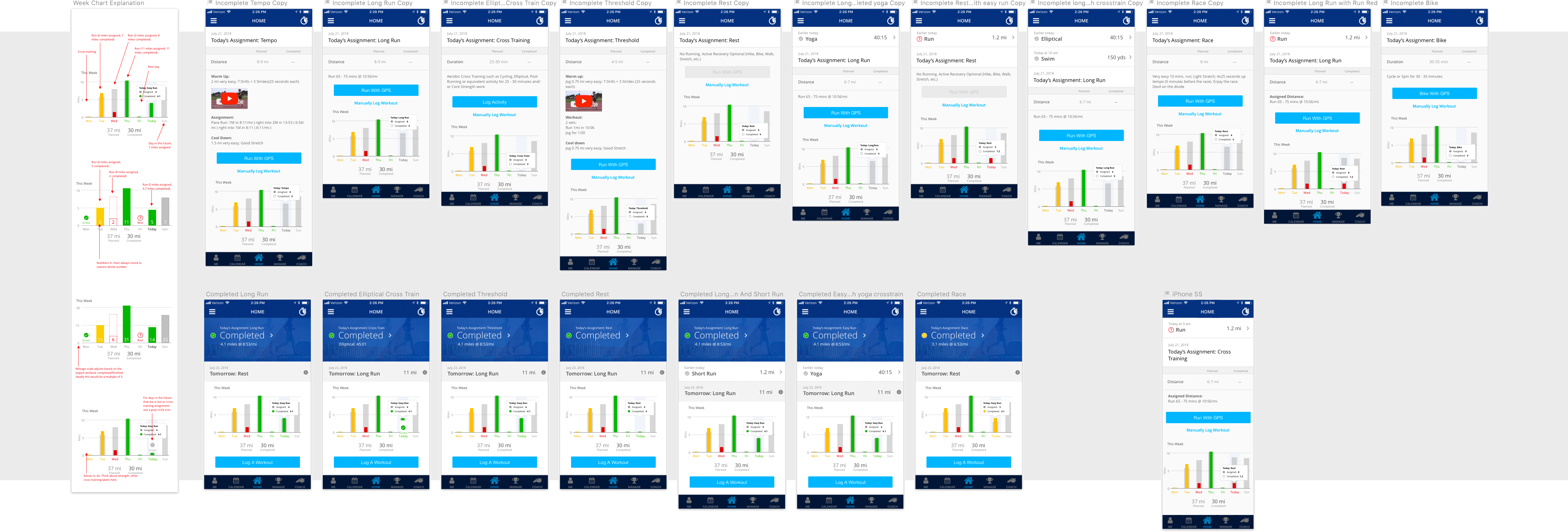
The image above represents some of the artifacts of the designer/developer handoff. On the left you can see notes about what each element means and why it exists. The screens to the right represent the edge cases and various states that could arise. Each screen is discussed and the corresponding specifications are recorded in tasks along with acceptance criteria. While I try to be thorough in my designs, inevitably some scenario arises that I failed to account for. I work hard to always be available to developers so that when questions arise I can answer them quickly or iterate on my designs to address new needs.
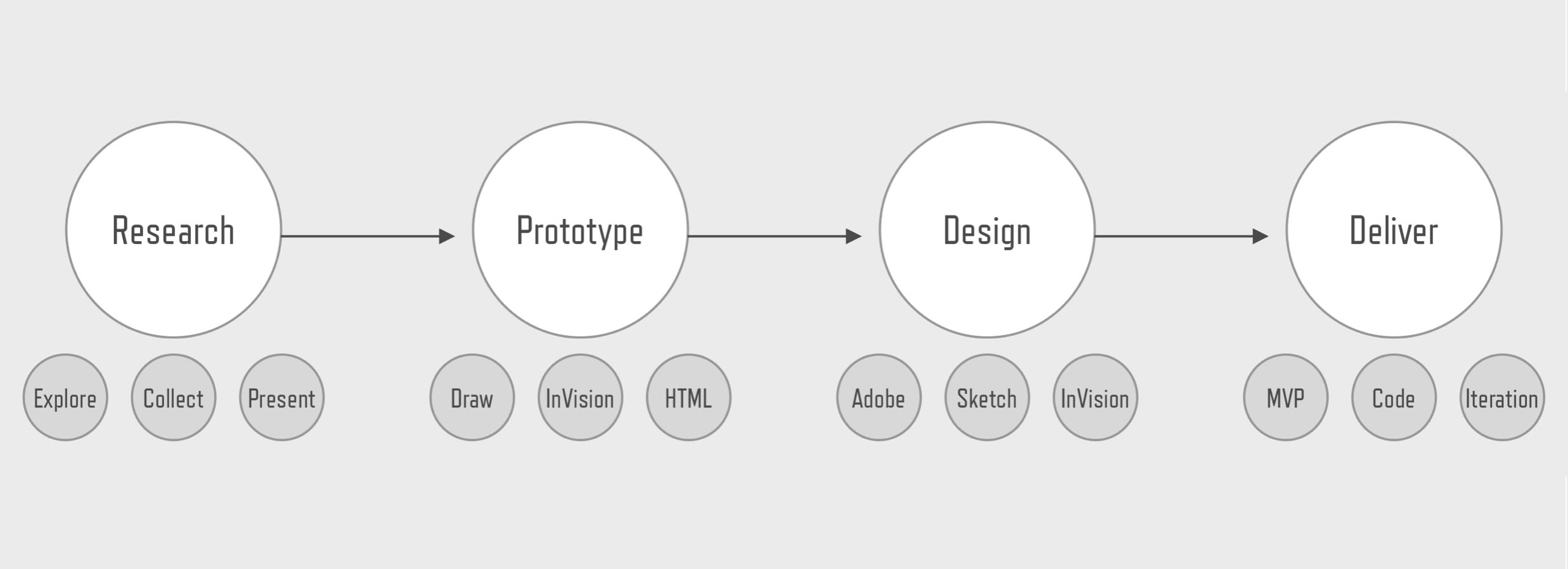
While we are building the minimum viable product I am simultaneoulsly working on preparing designs for the next iteration. With each loop through the design process (research, prototype, design, deliver) our app gets a little better. Today Runcoach is continuing to iterate towards the vision I set for the calendar.
Conclusion
Thank you for taking the time to read this case study. I hope that my enthusiasm for design and commitment to my craft comes through. If you would like to see some designs that weren't included here, be sure to check out this Behance gallery. If you have any questions I welcome the opportunity to talk more.