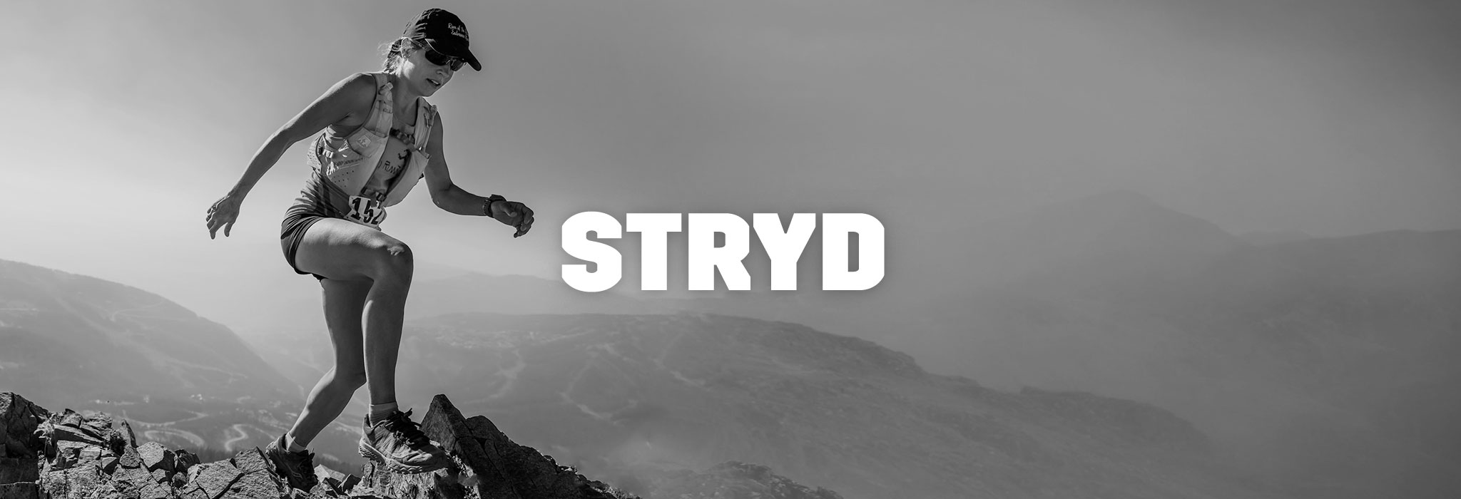
Evolving Stryd's Website and App
A Case Study by Adrian Hanft
In early 2017 I purchased a Stryd power meter because I wanted to experience first-hand how power data could improve my training. Would power-based training change running the way it revolutionized cycling?
As I dug into the technology I was disappointed by the design of the tools provided to analyze my workouts. Stryd's headquarters are located in Boulder, a short distance from me, so I contacted them offering my design services. To my delight, they hired me on a freelance basis and I have been collaborating with them for about six months. This case studies describes the process and shows some of the designs I produced for Stryd.
Part 1: Website Design
Visualizing Running with Power
My first collaboration with Stryd centered around creating imagery that helped tell Stryd's story. What does running with power look like? In a way the power meter seems almost magical. Stick it on your shoe and it somehow knows how many watts you are generating. It analyzes your run form and measures your efficiency. Cadence, vertical oscillation, leg stiffness, ground contact time – these are very technical concepts that can intimidate some runners. The challenge was to demystify the product without overwhelming people with technical jargon.
Our solution was to create an icon or badge that would represent a runner's critical power number. This is the number of watts that an athlete can sustain through the course of a race. This number boils complex concepts down to a simple idea that anyone can grasp. New runners are intrigued but not intimidated. Experienced runners see the value immediately and want to dig deeper. Below are a few of the iterations of the icon design.
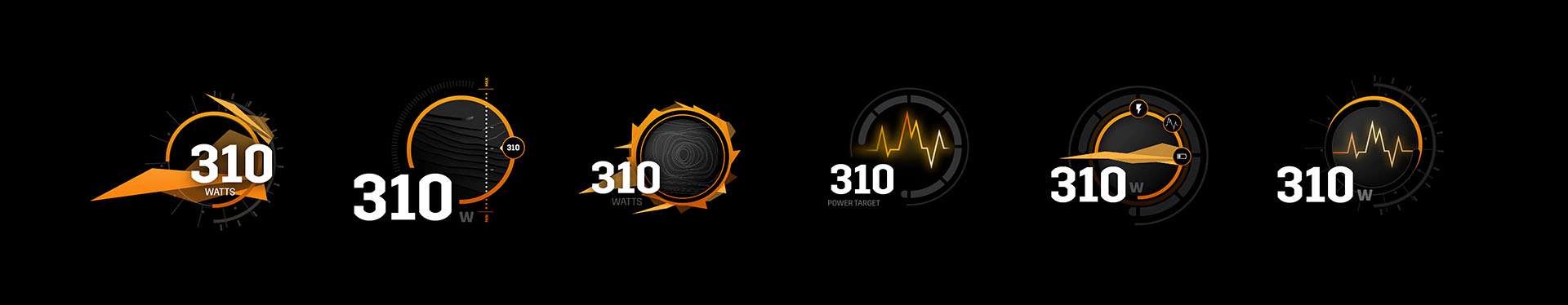
Power Icon Exploration
Once the icon was finalized it could be applied across Stryd's marketing materials. In addition to the website, they are using the icon on their trade show booth, Facebook, email campaigns, and a series of blog posts featuring athletes and their "Watts that Won."
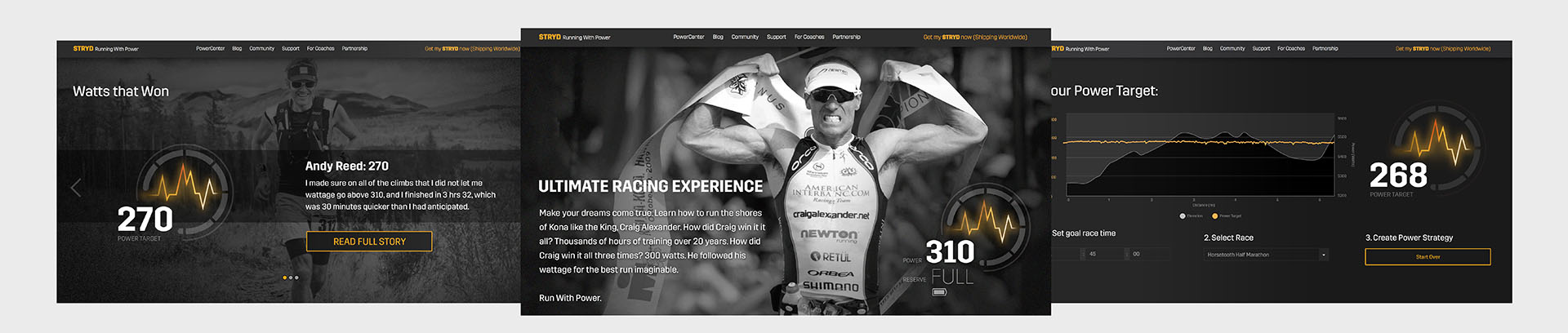
Website Designs and Power Icon Examples
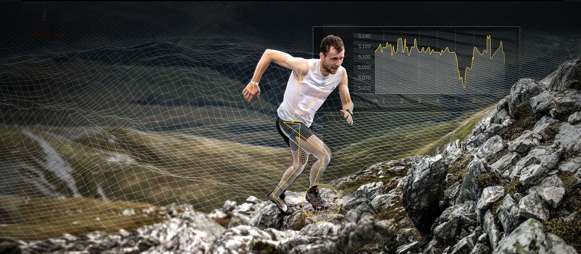
A common reaction to Stryd is disbelief. People want to know how it works. We could make people's eyes glaze over with descriptions of the sagittal foot path, but could we explain it visually? The designs below explored different ways to explain how the power meter records its position in three dimensional space.
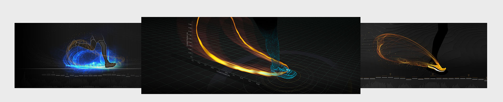
Visualization of the Foot Path
The holy grail for a tool like Stryd is to be so in tune with a runner's body that it can detect and warn the runner of potential injury. Imagine being able to watch your run in a virtual simulation that perfectly replays your running form in 3d. You can see the impact of each step, understand what is causing your aches and pains, and identify exactly where your body is wasting energy. Below is a graphic that begins to describe this future.
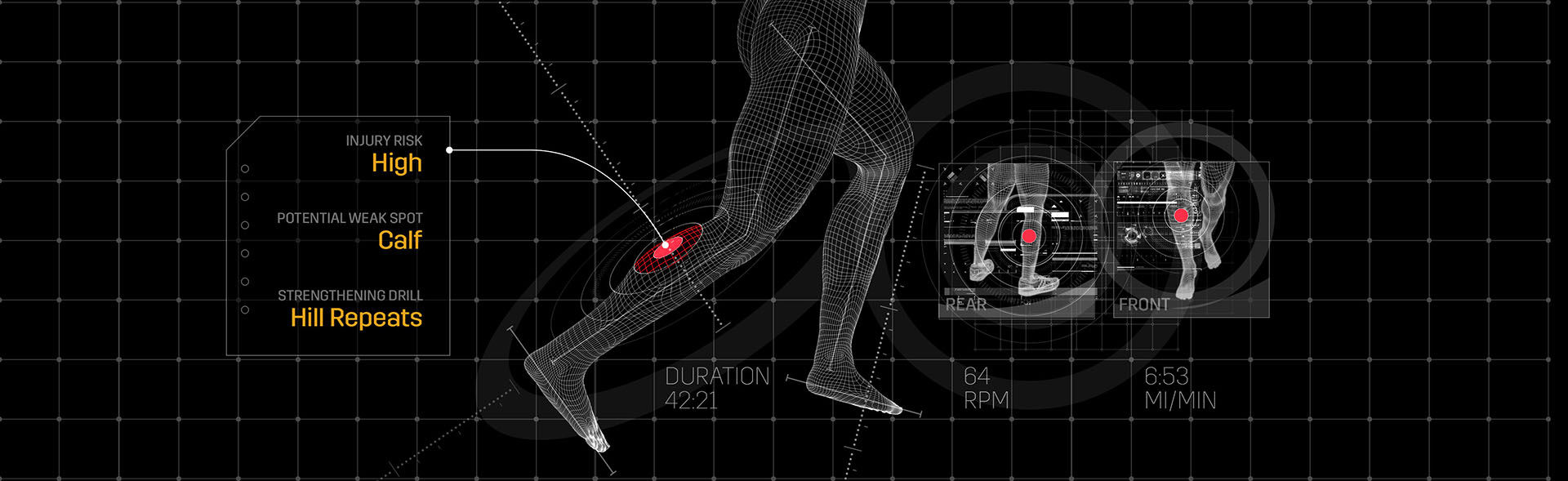
Injury Prediction Technology
Part 2: App Design
Stryd App Design
My second major collaboration with Stryd has been the next iteration of their app. As I prepared for the app project I wanted to establish a unique visual tone for the app. So many apps end up looking vanilla, I wanted to find patterns that complimented Stryd's existing brand elements but also introduced new ideas. The options below show some of the directions I explored.
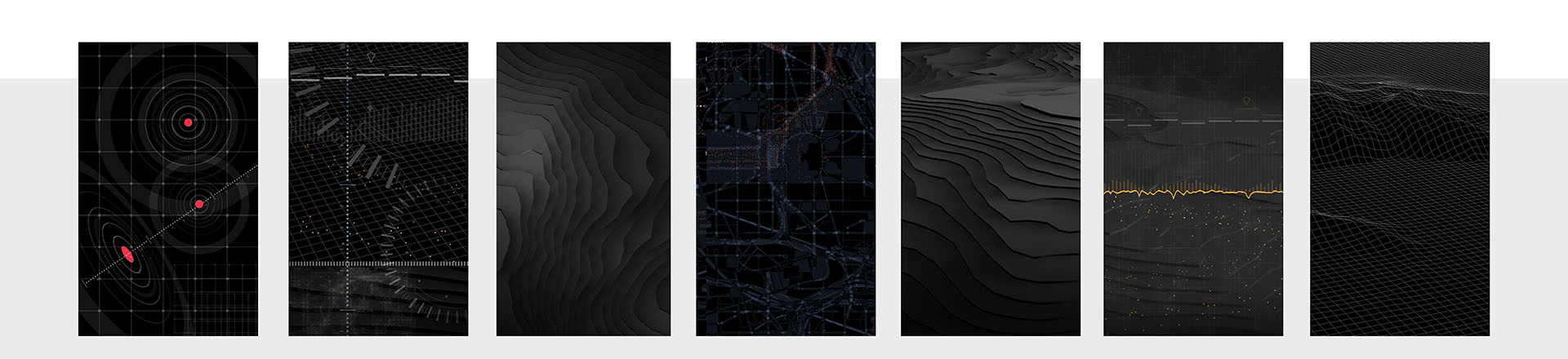
Visual Tone Exploration
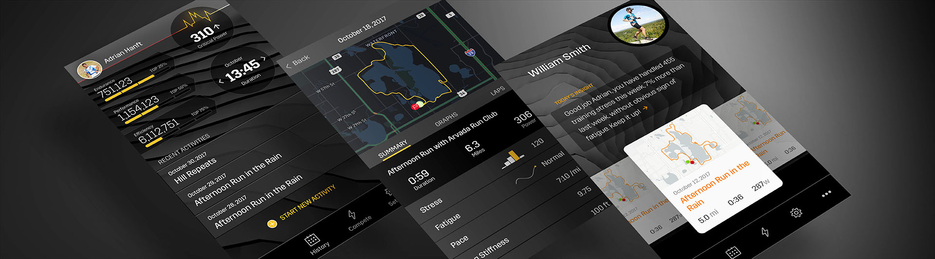
As I honed in on the app's visual tone, I applied the ideas to key screens of the app. The designs below show different approaches to the dashboard. At this point in the process I am trying to discover the correct hierarchy of information. What is the correct visual density and what proportions feel right? I like to show a wide variety of solutions and listen to customers and stakeholders as they make sense of the screens.
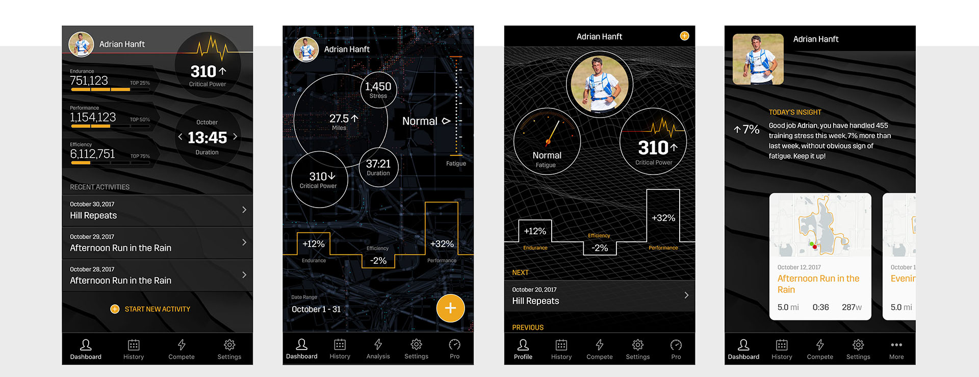
Different Proposed Dashboard Concepts
The biggest challenge of an app like Stryd's is presenting dense data on small screens. Below are some of the more complex charts in Stryd's app. These screens are currently in development and they will undoubtedly change as we refine the interactions and make adjustments to improve the experience. It is one thing to create something that looks pretty in a mockup, it is another thing to use the app in real life. Optimization is an endless task, but this is a challenge I welcome as a designer.
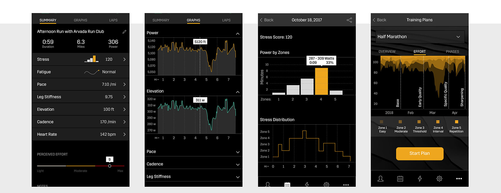
Data Visualization
Finally, a note about my tools. I designed the app in Sketch. I used InVision to build prototypes and review the designs with stakeholders.
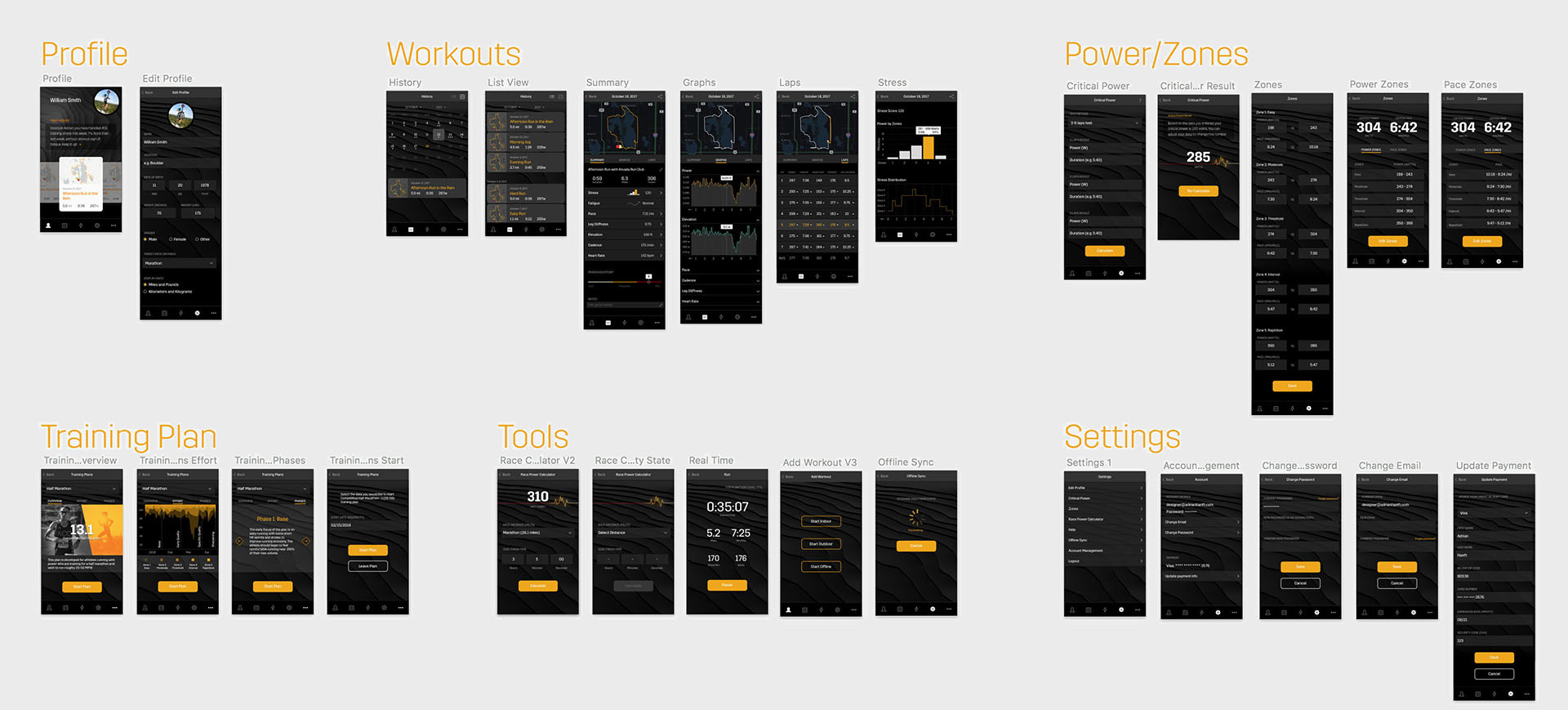
App Screens
Thank you for taking the time to read this case study. I hope that my enthusiasm for design and commitment to my craft comes through. If you have any questions I welcome the opportunity to talk more. You can contact me at designer@adrianhanft.com.