
The TrainingPeaks Coach Marketplace
A case study from the design portfolio of Adrian Hanft
Challenge
Coaches are the key to the TrainingPeaks ecosystem. Could we do a better job of leveraging them within our products?
Solution
We built a system that showcased coaches making it easier for athletes to contact, hire, and learn about the coaches from within our products. This “coach marketplace” included a searchable coach database, personalized coach profiles, hiring functionality, certification integration, a training plan store, and a curated coach matching service.
Intro
Product Development at TrainingPeaks
TrainingPeaks is a company that creates software for endurance athletes and coaches. Most of us are athletes or coaches and we are passionate users of the products we are building. We “eat our own dog food” as they say.
This project began in 2014 and launched in early 2016. This may sound like a long timeline, but as you will see this is a project with deep integrations, many stakeholders, and ambitious goals. Success required my team to work across the organization, rallying support from engineers, marketers, executives, designers, customer support, sales, and billing professionals.
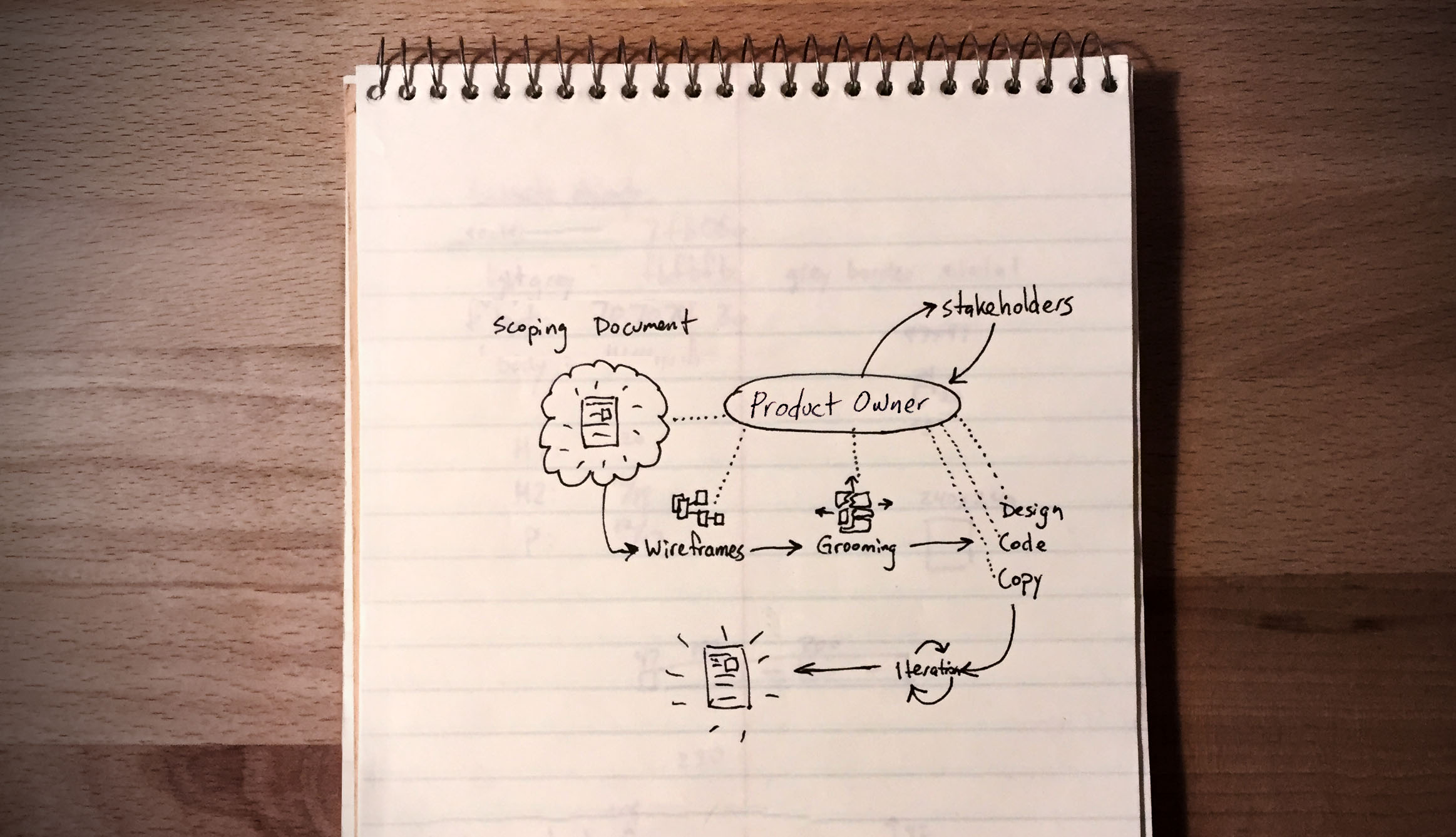
Major initiatives at TrainingPeaks are assigned a product owner. This role can be filled by a developer, designer, or anyone with the ambition to see the project through to completion. For this project I served as the product owner in addition to being the lead UX Designer. Our team fluctuated from 4 to 7 people, but we typically had 2–3 developers, 1 designer, 1 QA tester, and a product owner. Our process basically looks like this:
The Process:
Identify the problem space, conduct research, and estimate project scope
Explore solutions, groom the work, create designs, and write code
Obsess over the user experience
Test, solicit feedback, and iterate
Ship the product and measure the results
The real world is messy and the reality of this project is not as pristine as this list suggests. However, this case study is loosely built around these 5 bullet points and I hope that by the end you will see how a flexible commitment to these principles resulted in a great product that continued to get better through iteration.
Part 1
Research and Planning
The early stages of what would become the coach marketplace started in meetings with TrainingPeaks executives. Conversations centered around identifying areas of potential within our products.
The consensus from our leadership was that we could do a better job of leveraging coaches within our ecosystem. When coaches succeed they bring more and more athletes into the system. By making coaches heroes within our platform we reinforce a profitable feedback loop.
Early conversations and documentation were high level, careful to avoid jumping to solutions prematurely
My role in this early stage was to help support this thinking and identify ways that my team could support the executive’s vision. Design at this point is conceptual and consists of diagrams, loose wireframes, and rough proofs of concept.
I believe it is important to limit early thinking to the problem space, striving to simply uncover opportunities and identify friction. I resist the impulse to jump to solutions too early because the best people to solve the problems are the team members who will be doing the work.
Once the initiative officially received a green light I helped create a scoping document and loose timelines. Having a general sense of the level of effort involved in new projects allows the team to balance competing responsibilities and understand expectations for the foreseeable future.
The product owner helps define project scope and estimates timelines for competing initiatives.
Part 2
Design and Development
To prime our team for creating a great experience, we kicked off the project with a persona exercise. I identified an assortment of user types who would benefit from a not-yet-existent tool that easily connected coaches and athletes. Each team member was tasked with creating a wish list (user stories) through role-playing their assigned persona. This helped shatter our pre-conceived notions about what we were building.
An example of a user story written in this exercise is, “As a runner who was disappointed by my previous coach, I want to find a coach who I can trust.” A story like this leads us to conversations about how to display trust-building components like user ratings, certification badges, testimonials, and satisfaction guarantees. After the role-playing exercise, we had a collection of user stories that we continued to refine and groom.
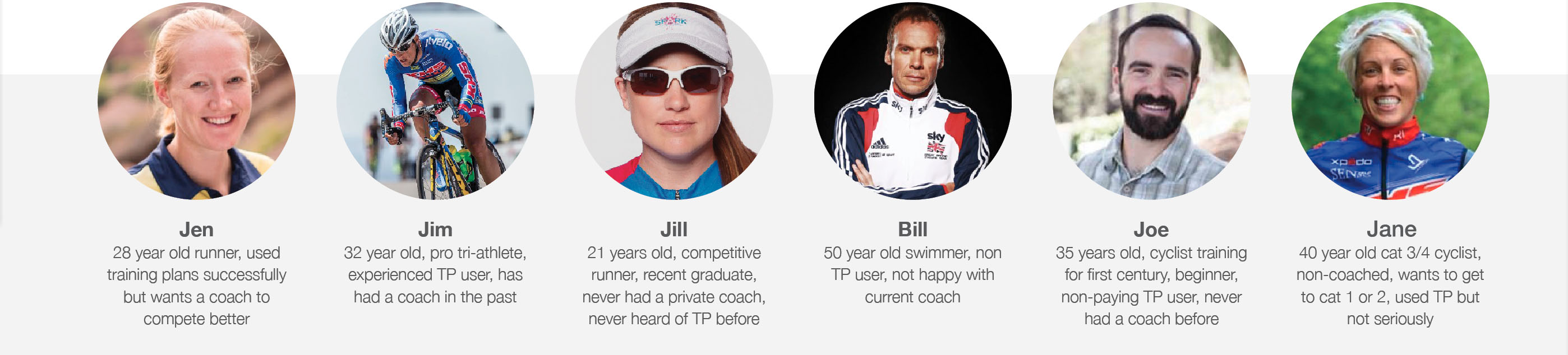
To kick off the initiative, a persona exercise helped us put ourselves in our customers’ shoes.
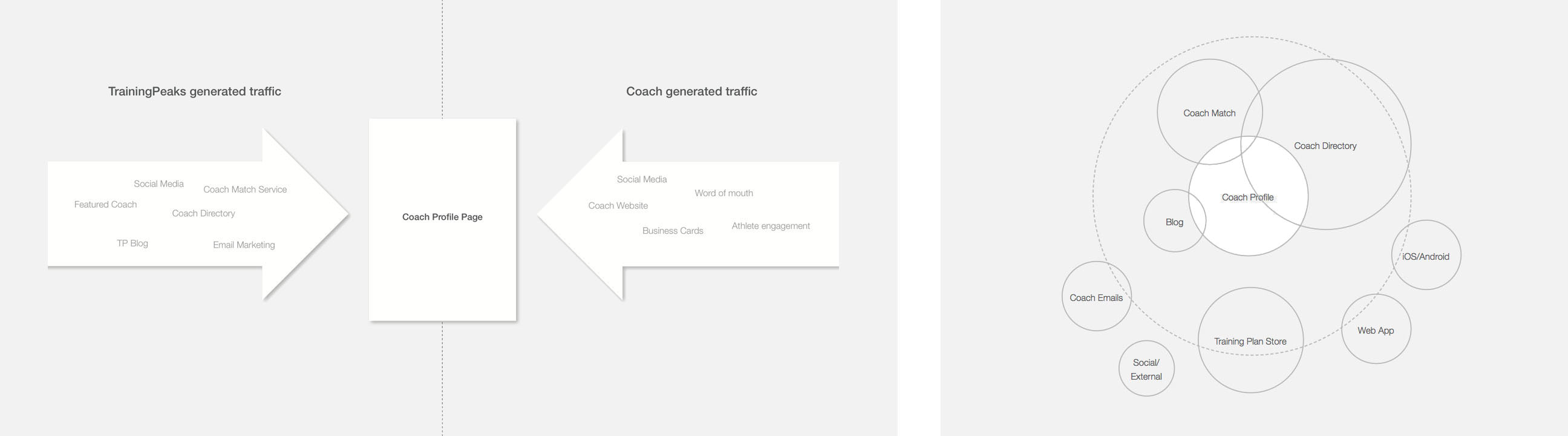
One major insight from the kickoff exercise was that there are many places where an athlete could benefit from coach information beyond our directory. Simply updating our existing search page would have left us with a slightly better experience but with nothing that could be leveraged moving forward. This is what pushed our solution to more of an API approach.
An API allows us to use coach data in any place where that information is relevant. For example, in our apps we can recommend a coach based on information we already know about an athlete. If a coach is also an author on our blog, their byline can pull info from their profile. We can create personalized email campaigns promoting coaches that match data we know about the recipients. The possibilities are limitless.
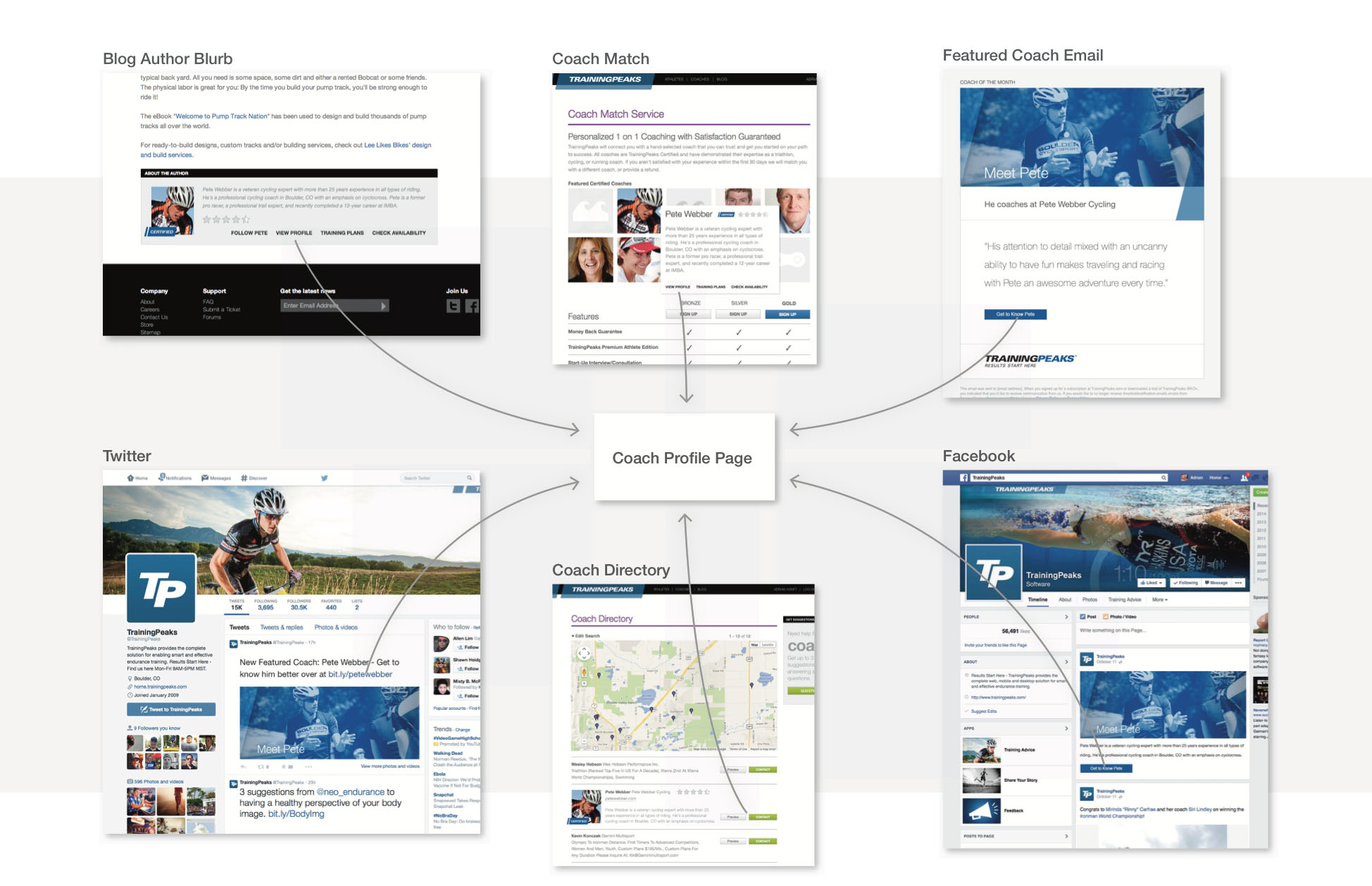
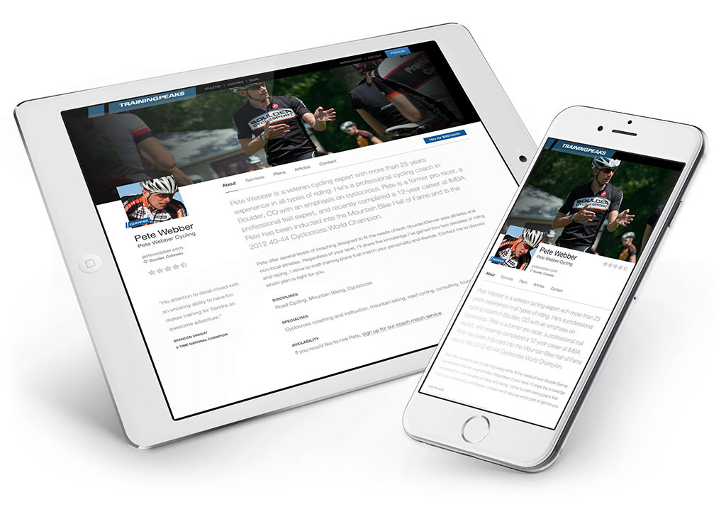
The coach profile would become the center of TrainingPeaks’ ecosystem. The goal was to lead athletes to coach profile pages from multiple sources.
Our solution would eventually contain 3 major components. First is a profile page for each of our 1,500+ coach customers. Second is a search engine that lets athletes hone in on a coach that meets their needs. Third is an API and framework that allows our coach information to flow outside the confines of our website.
Engineering Exploration
Engineers are great at identifying inefficiencies and architecting systems that eliminate pain points. The old system we used to store coach information was a brittle process that our developers knew they could greatly improve.
In the old system, coaches needed to contact a TrainingPeaks customer support representative in order to update their information. This started a process involving spreadsheets, home-brew admin screens, and database scripts manually run by an engineer. Not only was this inefficient, the data wasn’t accessible in a user-friendly way.
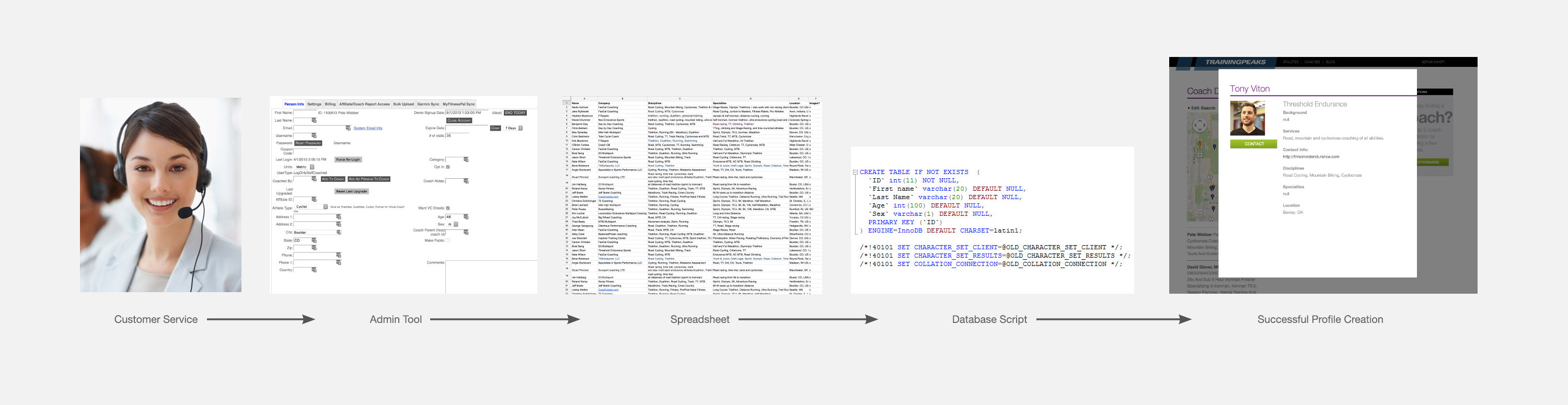
If a coach wanted to update their coach information they needed to call customer service. This triggered an inefficient internal process.
As our developers explored how they could improve this process, their goals for the project became clear:
Allow coaches to update their own information
Automate the process so it doesn’t rely on TrainingPeaks employees
Structure the coach data so it can be accessed via an intelligently designed API
Use the latest best practices so our database is fast and flexible
All this developer exploration happened at the same time that my designs were being crafted. Engineers don’t need pixel-perfect designs before they can get started. Having a developer architecting a solution at the same time that the designer is refining the comps often results in a better final product. When designers understand what is possible and what isn’t they are less likely to over-promise or under-deliver.
Design Exploration
My design process begins with sketches, wireframes, and whiteboard sessions. This is the quickest way to explore new ideas, build consensus, and seed a vision for what the team is going to build.
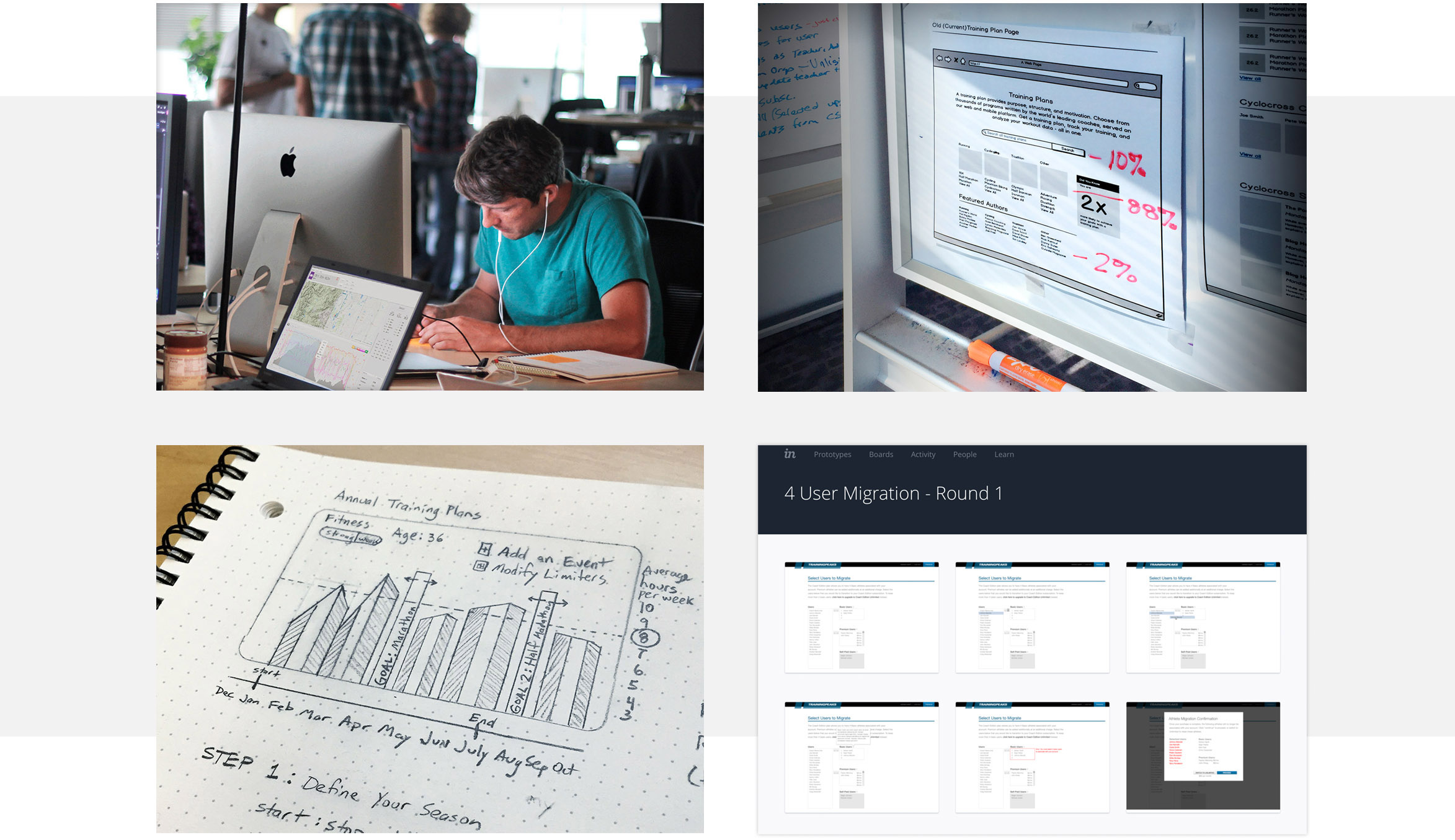
Sketches, wireframes, whiteboards, and interactive prototypes are important parts of the design exploration process
As these low-fidelity artifacts start to feel like they are working, I move on to more detailed comps, interactive prototypes, and more refined mock-ups.
The first component of the coach marketplace that I designed was the coach profile pages. My designs went through many iterations before arriving at a final direction.

My dream for the coach profiles was that each page would be as robust and compelling as a standalone website. Many coach websites, if they have one at all, are poorly designed. If done well, our coach profiles could replace the need for coaches to maintain separate sites.
Goals of the New Profile Design:
Instead of a pop-up modal, make the profile feel as complete and compelling as the coach’s own website.
Profiles have to look great on all devices from phones to desktops
Encourage athletes to contact and hire coaches directly from their profile
Let the coach’s personality come through while still maintaining TrainingPeaks branding
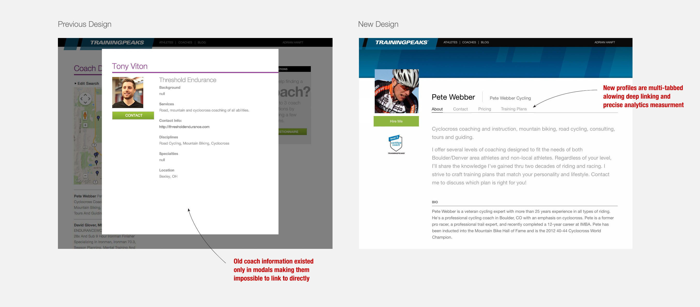
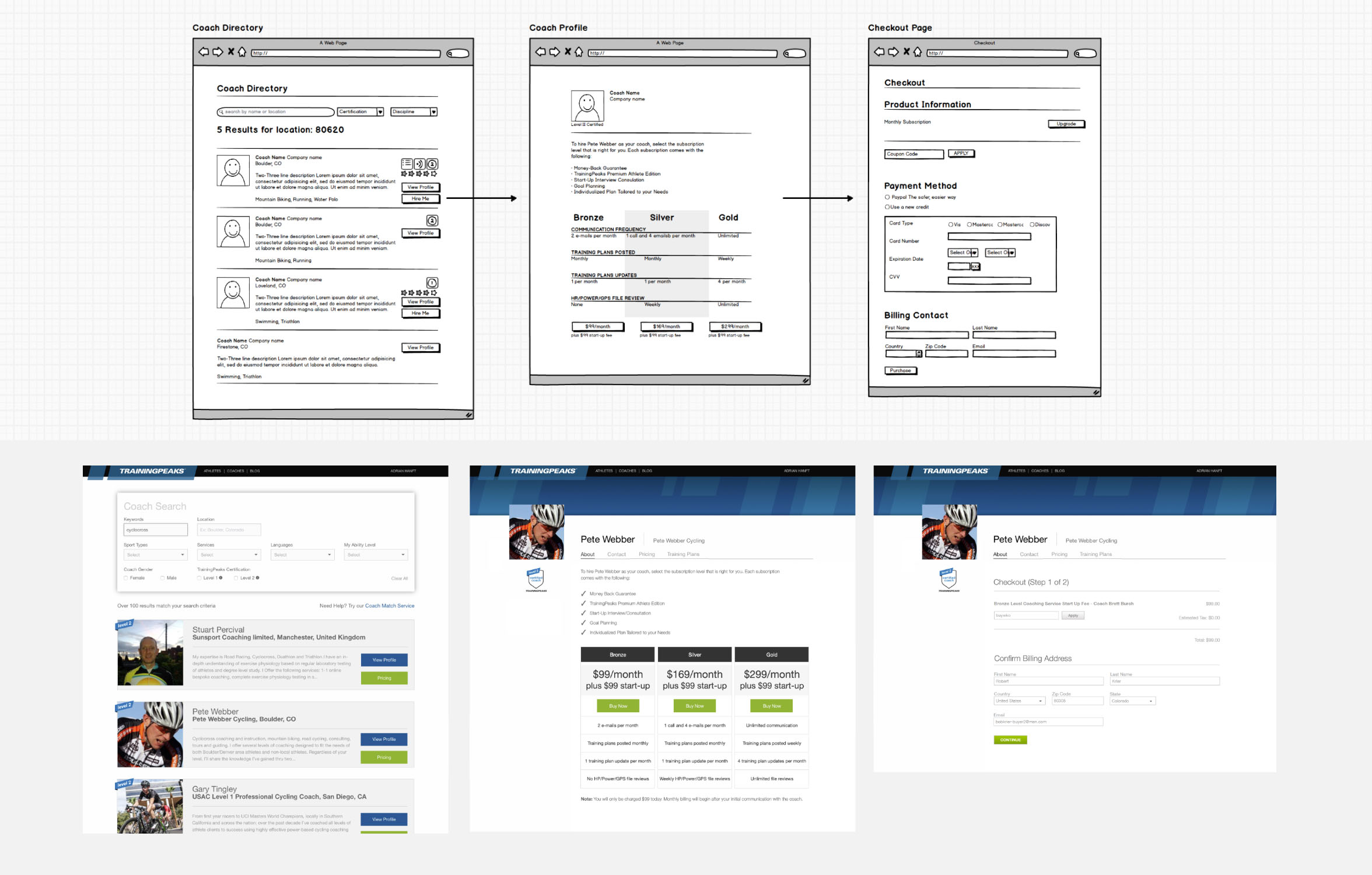
Old coach profiles existed only in modals making them impossible to link to. New profiles are multi-tabbed allowing deep linking and precise analytics measurement.
The design of the coach profile pages presented some interesting challenges. TrainingPeaks benefits most by promoting the more experienced, most profitable coaches. Coaches range from basic memberships at the low end of the spectrum up to coaches who are enrolled in all of TrainingPeaks' programs. This is a natural way of differentiating the coaches, but how do you promote the higher value coaches without short-changing the lower value coaches?
Our solution was to create templates where the more a coach participates in our programs, the more content they can “unlock” on their profile page. Basic users might be limited to a library of pre-selected header images, while a certified coach could get a custom header designed by TrainingPeaks. All profiles will look nice and professional and the additional widgets will entice coaches to upgrade.
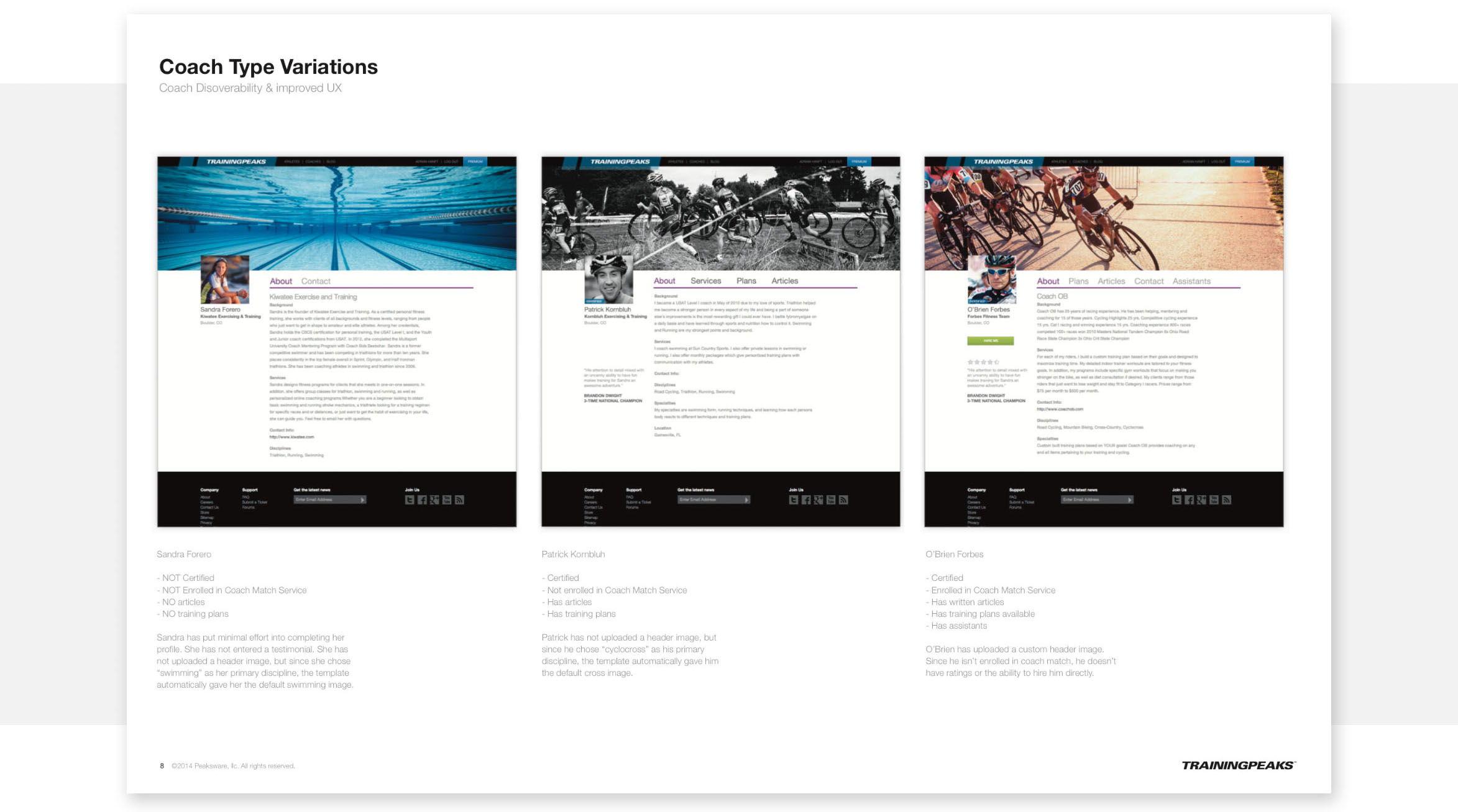
If the new profile pages were going to be embraced by coaches, they needed to be flexible enough to let the coach’s personality come through. However, our coaches aren’t graphic designers. Allowing coaches to customize their profiles too much could damage the professional feeling we needed our directory to convey.
I conducted a risk assessment by selecting an assortment of coaches and mocking up worst and best case scenarios. Images were pulled from coach Twitter and Facebook profiles as a proxy for the quality of images we might expect coaches to use.
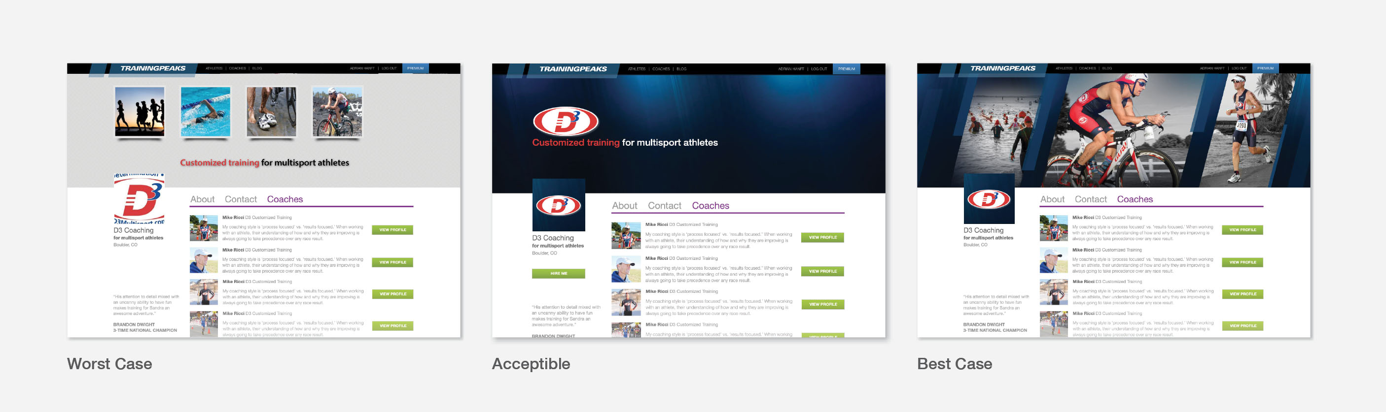
Ultimately the first release of coach profiles launched without custom header images. I believe that the risks do not outweigh the value that having a beautiful header image can bring. Header images were added to the roadmap and can be implemented in a future iteration.
Responsive Grid
It was very important to our team that any new page added to our website would look great and function on all screen sizes. As I design I am constantly evaluating the impact of changes at various sizes. Compromises are inevitable, but when done right you shouldn’t be able to tell if my designs started “mobile-first” or vice versa.
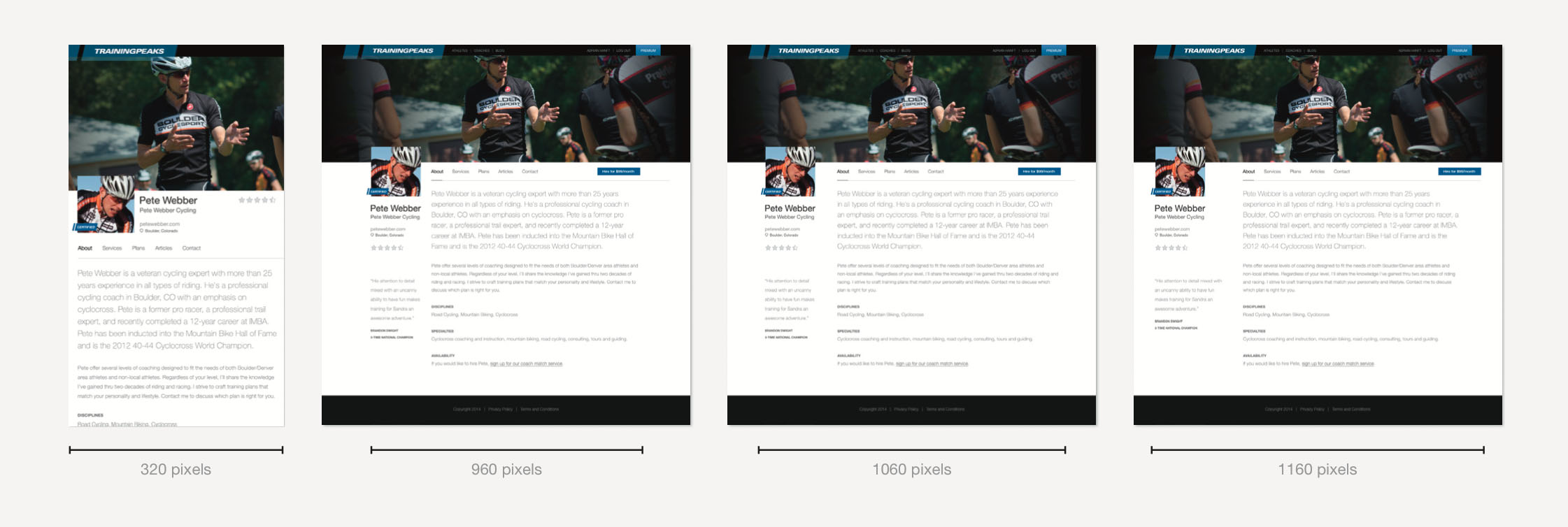
Early draft exploring different screen sizes
The final responsive design is powered by the Foundation framework. I had previous experience with Bootstrap, but input from the developers on my team persuaded me to step out of my comfort zone and learn a new system.
Part 3
User Experience
Just like the persona exercise, creating a great user experience requires you to put yourself in the shoes of the person using your product. I want the experience of coaches creating their profiles to be intuitive and error-free. For athletes looking for a coaches I want the search criteria we display to align with their needs. Below I will describe how good UX design improved the experience for both athletes and coaches.
The Coach UX
Allowing coaches to personalize their profile presented an interesting UX challenge. We were asking the coach to enter so much data that the process of updating their profile could easily devolve into a tediously long and confusing form. How do you make a form as compelling as the profile that the information will populate?
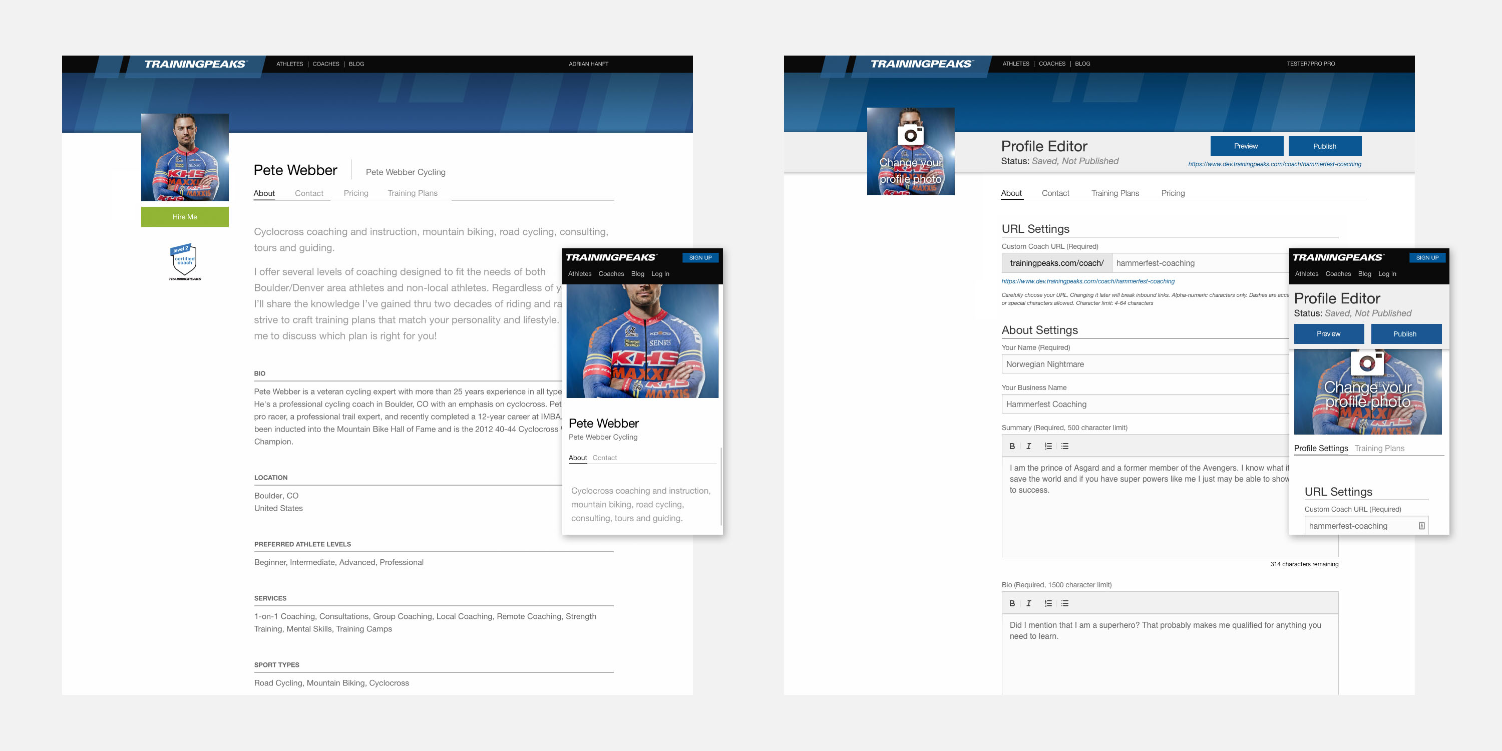
The editor view (right) was designed to closely match the public view (left). This reduced coach confusion by giving context beyond what you would get from a generic form.
The solution was to design the form so that it looked as close to the public view as possible. This gave context to every field of the form without resorting to lengthy instructions. The editor view is framed with an action bar that tells the current status of their progress.
This challenge is compounded by the limitations of small screens. Many web pages as complex as this abandon their mobile users, conceding that some interactions are just too complex for phones. Our team rose to the challenge and thanks to the responsive framework described earlier and careful consideration, the profile editor we built works on screen sizes large and small.
The Athlete UX
Previously, the coach search feature misunderstood what athletes were looking for when searching for a coach. It assumed that location was the deciding factor and prominently displayed a map of the search results. Additional criteria was hidden behind a small “edit search” link.
To make matters worse, users had to grant their browser permission to access their current location before displaying any results. This felt like a privacy invasion, and many users dismissed the popup and were left with an empty screen.
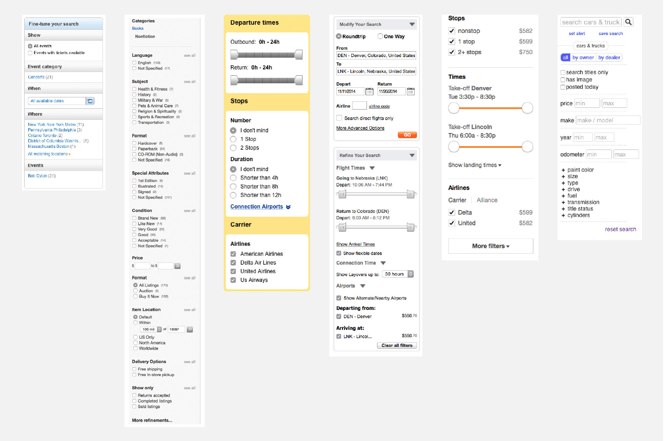
Collection of search patterns studied during UX research
Once we understood that location (beyond city and state) is not a deciding factor for athletes looking for a coach we could free up valuable real estate by eliminated the map completely in favor of controls that aligned with what athletes were looking for like sport type, services, ability level, and more.
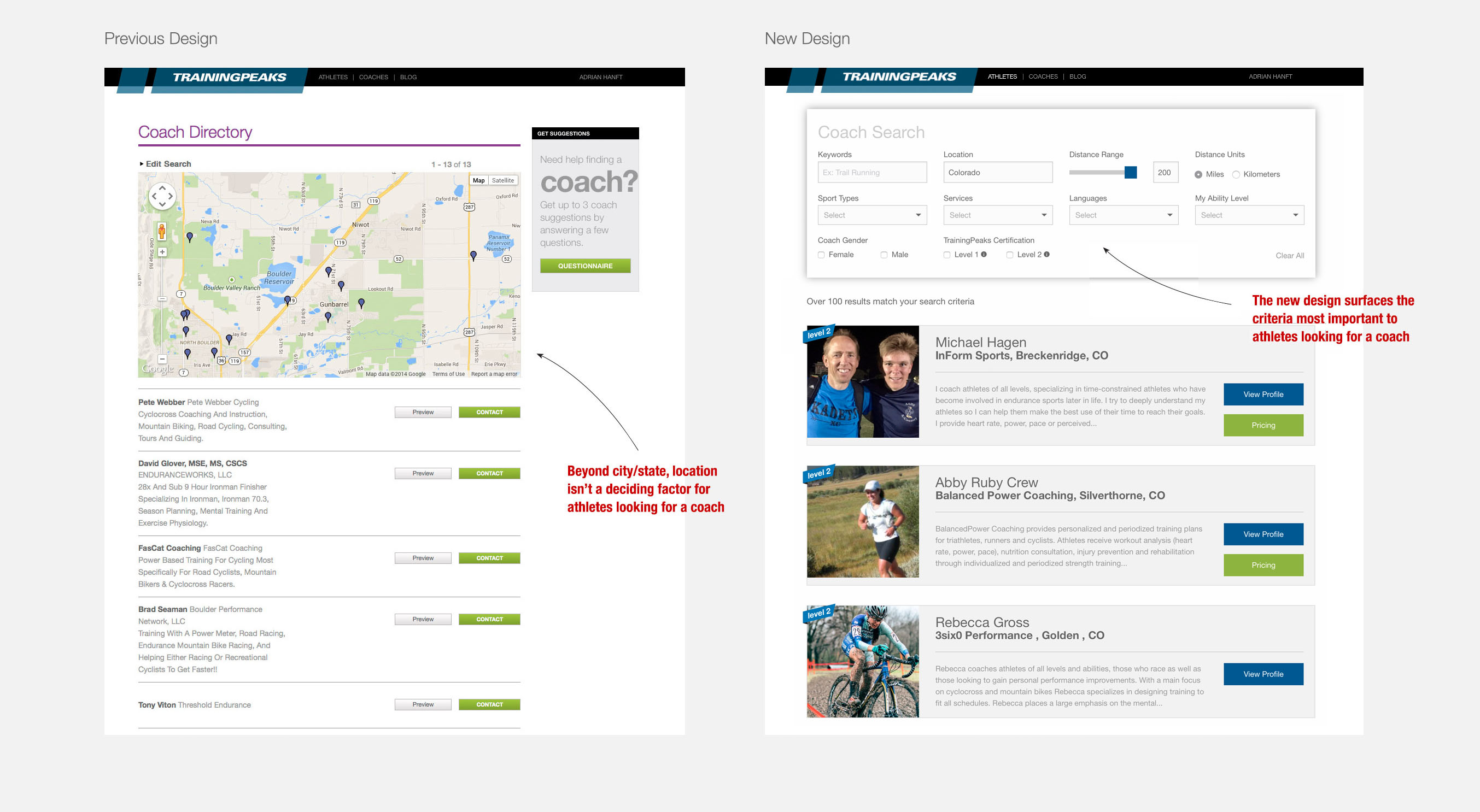
Beyond city and state, location isn’t a deciding factor for athletes looking for a coach. The redesign brought more important criteria into the foreground.
Another limitation of the old search feature was that each result in the list looked identical. A goal of the redesign was to visually differentiate the result list so that you could instantly spot the coaches who had completed our level 1 and level 2 certifications. TrainingPeaks benefits when athletes are paired with our best coaches, so it was important to push users to the most vetted coaches in our system. As we build out additional criteria (ratings for example) that info will be added to the listings to add further hierarchy to the results. Visual differentiation is a key aid in helping users make a decision and ultimately making a purchase.
UX tends to be thought of as a designer’s role, but I want to point out a major contribution to the experience that our developers provided. They relentlessly optimized our database and built our API so that the results can be shown in microseconds. This allowed me to remove the “submit” button because we are able to refresh the results as quickly as the athletes can change the controls. Users end up doing more searches because there are no loading bars or page refreshes to slow them down.
Part 4
User Testing and Iteration
No matter how carefully you plan a project there will always be room for improvement. Putting your product in front of users, whether in rough prototype form or days before the release, will always teach you something.
When soliciting this type of feedback it is important to ask a user to complete a task and then sit back and watch. Don’t give hints, don’t over-explain your request, and don’t judge their responses. Just observe, take notes, and learn from them.
TrainingPeaks is lucky to have professional coaches on staff so user feedback is as easy as a walk to the other side of our office. Below is a sample of my notes from observing a user along side a prioritized task list generated from all the testing we conducted.
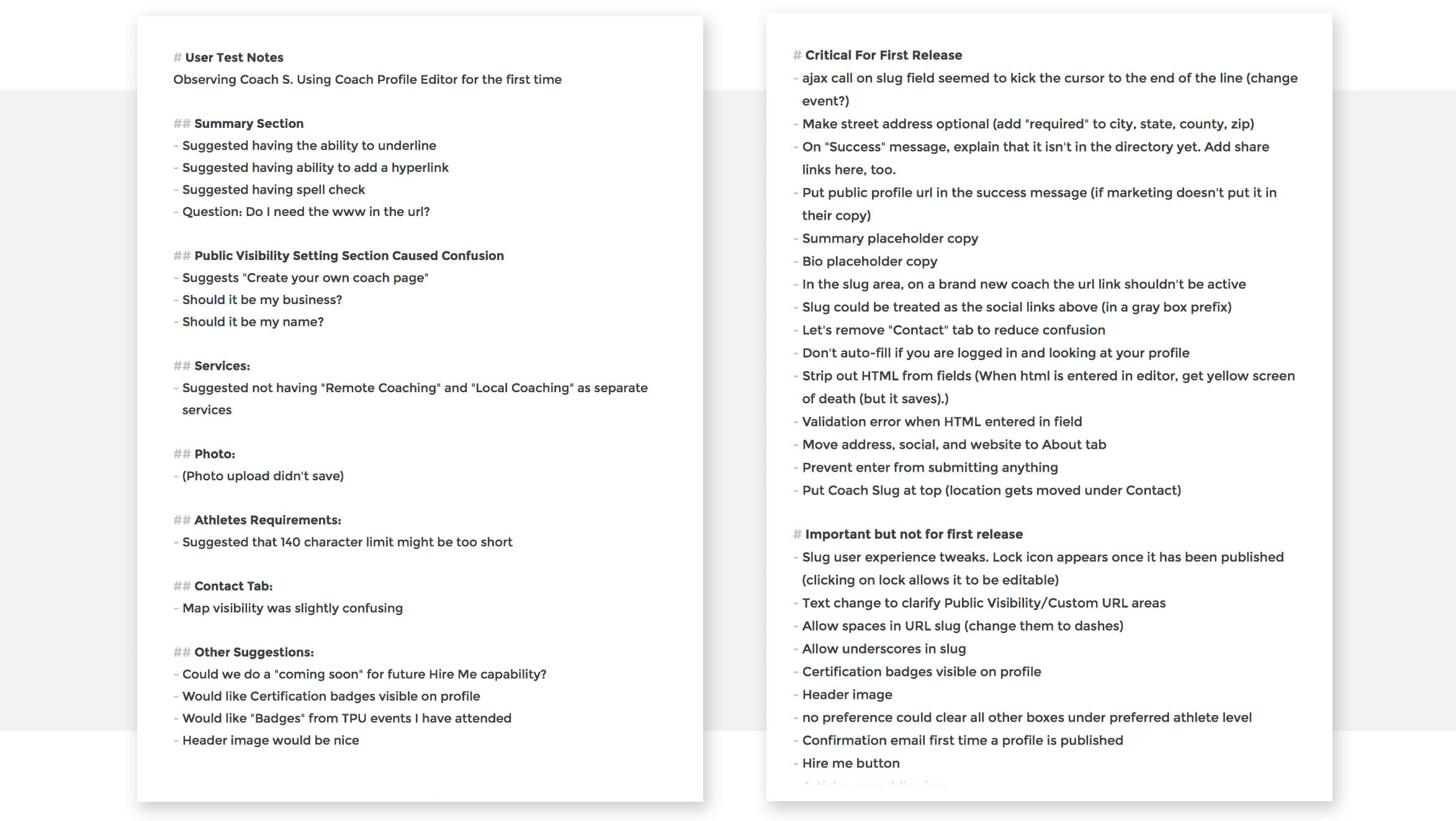
After collecting observations (left) a prioritized list (right) can be made of issues that need to be addressed immediately and what items can be addressed later.
Once trends become apparent from the user research a list of improvements can be made. This list can be prioritized in grooming meetings where team members respond to the feedback and brainstorm solutions. Items that are critical get addressed first and non-essential enhancements can be put into the team’s backlog.
In the example above you will note that an item “Hire me button” is de-prioritized until after launch. This single bullet point represents the main way the coach marketplace will put money in our coach's pockets. Why would we wait until after the launch to release this?
The answer is not intuitive and it represents a trap that many teams make. If you wait until your product is “finished,” you will never ship. There will always be ways to improve your product but the cost of not shipping your work often outweighs the value of getting a usable product in front of your customers and iterating later. It took guts, but we decided to add hiring functionality in a follow-up release.
The ability to hire a coach was designed as a slice of functionality that could be released after the coach marketplace launched.
When it came time to add hiring capabilities, we already had a fully functional system to plug it into. Our focus wasn’t distracted. Risk was reduced because delivering a single feature is less dangerous than shipping a massive “finished” product.
TrainingPeaks continues to iterate on the coach marketplace. The next phase focused on a training plan store that dovetailed perfectly with the new marketplace.
Part 5
Rollout, Launch, and Measuring Results
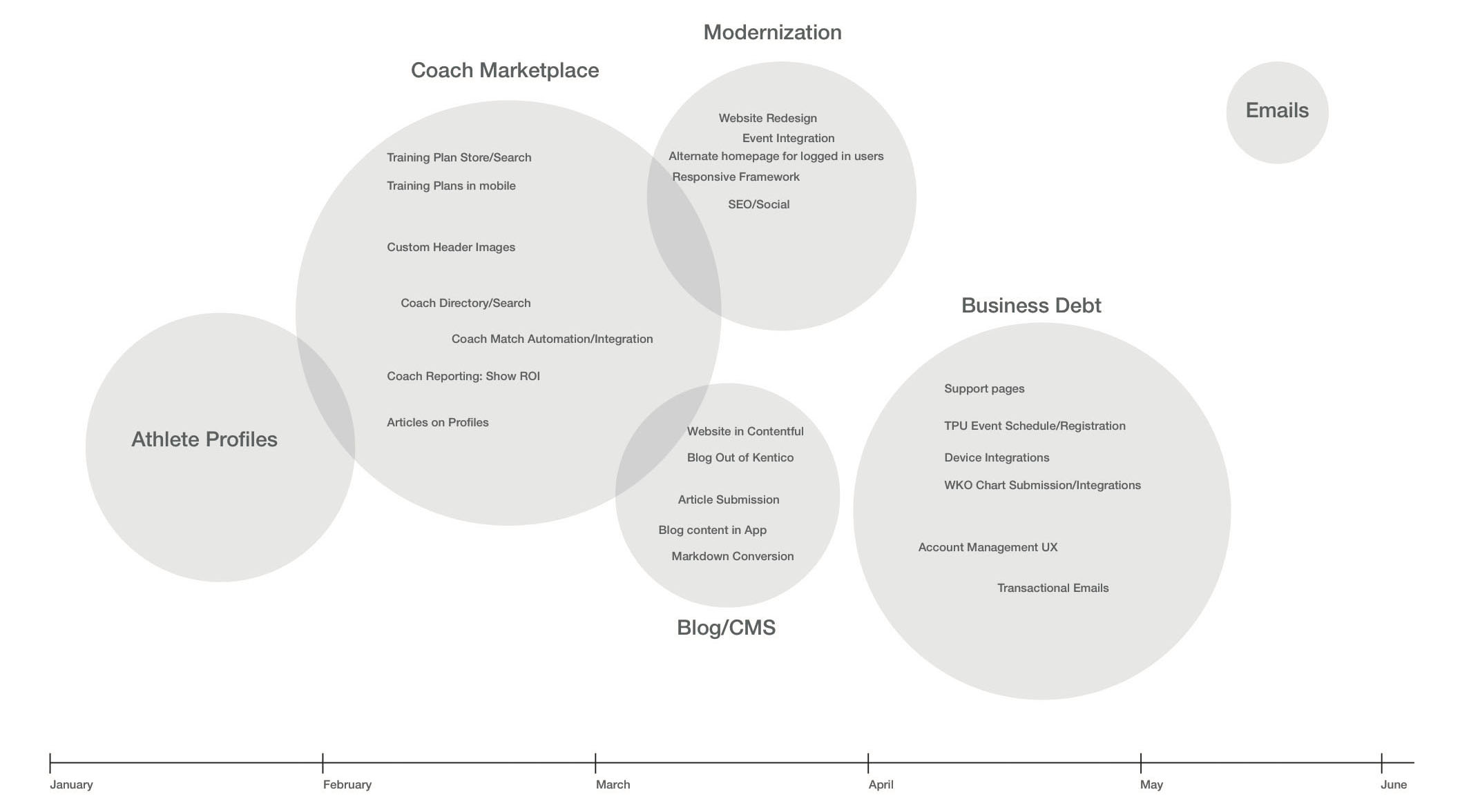
Projects containing so many moving parts require a careful rollout. As product owner I helped create a timeline for the team so that work could be tackled in the most efficient order.
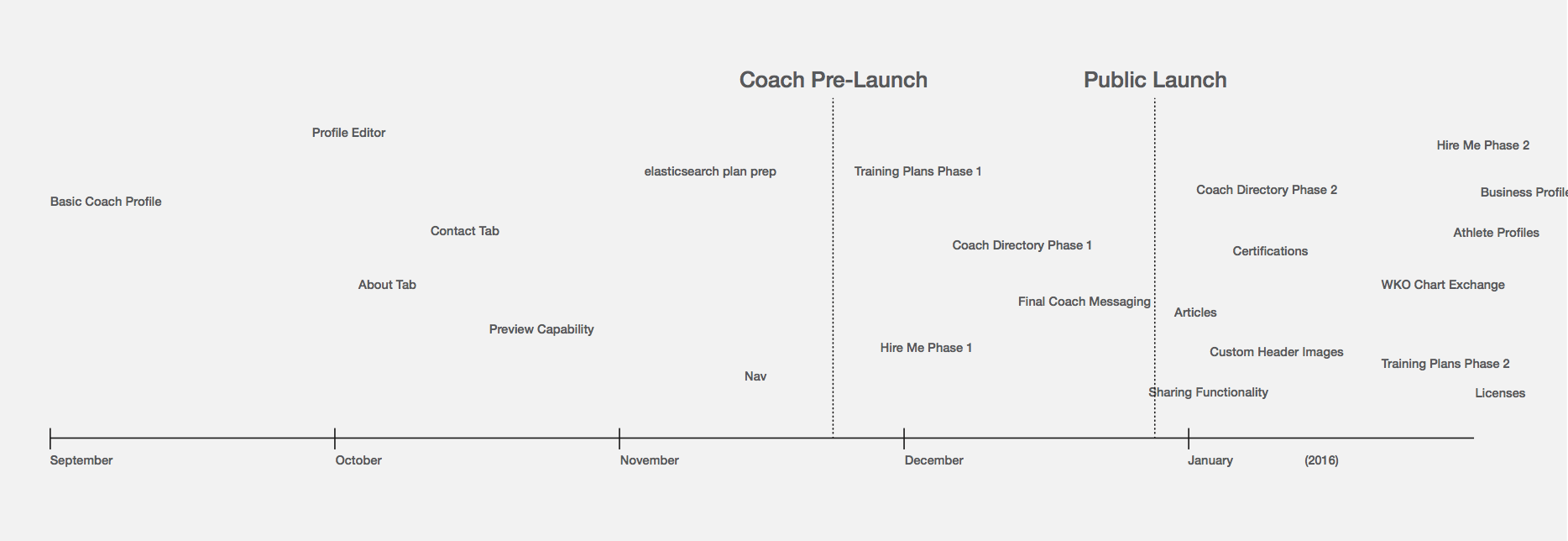
The dotted lines in this timeline represent milestones of shipping product
The first phase involved an email campaign sent to existing coaches announcing the new feature and encouraging them to create their profiles and update their information. These emails were created in collaboration with our marketing team who manages the mailing lists.

The second phase was the public launch. To measure success of the profiles we gathered data using Google Analytics and Mixpanel. Beyond the basic trends of unique visitors and identifying the most popular pages, there are several business metrics that we track.
The first key metric we track is athletes leads. We define a lead as an athlete who contacts a coach from the contact form on a coach profile. The second metric is coaching requests, or how many athletes hire a coach after the initial contact form submission. Finally, we are watching to see how many athletes upgrade their accounts to premium after hiring a coach.
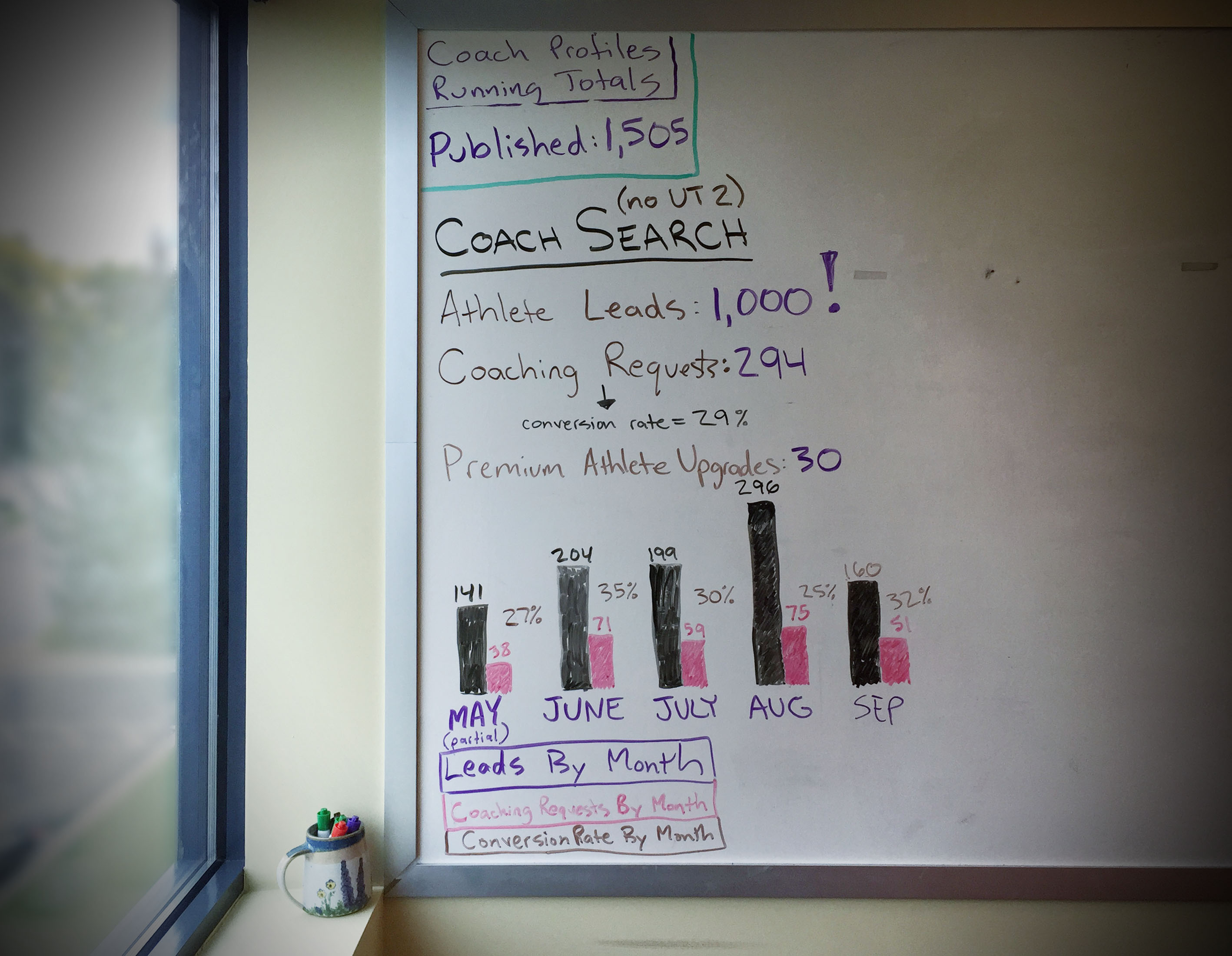
Key metrics are updated daily in our team’s war room
This data is important to us, but it also has value to the coach. Our roadmap includes adding a reporting feature for coaches. We plan to allow coaches to see how many profile views, contact requests, athlete hires, training plan sales, and more. This will validate the value TrainingPeaks is delivering to our customers and decrease churn.
Celebration
After major product releases, our team celebrated with a trip to the brewery near the office. We enjoyed a beer while watching the stats as users start using our creation. It is extremely rewarding to sit with co-workers and share the success of a major team effort.
Thank you for taking the time to read this case study. I hope that my enthusiasm for design and commitment to my craft comes through. If you have any questions I welcome the opportunity to talk more.