January 23, 2016
A Special Hell for Designers Like Me
Part 1: Scratching the Surface
You keep hearing me talk about oatmeal and zombies. In case you think I am pointing fingers from my ivory tower, today I want to confess my own contribution to this mess.
(Disclaimer: Trashing your clients and former employer is bad form, even after a decade of silence. That’s not my intention. The people I worked with and for in the story that follows were not zombies. We were passionate insiders trying to make a difference in a zombie industry.)
I knew I was going straight to designer hell the summer of hurricane Katrina. I was taking a lunch break from a photo shoot in Indiana, the heart of American RV manufacturing. I was stopped at a railroad crossing, waiting for a train to roll by. The cargo was unbranded RVs. Hundreds of big white boxes rushing south like blood cells racing to a wound.

The RVs were to be temporary homes for the victims of the hurricane.
People were helping other people. Warm fuzzies.
This is the surface appearance, the outer layer where designers, marketers, and brand experts make our living. Here we assume good intention, never question motives, and spin the details into glossy, highly consumable stories about our clients.
The logoless RVs on that train seemed like a perfect metaphor for the marketing industry. Clients come to us with their plain white boxes. Then the creative people go to work. We add stylish stickers to the product. We create logos and invent brands. We stage photo shoots where, if we put the camera in just the right spot, we can make the white boxes look like luxury goods.
This was my job, and I would like to think I did it well. The work we created for our RV client was solid, and when you compare it to the notoriously low standards of the competition, we had created a surface layer for our client that put them (arguably) at the top of the industry. Here is my story, a list of the sins that I committed, and the secrets of how to market white boxes.
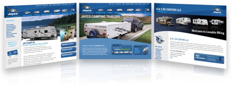
First, let me tell you a little bit about the literal surface of the RVs. The exteriors are ugly and the swirly stickers don’t help much. I desperately wanted a chance to improve the graphics of the RVs. It seemed like the easiest way to differentiate our client’s white boxes from the competition.
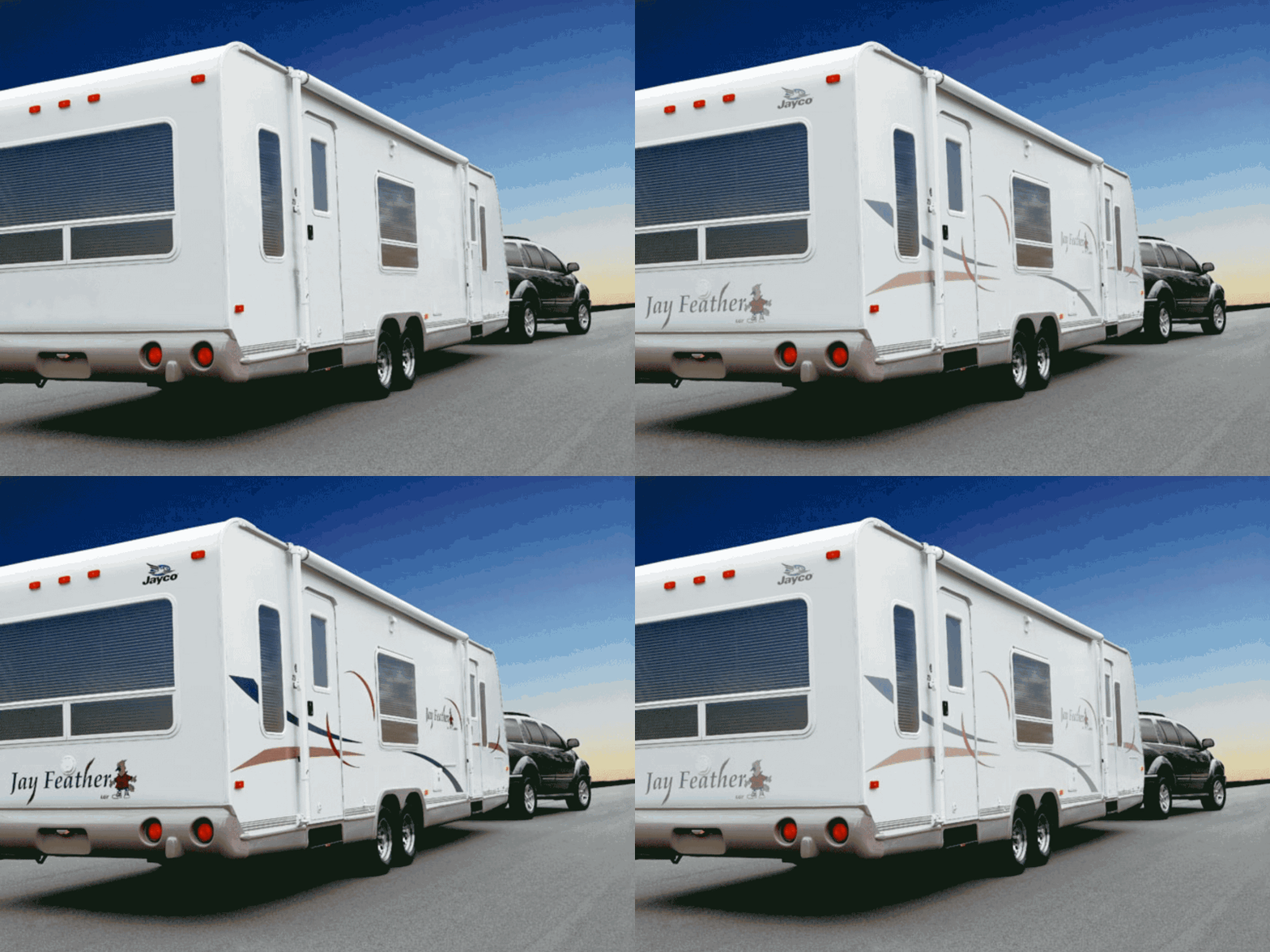
Here’s how the graphics on an RV come to be. RV manufacturers have contracts with the companies that produce the decorative decals. The “design costs” are baked into the cost of the stickers. These sticker-makers are cutting deals with all the RV makers so all the stickers are designed by the same cost- constrained designers. It’s a monopoly of mediocrity.
Each year our agency would plead for a chance to design the stickers. Each year we lost. So we worked with what we had.
You can still make a white box with ugly stickers the object of desire. Like any magic trick, once you know the secret the illusion loses it’s charm. So let’s demystify this a bit.
Magic Trick 1: Makeup
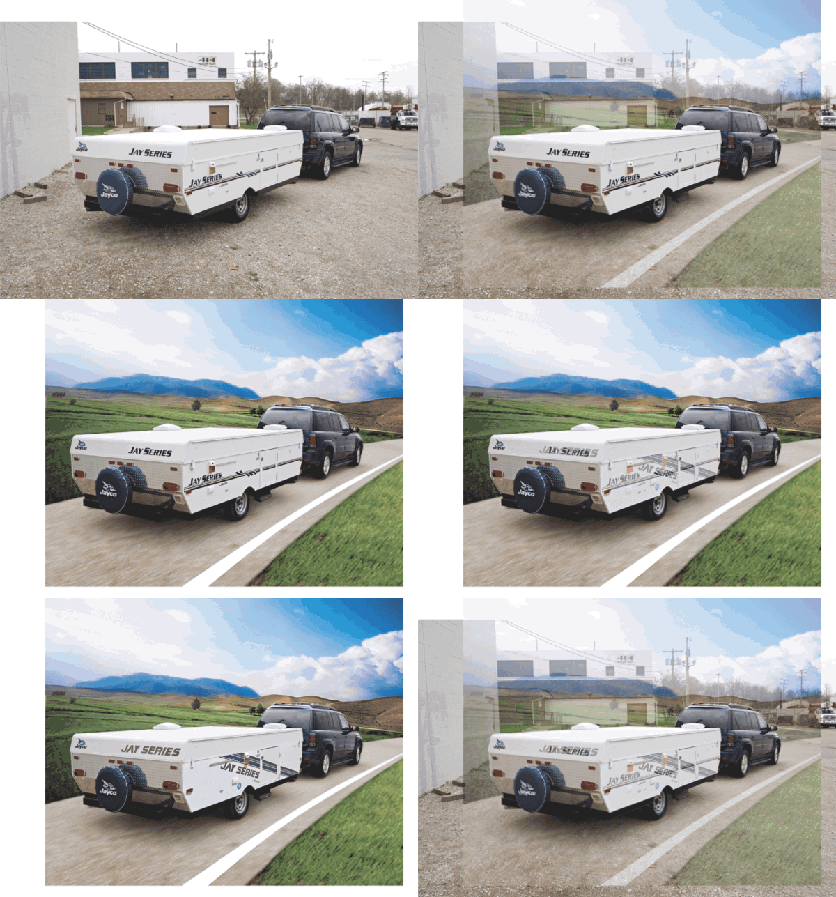
The first trick is the oldest in the book. Add makeup. Photoshop out the blemishes. Fix it in post.
Park an RV anywhere, it could be on the side of the road. Replace the dirty industrial park with an imaginary single-lane highway pointed at some mountains. Well done, designer.
“Oh, by the way. We don’t have money for you to repeat that trick this year. Go ahead and add our new slightly less ugly graphics to the photo you faked last year.”
The post-production used in photos of female models is well-documented. The damage to the self-image of women is obvious and easy to point at. You rarely hear criticism of the day-to-day product photo touchup. Who are the victims of this deception? We’ll get to that, just stick with me.
Magic Trick 2: Use a Wide Angle Lens
I don’t know if you have been in an RV, so let me just tell you. They are tiny. Often you can stick your arms out and touch both walls. Making the interior of an RV look spacious is an impressive trick.
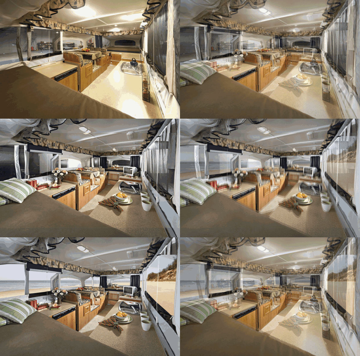
We used an assortment of photographers in Indiana who specialized in creating these illusions. It was amazing to watch them build a shot. In the morning you have an ordinary RV. You find the best place to put the camera. Select the right lens. Manicure the surfaces. Add props. Then carefully build light. By the end of the day you have achieved the impossible–the tiny interior looks massive.
The final step would be for me to take the interior photo, cut out the windows, and insert a stock photo of a beautiful landscape. Deception complete.
Magic Trick 3: Misdirection
The third trick is misdirection. If your product can’t rely on its own good looks, you create images that encourage the viewer to look at something else. We called them lifestyle photos. Pictures of smiling, happy people doing exciting things with your product as a prop in the background. The sleight of hand is to shift of attention away from the product.
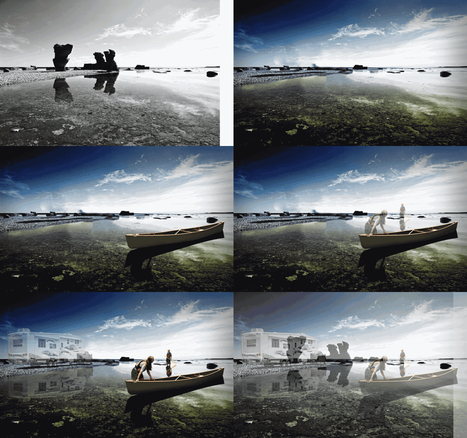
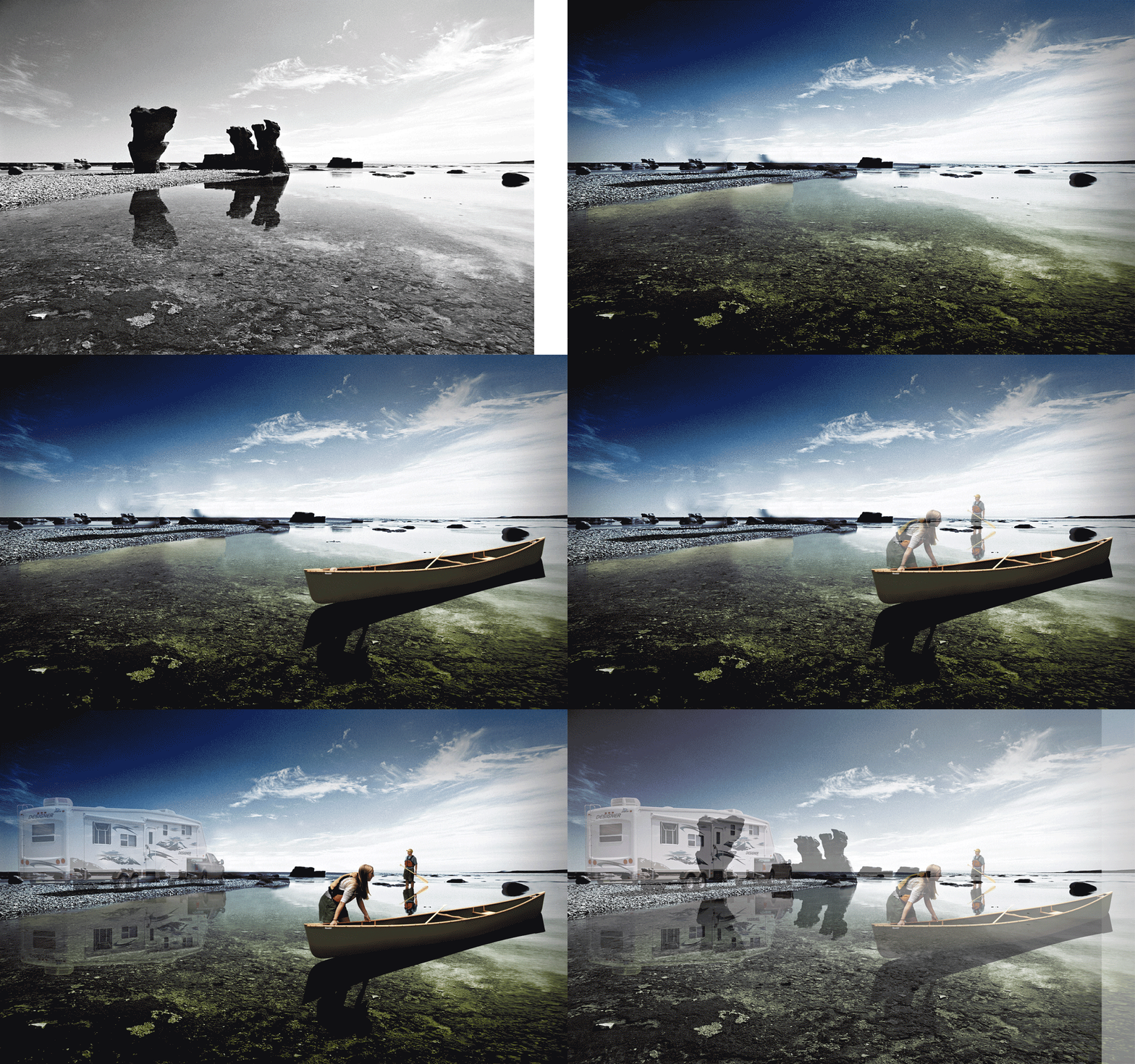
Imagine an adventurous couple on vacation. They slide their canoe into a crystal clean lake. Before climbing onboard, the man looks back over his shoulder at his RV parked on the beach. With a knowing nod, he thanks the heroic product for making this all possible.
If you can convincingly Photoshop this concept does it matter that it is a complete fiction? You can answer “no” once or twice, but when you see this trick done enough times you have to wonder. How far removed from reality can something get before the product, the reason you are doing this work in the first place, ceases to be a touched-up version of reality and crosses the line into a deception that obscures truth.
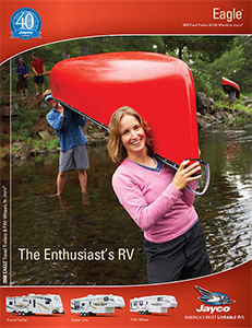
It makes a better trick to include the product in your illusions, but this isn’t mandatory. Simply having your product next to lifestyle images can be enough to distract attention away from the product. For the record, the following brochure cover wasn’t created by me.
Let’s jump back to Indiana where I watched the train of unbranded RVs dissappear in the distance. I crossed the tracks and headed back to the photo studio where I commented on the train and how great it was to see an act of goodwill. I asked if anyone knew which RV company was making such a generous donation. The response was,
“Donation? Why do you think there isn’t a single logo on those RVs?”
I had no idea. What I learned next made me question everything. Were my magic tricks really harmless illusions? My tiny exaggerations were about to become a dangerous contribution to a lie that ended up permanently injuring people.
Today’s post was about the surface layer, the tricks of the trade that by themselves seem harmless. Next week I am going to talk about what happens when you start asking questions. That’s where my path to hell gets paved. Stay creative.
Part 2: Got a Brand Problem? Put a Bird on it.
Previous: The Slow, Steady, Inevitable March Towards Oatmeal