February 6, 2016
Death by Toothbrush
A Special Hell for Designers Like Me (Part 3)
“For you to sleep well at night, the aesthetic, the quality, has to be carried all the way through.” — Steve Jobs
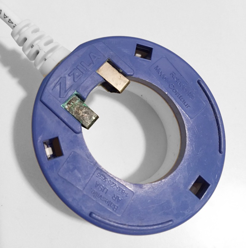
Can you see what’s wrong with the following photo? This is the bottom of a charger for an electric toothbrush. Do you see the problem? It’s not what you think. Study it, and I will explain the error in a moment. First, let me tell you about my week.
So, this week I found myself knee deep in the unsexy part of my job. I was cleaning up sloppy HTML. There’s no fame or glory in writing clean, semantic markup. Nobody views the source of a website and says, “Wow, somebody really took pride on this page.”
And yet, I was enjoying it. There is something therapeutic about reducing a page’s markup to its bare essentials. I asked myself why? Why wasn’t I looking for shortcuts to bypass this tedious task?
As I was organizing CSS and deleting divs I was also watching the reactions to my posts about “Designer Hell” (part 1 and part 2). The line that got highlighted and shared the most was this:
“Cataclysms are rarely masterminded conspiracies, they tend to be cascading apocalypses of apathy.”
It got me thinking, how do you stop that? You can’t force people to care. What does a battle against the apocalypse of apathy even look like?
Then something clicked as I finished re-indenting some misaligned HTML.
This is the war. Right here. I was battling the apathy apocalypse by taking pride in the thankless work I was doing. It is these tiny details, the ones that nobody will ever recognize where salvation might be earned.
There is a passage in Steve Jobs’ biography where he touches on this idea. Jobs said,
“When you’re a carpenter making a beautiful chest of drawers, you’re not going to use a piece of plywood on the back, even though it faces the wall and nobody will ever see it. You’ll know it’s there, so you’re going to use a beautiful piece of wood on the back. For you to sleep well at night, the aesthetic, the quality, has to be carried all the way through.”
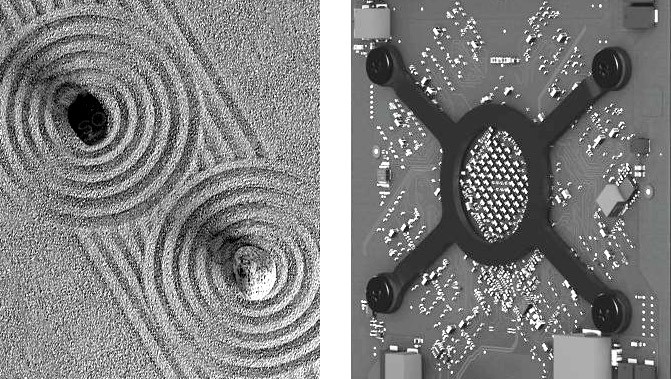
Apple products are notoriously hard to open because they are obsessed with hiding screws and minimizing seams. But if you are able to crack open one of their products you will see something beautiful. The components are perfectly lined up. The invisible space is tended like a zen garden.
Back to the electric toothbrush charger photo. Did you discover the problem?
Wrong answer #1: exposed electrical contacts
Put aside the fact that the metal charging contacts are exposed. I am no electrician, but it seems like that could be a dangerous item to have in your bathroom. Bump the brush into a full sink, and zap. Death by toothbrush. Nah, that’s not the problem. Try again.
Wrong answer #2: corrosion on the metal
No, the problem isn’t the rust and corrosion. I am not a metallurgist, but it seems like an item that sits next to running water 24 hours a day should use components that don’t rust over. That’s not the problem though, because I am a graphic designer, remember? Look again.
Wrong answer #3: poorly designed mold
Could the problem be the square holes in the mold? Well, I am not an industrial designer, but it seems like this would be a great place for bacteria to reproduce and evolve into some new breed of disease. That’s not my job, though. One more time, look again.
Last chance. Do you see it?
Correct answer: the logo is wrong
Ding, ding, ding. We have a winner? Let me explain.
As the top ranking member of the creative department it was my job to govern the use of our company’s logos and trademarks. Not to mention I had designed the original logo in question, so I was personally offended that some schmuck somewhere had poorly recreated my logo for his mold. The font was wrong! The symbol looked to be redrawn by hand!
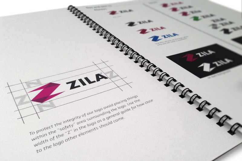
If they had studied my branding handbook it would have been perfectly obvious that they should have used the one-color version of my logo which looked like this:

The logo mistake wasn’t a surprise. I saw the prototype. While there was still time to correct the mistake, I threw my fit. I demanded that it be corrected. My outrage was acknowledged. Then it was dismissed. I failed to justify the expense, the time lost, and the inconvenience that fixing the problem would require.
The mistake was mass-produced. Our brand new flagship product contained a blatant disregard for my meticulously crafted brand standards.
I don’t show the bottom of the toothbrush charger in my personal design portfolio. Why would I? Designers aren’t evaluated by how well random vendors execute their vision. No, in my portfolio I can carefully choose the best examples, the ones without any hint of mistakes, where any flaws are carefully Photoshopped out so that the marketing of the crappy toothbrush looks like this:
This is the part of my post where I need to take my own medicine. Last week I identified the problem as neglect caused by the mantra, “That’s no my job.” If I had taken that to heart, my interaction with the charger prototype would have been different.
In addition to checking the logo I would also have asked questions that were outside my area of expertise.
I would have had to track down an electrical engineer to question the placement of the positive and negative terminals.
I would have had to track down the supplier of the metal and ask how susceptible it would be to rust and corrosion.
I would have had to track down the mold maker and question why the injection molding left big gaps in the plastic.
None of these things were in my job description. Plus, imagine the audacity required for a graphic designer to step out of his field and question the work of other professionals? These questions would not be welcomed.
And yet, that’s what I should have done. Who else was going to do it? I could have at least tried. Damn the consequences. If I had asked some tough questions perhaps thousands of people wouldn’t be throwing away their $100 toothbrushes today due to catastrophic failure.
I am not aware of anyone dying from toothbrush electrocution, but that’s not that far of a leap, is it? And yet, I can sleep at night just fine because I think I did my job. My portfolio is full of pretty jpgs that ensure I will be employable for as long as I want to keep playing the game.
Designers wrongly believe our responsibility is creating the big pictures. The reality is that success lies beneath the glossy surface. It comes from tirelessly fighting the invisible battles. It comes from asking the hard questions.
The best work you do may never be noticed. Whether it is well-formatted HTML, the perfect alignment of a chip on a motherboard, or the correct logo on the base of a toothbrush, this work is crucial. It may exist in obscurity, a job well done but never appreciated. That’s okay. You can sleep well knowing that it’s there. This is how we defeat the apathy apocalypse: by caring.
Part 4: Stop Dribbbling, Get a Design Education at Costco
If this is the first time you have ventured into the depths of my skull, I thank you. There is a growing archive of my crazy ideas that you can explore on my profile page. Thanks to everyone for following, recommending, sharing, highlighting, and tweeting my thoughts. Stay creative.
Previous: The First 31 Paintings of 2016