January 31, 2016
The First 31 Paintings of 2016
Going to try something different today. Rather than sermons related to Art of the Living Dead I am going to show you some actual art. Since January 1, I have been posting one piece of art a day on Instagram (@ade3). I also have a Tumblr going as of today. Follow me if you want to keep up with this ongoing project.
When it comes to art, fewer words are usually better so I will let you browse the art before I get too wordy. If you want the back story, scroll to the end...
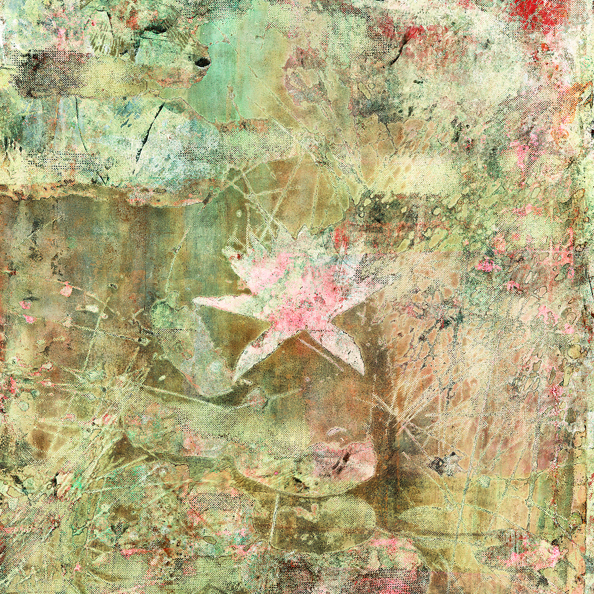
Week 1: Water Lilies
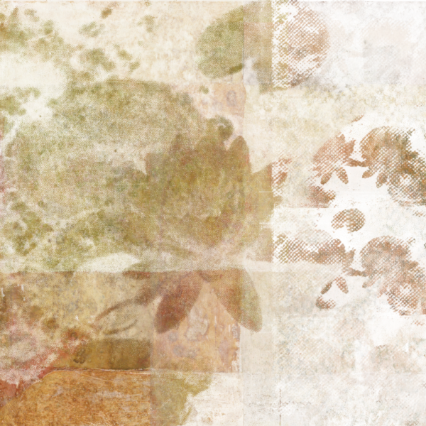
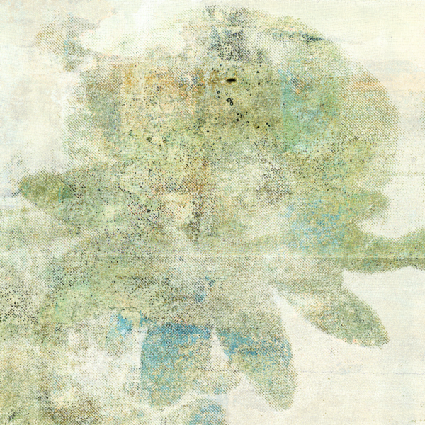
Day 1–2
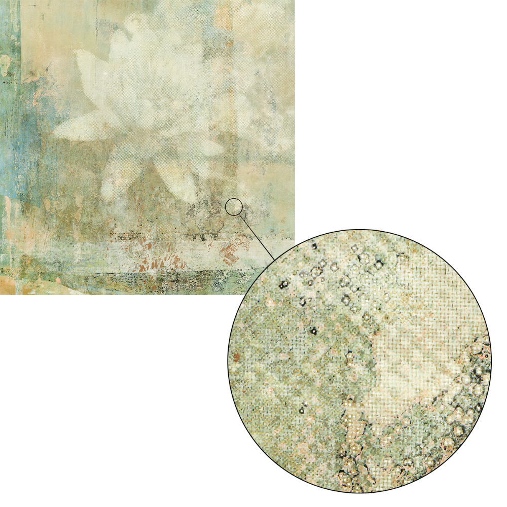
Day 3 (with detail)
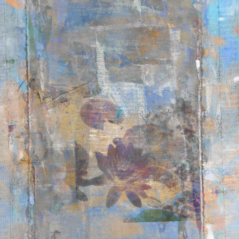
Day 4

Day 5
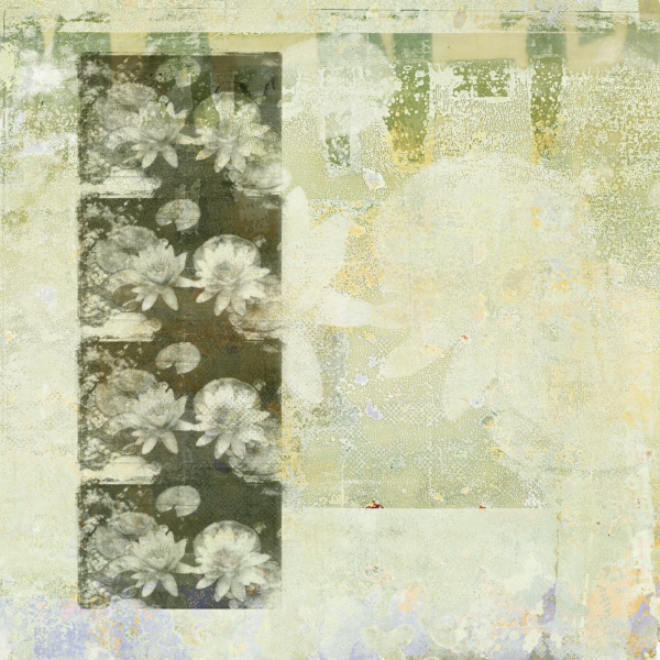
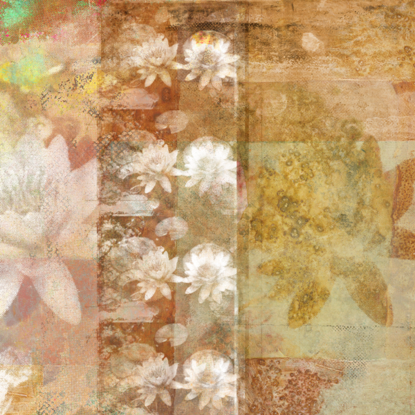
Day 6–7
Week 2: Single Water Lily
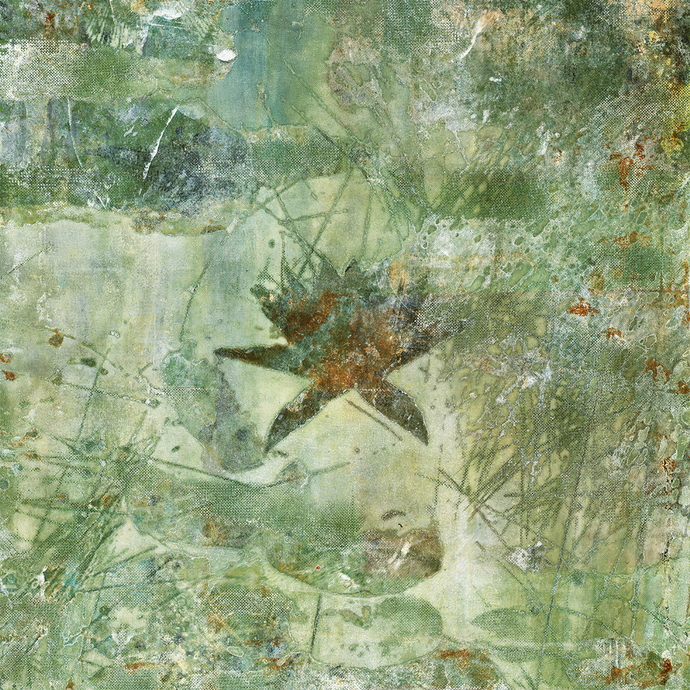
Day 8
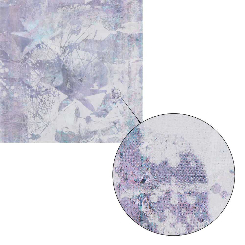
Day 9 (with detail)
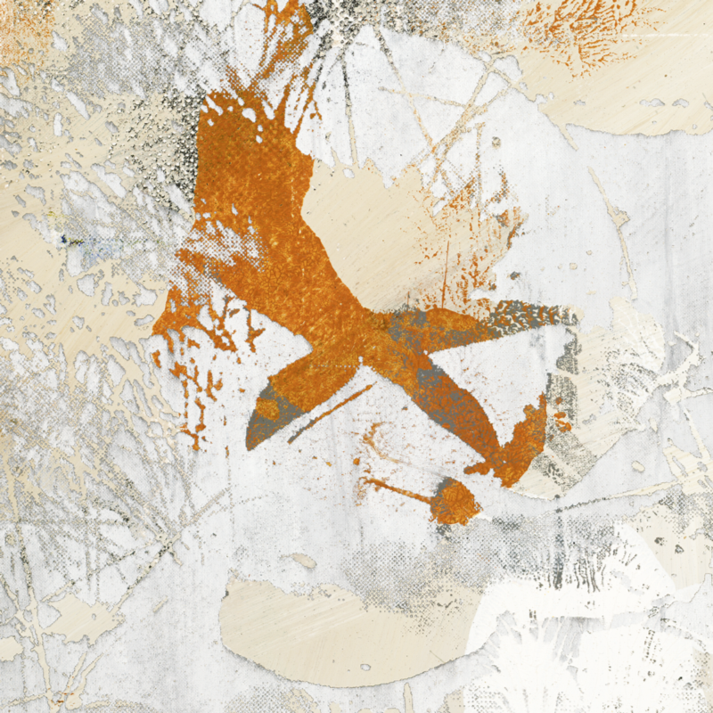
Day 10
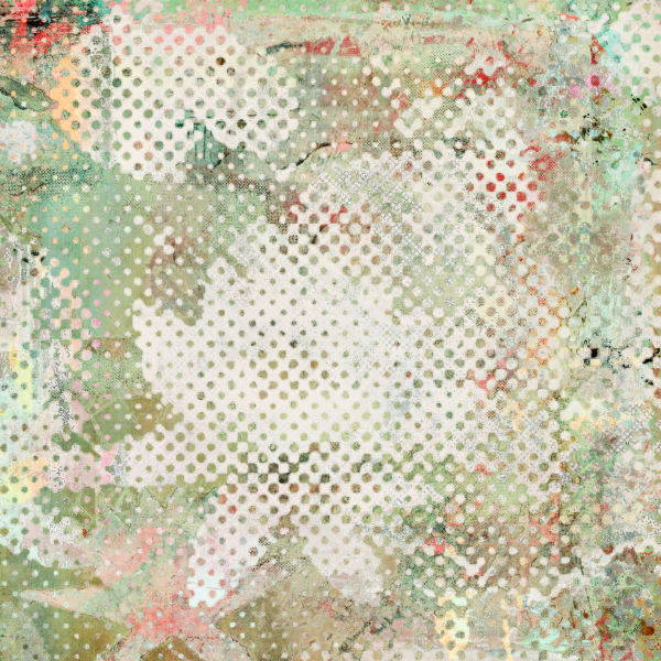
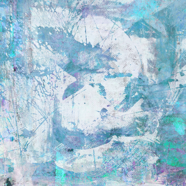
Day 11–12
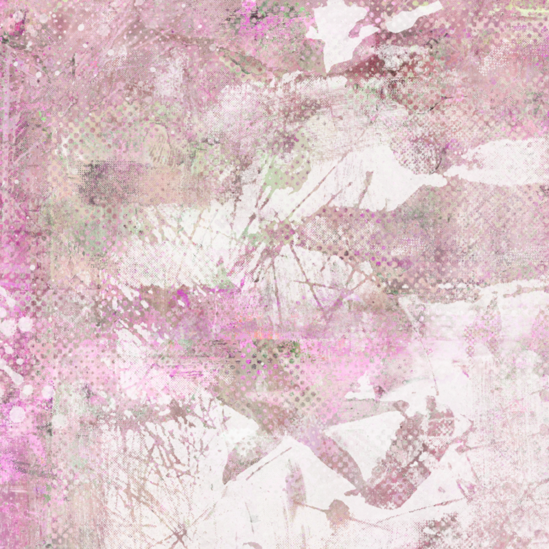
Day 13
Day 14
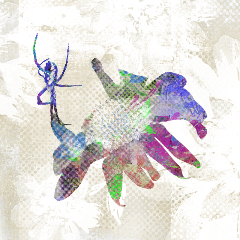
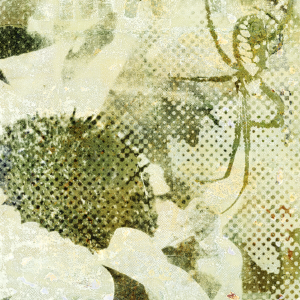
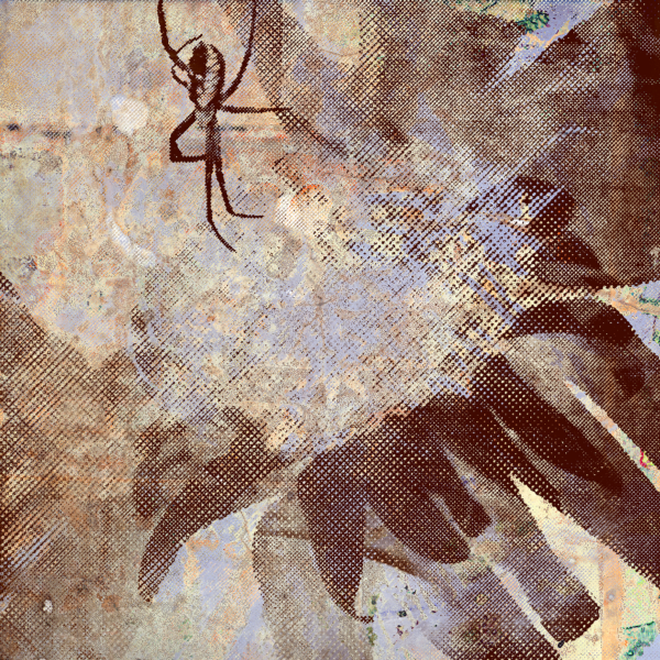
Week 3: Spider Flower
Day 15
Day 16–17
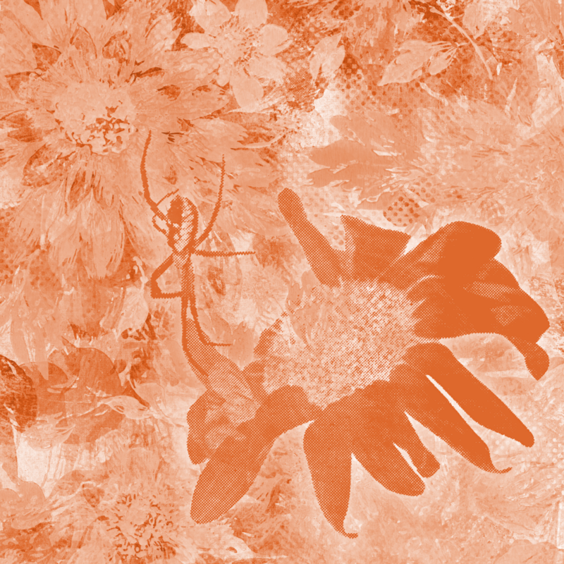
Day 18
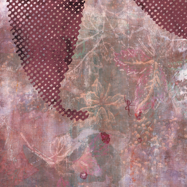
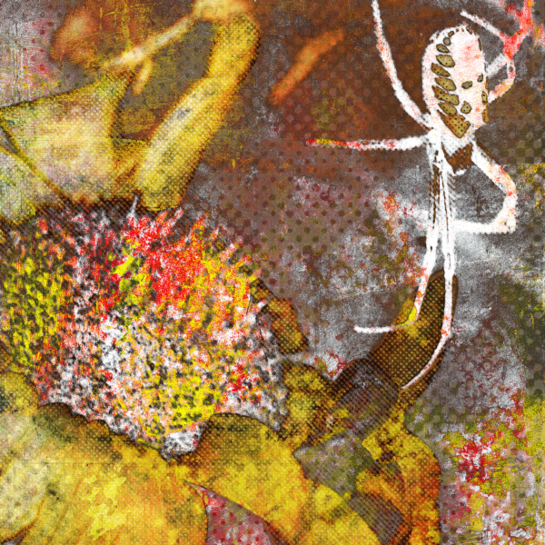
Day 19–20

Day 21
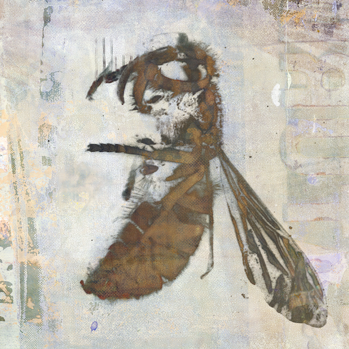
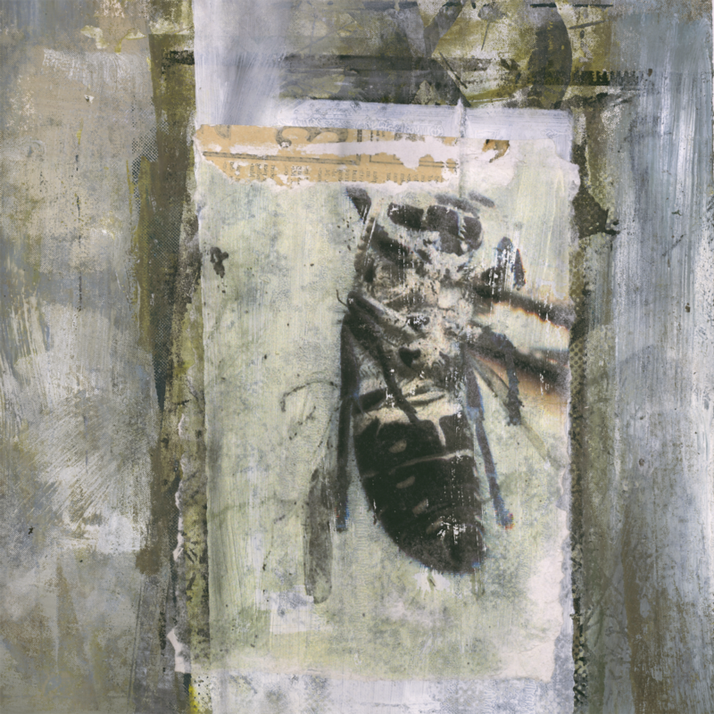
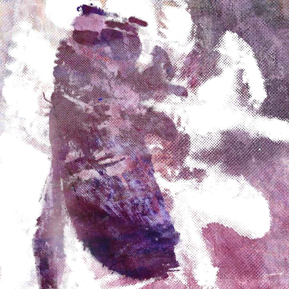
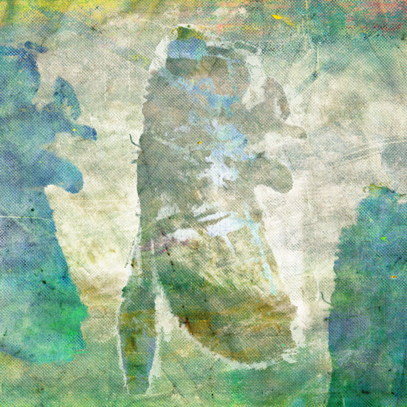
Week 4: Wasps
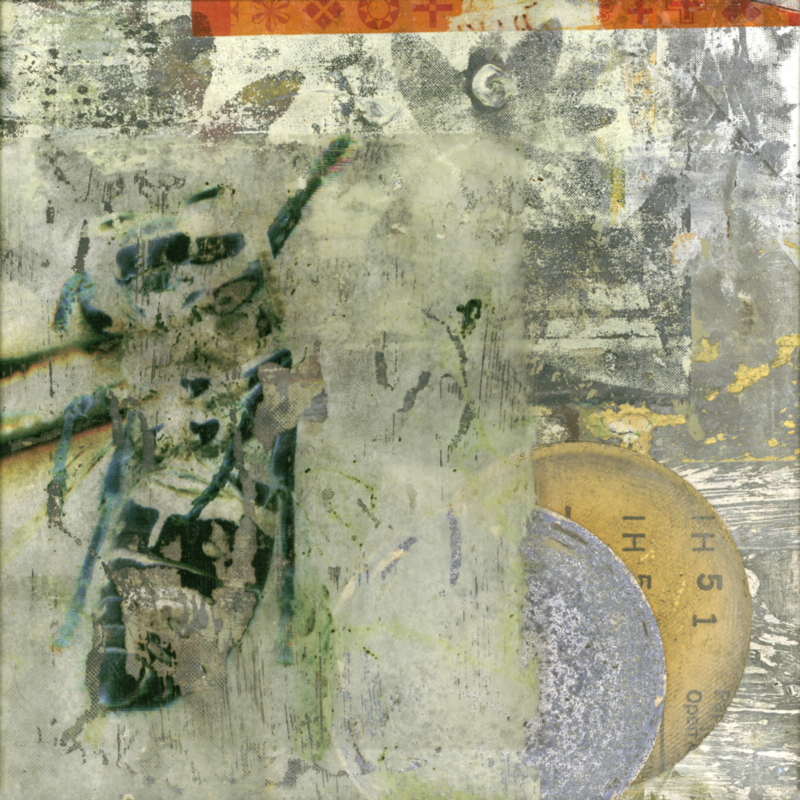
Day 22
Day 23
Day 24
Day 25
Day 26
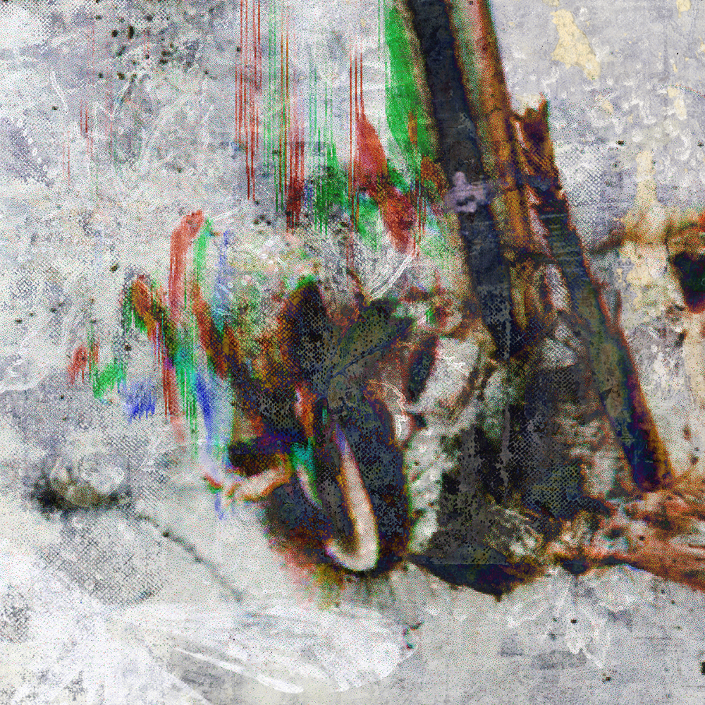
Day 27
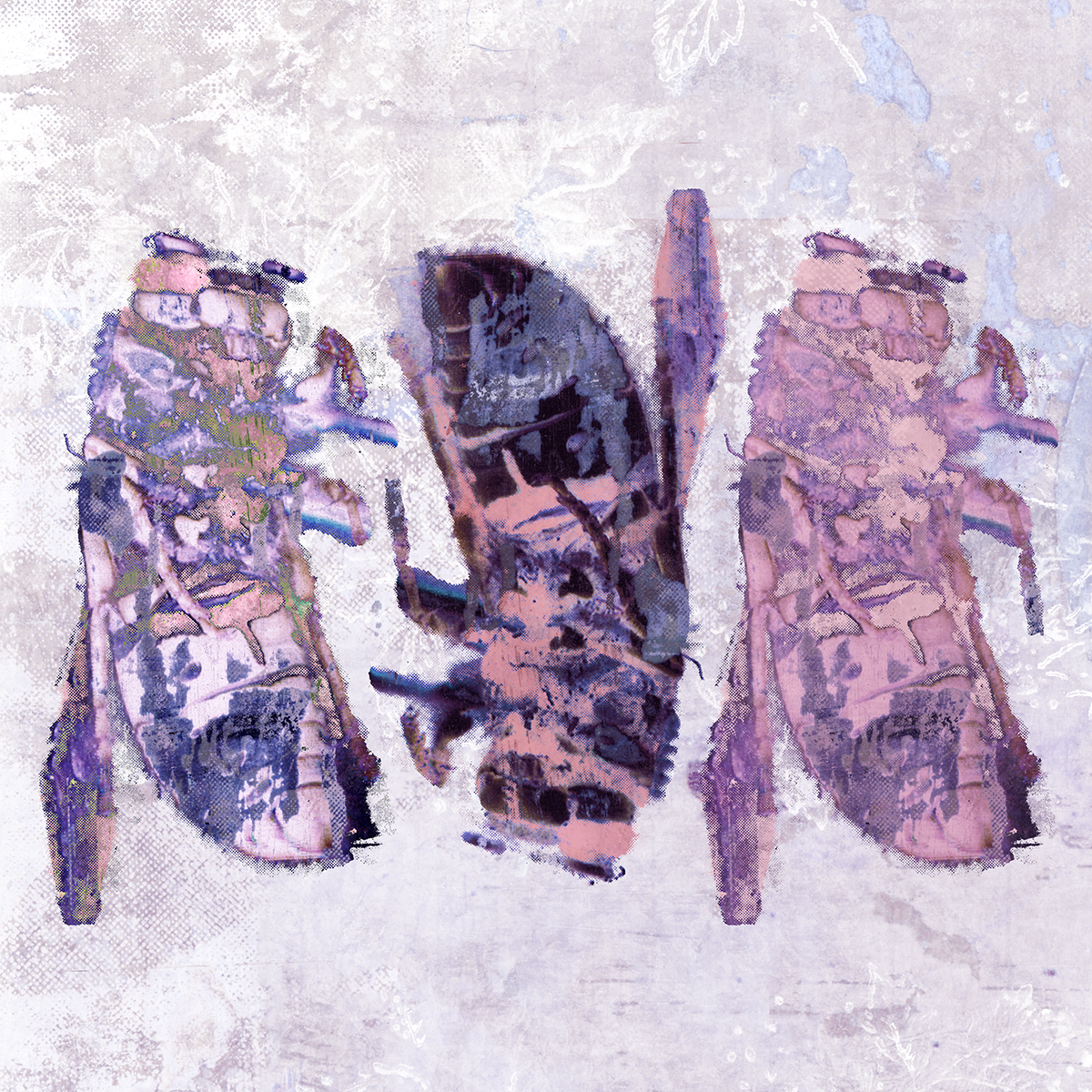
Day 28

Day 29
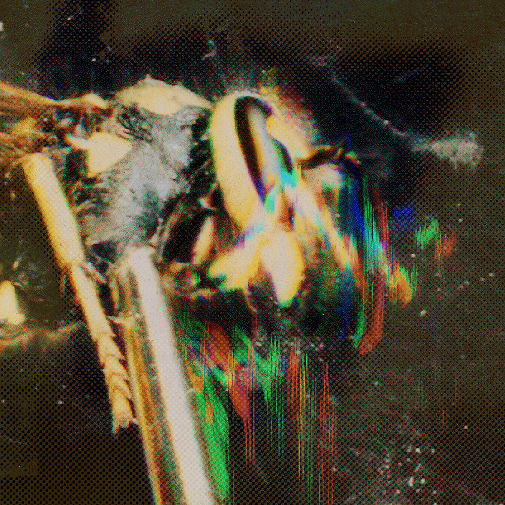
Day 30
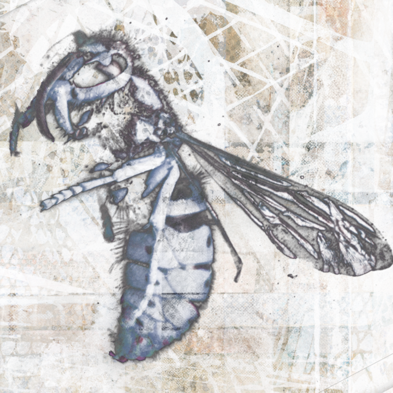
Day 31
The Back Story
I refer to these as paintings mainly because I don’t have a better word for them. Since the word “painting” conjures up ideas of brushes and canvas, I should explain generally what I am doing.
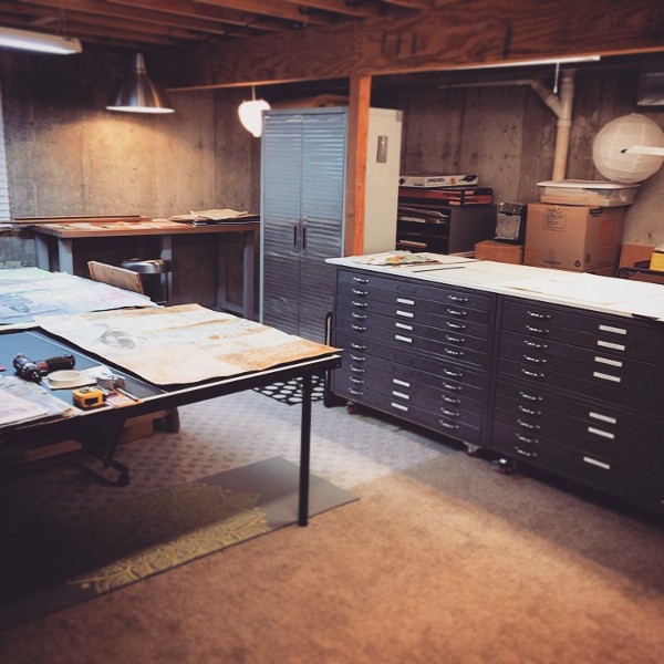
My new studio space
We moved to a new house last year. Sorting, packing, and moving my art out of my basement studio made me realize how unfocused the last decade of my art has been. That’s a nice way of saying I had accumulated way too much junk: unfinished work, boxes of paper scraps, wallpaper, and half-executed ideas.
Now that I have a new studio space it’s a chance to get intentional again. As I sort through my archives I am scanning, cropping, remixing, and completing my work.
For my first month, I picked some of the oldest imagery in my book. The lily photos were from one of the first rolls of film I ran through my Pentax back in high school. In college I used these photos to create screenprints which I mixed into my senior show in 2001.
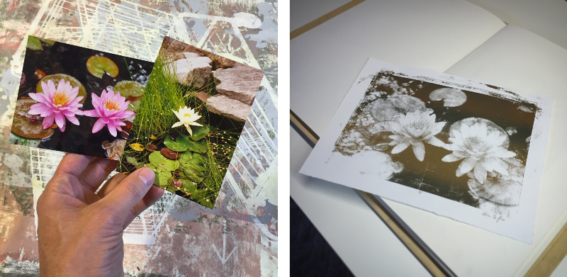
Sources of imagery from 1997 and 2001
The new paintings this year are yet another iteration. I have scanned the paintings, prints, and screens and remixed them. The size of each piece is 24in x 24in. That’s pretty big, so the images in this post don’t fully do them justice.
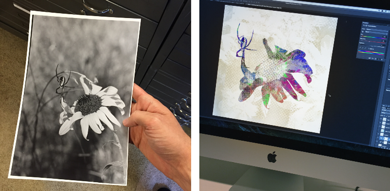
The spider and flower paintings starting in week 3 are similar in that they build on work that goes back to my senior art show. The titles of my work in that show were all phrases pulled out of a poem by Robert Frost called “Design.” It is a poem that I deeply love, so let me share it with you if you aren’t aware of it.
Design
by Robert Frost
I found a dimpled spider, fat and white,
On a white heal-all, holding up a moth
Like a white piece of rigid satin cloth —
Assorted characters of death and blight
Mixed ready to begin the morning right,
Like the ingredients of a witches’ broth —
A snow-drop spider, a flower like a froth,
And dead wings carried like a paper kite.
What had that flower to do with being white,
The wayside blue and innocent heal-all?
What brought the kindred spider to that height,
Then steered the white moth thither in the night?
What but design of darkness to appall? —
If design govern in a thing so small.
Isn’t that fantastic? Anyway, here is what the source photo looks like to give you an idea of how far this theme has come.
The final theme of the month keeps the bug theme going, but shifts from a spider to a wasp. Day 22 and 24 are the least “digital” of the bunch. They are unaltered photos of work I have framed and hanging in the house.
The wasp image doesn’t come from photos sources like the others. They come from a wasp that got into our house some time around 2004. I managed to get him into my scanner, still alive, and attempted to scan him.
I like the idea of an insect finding a tiny entrance into a framed piece of art. There, pinned beneath the glass he gets trapped, becoming a permanent part of the artwork. Perhaps one day the glass breaks and the insect escapes, taking with him the life he brought to the art.
UPDATE: Month 2 of artwork can be found here.
Thanks for reading. Again, follow me on Instagram (@ade3) or Tumblr if you want to see my daily art. Otherwise, I will probably make another post like this next month to show the next 30 paintings. Stay creative.
Previous: Got a brand problem? Put a bird on it.
Next: Death by Toothbrush