July 9, 2016
Font Blocking, Invisible Words, and Flames of Shame
A Special Hell for Designers Like Me, Part 10
It’s been a while since my last confession in the Special Hell for Designers Like Me series. The time has come to come clean on another atrocity.
You never know when you will be confronted by a test of character. There will come a moment when you are forced to choose. Do you stick to your beliefs, or do you fold under the pressure and sacrifice your very identity?
For me the test came in the form of an indecent proposal from a secretary. She was so innocent. She had no idea that her simple request would force me to compromise my ideals. She said,
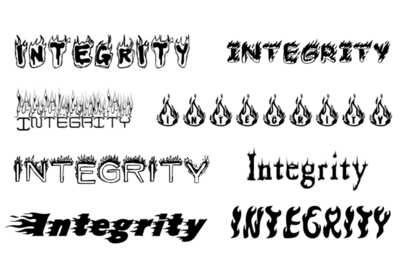
“Adrian, do you have any fonts that are on fire?”
I guess I am lucky my biggest moral dilemma’s center around typeface selection and not more dangerous vices. Anyway, like the professional that I strive to be I chose my words carefully and asked some probing questions.
“Where will this flaming font be used?”
It turned out she was working on a PowerPoint for her boss, the CFO of the company. That complicated things. My normal font police routine in which I point to our brand handbook wasn’t going to fly. I had to handle this request with care. Saying no to a secretary is one thing, refusing a request from the Porsche-driving executive in the corner office has potentially more dangerous repercussions.
She knew that the CFO’s request was dumb, she was just dutifully doing her job. I did my best to arm her with rational that she could use when she returned the PowerPoint presentation to her boss sans fire. She reluctantly accepted my font block and returned to her desk to try and ignite the dull PowerPoint in some other way.
While I waited to see how my treasonous actions would be received by the bigwig, I am ashamed to admit that I actually typed “flaming font” into Google. I sat there in the glow of burning letters contemplating forwarding the search results to the secretary. It would have been so easy to just give her a fiery font and pretend the whole thing never happened.
Unsurprisingly my nuanced typography speech got lost in translation. I am pretty sure her explanation was probably something along the lines of,
“I asked Adrian, but he didn’t want to help us.”
I deduced this because a few minutes later I received a visit to my humble cubicle from the man himself. He wasn’t visibly angry, just amazed by the audacity of someone standing between him and his vision of lighting his words on fire.
I only got a few syllables into my brand standards spiel before he cut me off. He said he was already using the company approved PowerPoint template, he just had one slide that needed to be impactful. He conceded that the font didn’t have to be flaming, it just needed to pop. Oh, how I loathe that expression.
He went on to explain that he wanted his words to jump out like the opening scene in a movie. And this is where he gave me an out. He asked,
“What font do they use in movie trailers?”
Let’s pretend that I said this,
“Dave, I understand that you want your words to have a big impact. There are many ways to achieve this. If you help me understand what you are trying to say, I will gladly design something that helps you get that across in the most compelling way possible.”
No, instead I said,
“Trajan. It seems like every movie trailer nowadays uses Trajan.”
At this point I may have opened Illustrator and typed a few words in Trajan speaking them aloud in that ubiquitous movie voiceover tone,
“In a world struggling to survive, one man…”
Seeing what to him looked like Times New Roman on my screen and having heard enough from this strangely stubborn font nerd, Dave excused himself from my cubicle. Awkward.
I never saw his final presentation. I can only assume that he went back to his huge office and typed “flaming font” into his browser. I imagine him giggling with glee when he found exactly what he was looking for. I wonder if he was surprised when his big presentation ended not with the crescendo of flaming glory he was hoping for but with the plop that millions of yawning PowerPoint attendees endure daily.
With countless exotic fonts only a click away, it is hard for most people to understand why designers are so passionate about fonts that lack visual flair. Our job is often perceived as decorators with the assumption that our role is to apply frosting to other people’s oatmeal. Some designers accept this model, building their careers by further reinforcing the perception that we are merely combover artists.
But most of us understand that if you find yourself searching for the perfect font, you are almost certainly focusing on the wrong thing. Fonts don’t make words interesting. Compelling words are inherently interesting. We strive to make the font invisible because if you find the right words you can let the font fade into the background where it belongs.
The world doesn’t need another junky PowerPoint. We need leaders whose words move us regardless of the font choice.
Thanks for reading. If this post lit your fire, fan the flames by sharing it on Twitter. I write combustible words like this weekly, so follow me if you don’t already. Stay creative.
A Special Hell for Designers is continued in part 11 where I tell you about My First Golden Combover.
Previous: Boosters and Drainers
Next: Deadly UI