July 16, 2016
Deadly UI
“I want to make a revolving door that says ‘Pull’ on it, just see how obedient people are.” — Demitri Martin
Take a look at the following maps showing variations of the most common user interfaces in the world. Do you recognize them?
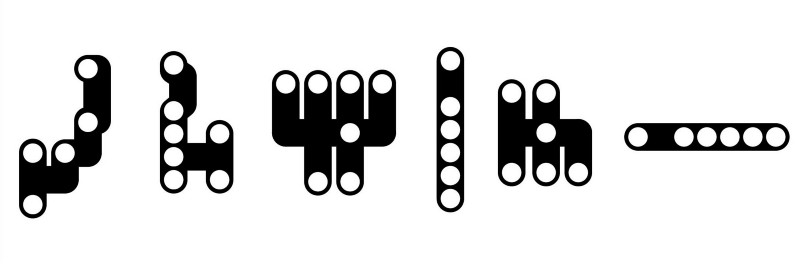
Even if you figured out that these diagrams represent automobile shifter positions, I am willing to bet that it wasn’t an instant association. Now look again at the diagrams and try to match the actions of each white dot with their corresponding letters. You’ll get it, but you will struggle a bit. That’s because your mind has to stumble through every vehicle you have ever driven, remembering exceptions and variations to the patterns. You will think things like:
“Well, my dad’s truck had reverse in the upper right, but my sister’s car had it in the lower right. Which kind is this?”
The other thing that trips you up is that the ideas in your mind are mapped to different concepts than the ones assigned by the car manufacturer.
Your mental map looks like this:
P = Stop
R = Backwards
N = Roll
D = Go
L = Slow
S or M = Fast
The manufacturers chose fancier sounding words that don’t own any instinctual real estate in our lizard brains:
P = Park
R = Reverse
N = Neutral
D = Drive
L = Low
S = Sport
M = Manual
This code was explained to us when we first learned to drive and few of us have questioned it since that very first confusing lesson. The cognitive load may be minimal, but it adds up because these are the most widely used systems in the world. Billions of us use it every day without giving it much scrutiny. The odds guarantee that accidents will happen.
The redeeming characteristic of the traditional gear shifter systems is that they are combined with strong tactile feedback. When you get in the car you drive every day your muscle memory takes over. Your hand instinctively knows where the shifter will be. You pull the lever with exactly the right amount of pressure and you feel the moment that the knob clicks into the right spot.
You don’t have to look down to make sure the “D” is highlighted. Your mind doesn’t have to reference your mental map or do the “D=Drive=Go” translation.
Last month Anton Yelchin died because of an “innovation” in shifter design which removed the traditional tactile feedback from the shifter system. Anton believed his Jeep was in “P=Stop” mode and got out of his vehicle. He was crushed against the gate in his driveway because the Jeep was actually in “N = Roll” mode.
After the high profile tragedy all vehicles containing the “monostable shifter” design have been recalled. The consensus is that Anton Yelchin’s death is the tragic result of a design flaw. That’s true. However, to prevent future accidents, the proposed solution, it seems, is to mandate that cars should be required to use the semi-standardized “PRNDL” system. I believe that would be a mistake. Design problems should be solved by good designers, not government regulators, standardization committees, or public sentiment that is blindly addicted to compromised design patterns.
Why drag flawed metaphors of the past into the future? The design of the automatic shifter is itself a metaphor referencing the “stick shift” design and location of manual transmission vehicles. It could have been anything, but it took that form to soften the transition for users intimidated by the new technology. I am not convinced this was the correct design decision, but we might be stick with it.
The monostable shifter lazily repeated the shifter “stick” metaphor again. There was no imagination involved in its creation, just the blind acceptance of historic answers. Instead of improving the experience, the designer applied chrome and wood veneer on top of the design flaws. The aberration was then passed onto the marketing department who created the term “monostable shifter” possibly the most deceptive marketing terms since “lite” beer. The results were fatal.
As we transition to an inevitable future of autonomous vehicles we have a chance to free ourselves from the flaws inherent in the original “PRNDL” systems. Will designers be involved at the moment when they can have a meaningful influence on the solution? Or will the designers shrug and say, “that’s not my job” satisfied with their traditional role of adding polish to more turds?
Today there are virtually no limits to the form that vehicle UI can take. If we can’t design something better than the absurd patterns represented by the diagrams above, we deserve the zombie-mobile landscape we seem to be trapped in.
Thanks for reading. Shift yourself into first gear by following me so you can keep up with my weekly transmissions. Stay creative.
Previous: Font Blocking, Invisible Words, and Flames of Shame