January 21, 2019
Boston Marathon Data Analysis, Part 1
Women, men, young, and old: What can we learn from the data about how to qualify for Boston?
This is my first story in a new series focusing on the Boston Marathon. This is a bit of a departure from my normal themes of design and creativity, but if you look closely those ideas will still probably break through at points. Let’s get to it…
Every time I line up at the start of a marathon I am amazed by the diversity of humans I see. Running is truly a sport for all shapes, sizes, and varieties of people. While the top finishers steal the headlines, the real story to me is the thousands of runners who finish behind the winners. If you dig into the data of the thousands of runners who conquer Boston, what kind of themes will emerge? That is what this series hopes to uncover.
The Boston Marathon is the perfect race to mine for data. Its high profile, strict qualification standards, and long history of results make it a juicy target for analysis. As a recent qualifier, I have been on a mission to learn as much as I can about the race and share the fruits of my research with you. For the first part of this series I am digging into the data around age, gender, and the standards around qualification for the big race.
Who gets in and who gets rejected?
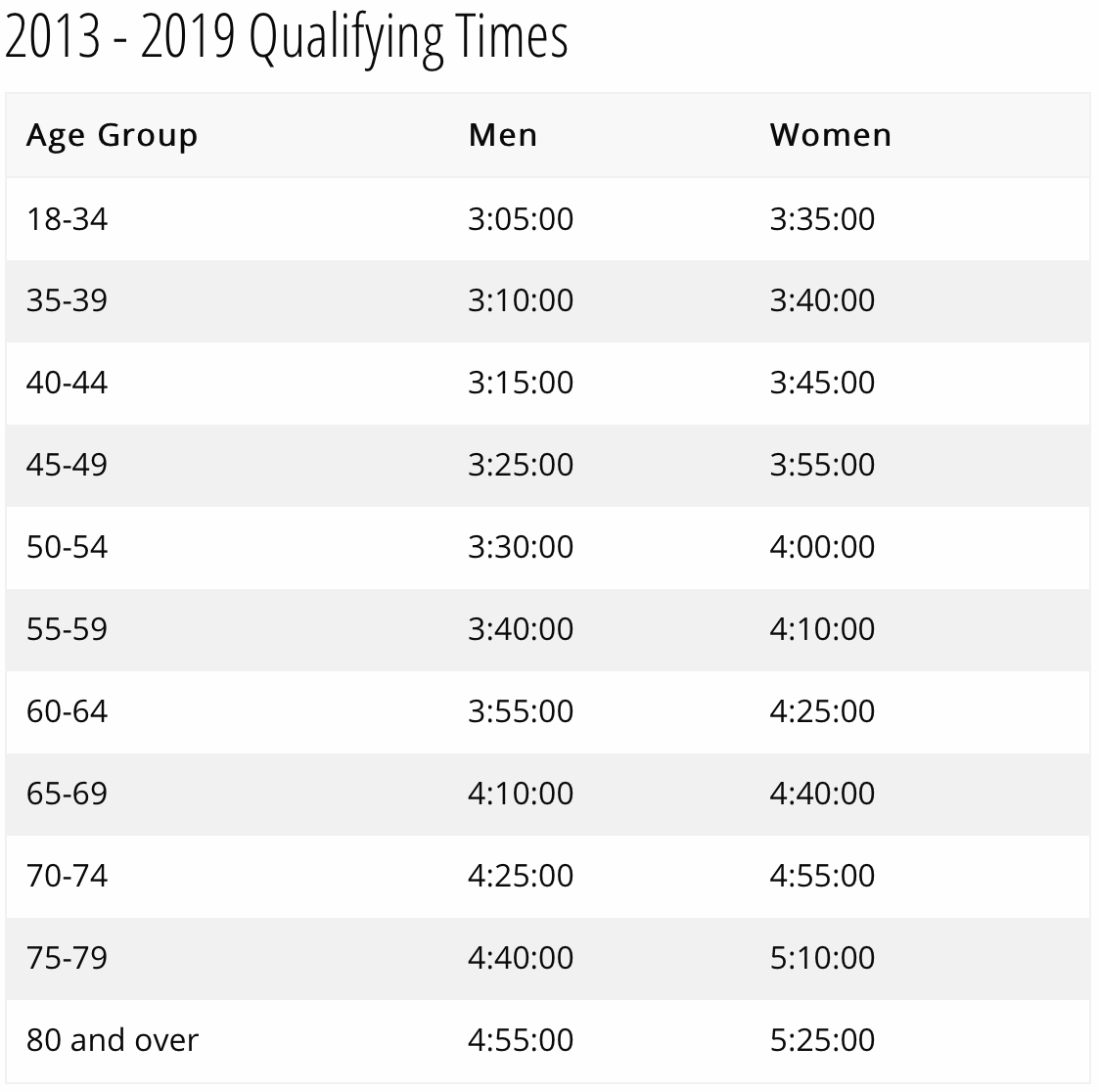
Boston is notoriously hard to get into. Participation is capped at 30,000 runners with more than 20% reserved for special invitations and charity programs. That leaves about 23,000 spots up for grabs for anyone who can meet the qualification standards. If you know anyone who has tried to earn their “BQ” you can know how much work goes into achieving a qualifying time. The chart below shows the times needed to qualify for Boston from 2013–2019.
Adding to the difficulty of securing a spot at Boston’s starting line is the fact that so many people want to participate. There aren’t nearly enough open spots to satisfy the amount of people who qualify and apply. That puts the B.A.A in the unfortunate position of having to turn runners away. In 2019, Boston rejected 7,384 runners who had qualified based on their times. That is a rejection rate of nearly 1 in 4 and an increase of 2,200 from 2018.
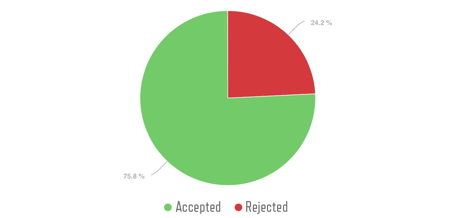
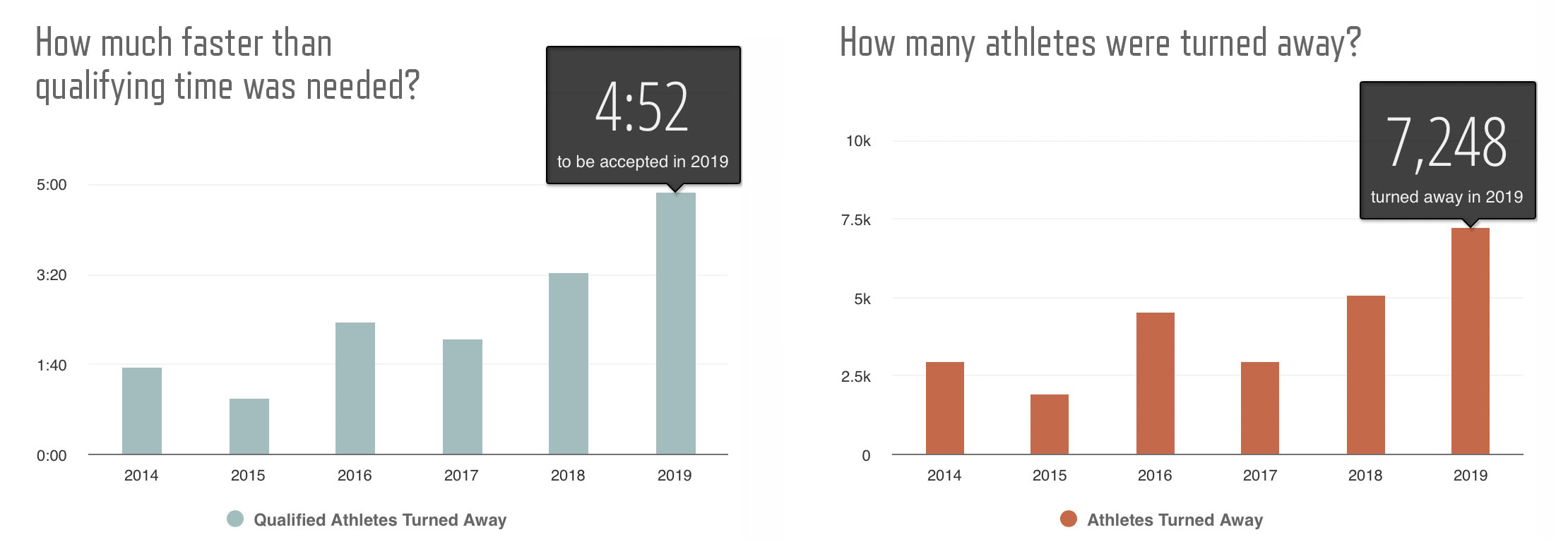
Nearly 1 in 4 athletes who qualify for Boston were rejected in 2019 The rule of thumb has been that if you want to be sure you can get in to Boston you should aim to beat your qualifying time by 5 minutes. This advice got thinner and thinner until in 2019 the cutoff time was 4:52.
Cutoff Times:
2014: You needed to beat your qualifying time by 1 minute, 38 seconds 2,976 people turned away
2015: You needed to beat your qualifying time by1 minute, 2 seconds 1,947 people turned away
2016: You needed to beat your qualifying time by 2 minutes, 28 seconds 4,562 people turned away
2017: You needed to beat your qualifying time by 2 minutes, 9 seconds 2,957 people turned away
2018: You needed to beat your qualifying time by 3 minutes, 23 seconds 5,062 people turned away
2019: You needed to beat your qualifying time by 4 minutes, 52 seconds 7,248 people turned away
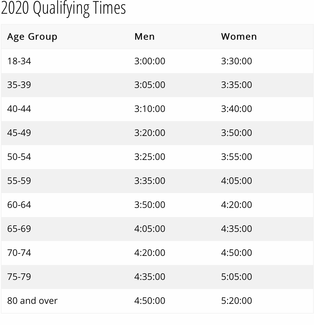
New Standards in 2020
In response to the increasing number of people applying for the race and to reduce the number of disappointed qualifiers, the B.A.A. adjusted their standards for 2020. The field size remains at 30,000 but the times needed to qualify has increased by 5 minutes for all age groups. Below is a chart showing the new qualifying standards.
What do the new standards mean for runners?
Although an increase of 5:00 might seem disheartening to runners hoping to qualify, if you were already aiming to beat your qualifying time by 5 minutes, this probably won’t change your training or goals. Remember, just because the standards have changed doesn’t mean there will be thousands of runners who are running faster. It is likely that the biggest impact of the standards change is just a reduction in the number of rejection letters that get sent out.
Here is the breakdown of how people got in to the Boston Marathon in 2019:
- 18% (5,256) beat the qualifying time by 20 minutes or more
- 29% (8,620) beat the qualifying time by 10–20 minutes
- 29% (8,545) beat the qualifying time by 5–10 minutes
- 1% (220) beat the qualifying time by less than 5 minutes
- 22% (6,656) were invited by special invitation or through charities
- 1% (433) have run 10 or more consecutive Boston Marathons
- 1% (270) athletes were accepted with disabilities

Age and Gender
In a perfect world the distribution of runners would be spread equally across all ages and genders. But the world is a messy place and the B.A.A. does a commendable job of balancing the fairness of qualifying times with a mostly even distribution of runners across ages and gender. Over the last four years the race has consistently been 45% female and 55% male.
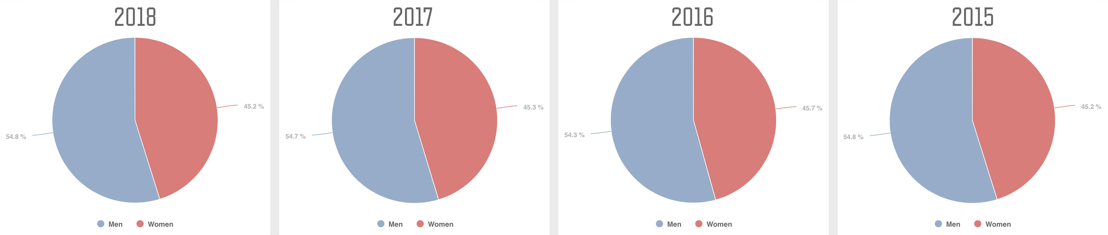 The field is consistently 45% female and 55% male
While the average age of a runner in the Boston Marathon is 42.5, that doesn’t tell the whole story. An interesting side effect separating the field into age groups is that it gives an advantage to runners on the younger side of the 5 year divisions. You have a much better chance of running a 3:35 as a 55 year old than running a 3:25 at 54 years old. This advantage comes through in the data. For example, in 2017 there were 651 runners age 44 compared to 1,127 who were 45. Notice in the graphs below that there are spikes at the start of every age group.
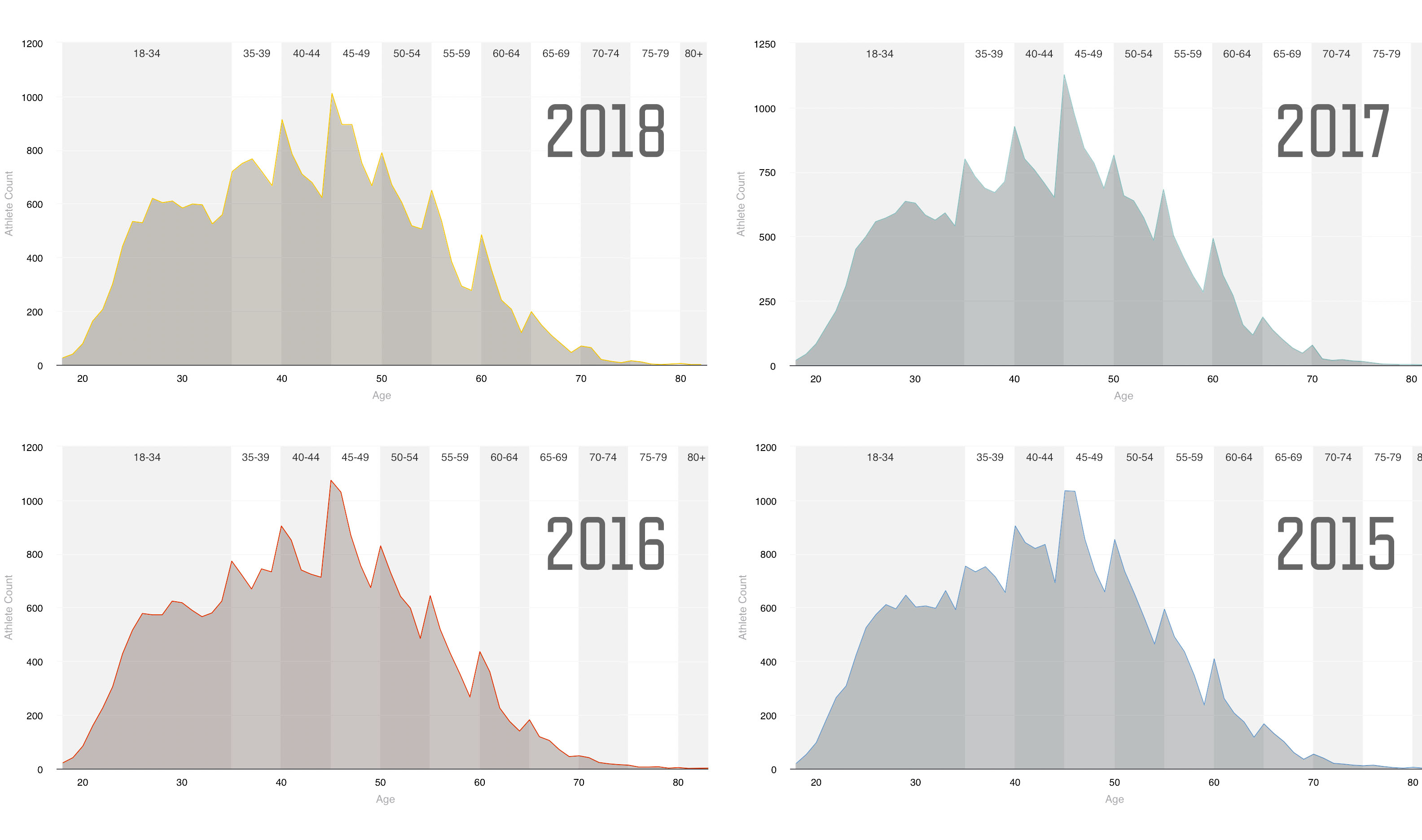 The age distribution is remarkable consistent from year to year
At the extremes, the number of runners on the young side of an age group can double the number of runners on the older side of the spectrum. In 2018 there were 650 runners age 55 compared to 277 at age 59.
If you are a runner hoping to qualify for Boston you should definitely take advantage of the benefits of age groups if you can. If you are close to an age group jump, let that be added motivation for your training. Also, remember that your qualifying times are based on your age on the day of the race. That means that you can run your best race at age 34 and use the qualifying times for the 35–39 age group because that’s how old you will be on race day.
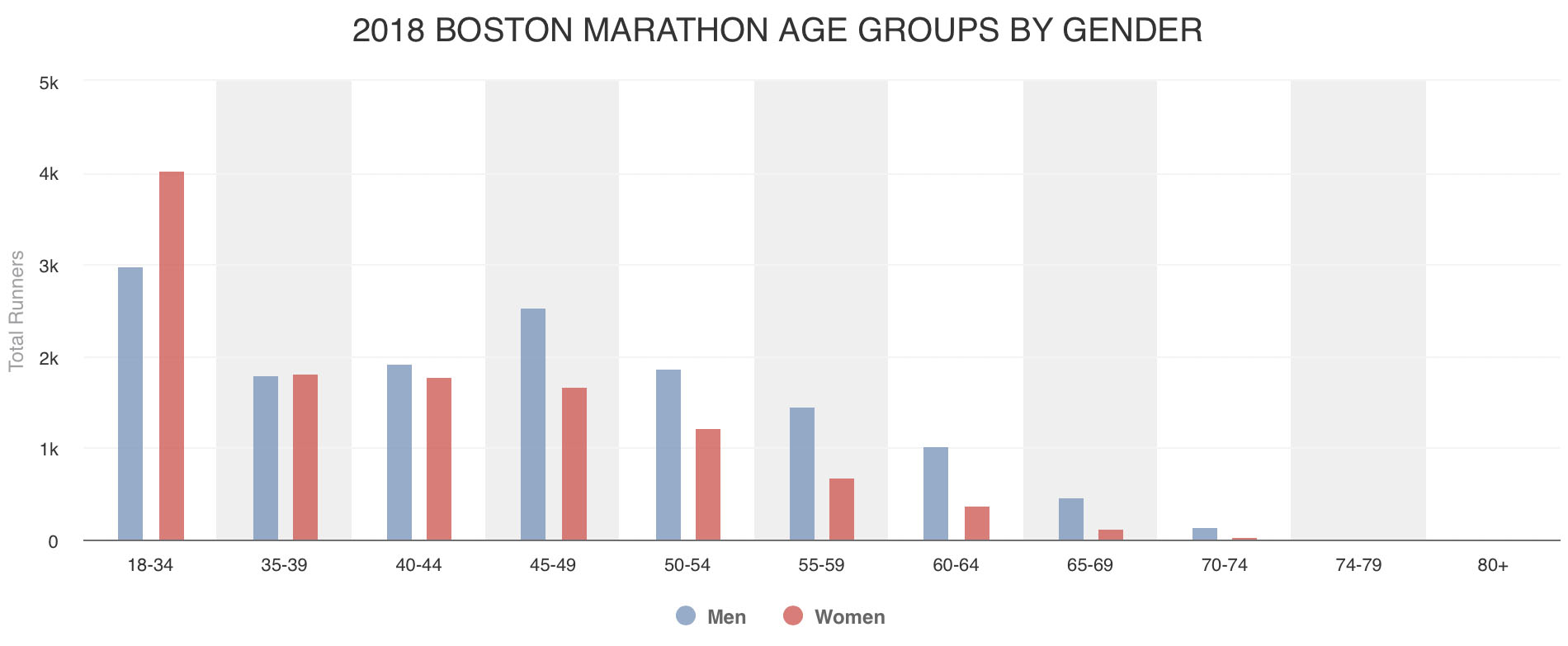
The largest demographic in the Boston Marathon by far is the female 18–34 group with 4,033 runners. The second largest group is the 18–34 male group with 2,984 runners. The 18–34 age groups are a 16 year spread while the other age groups are 5 years, so it makes sense that they will be large. Coming in third is the male 45-49 group with 2,540. The next closest group are males 40–44 with 1,932.
If the chart above is redrawn as a line chart (see below) another interesting story emerges. Notice how the female trend drops off steadily as age increases. Males, meanwhile, rebound to age 45-49 before descending again.
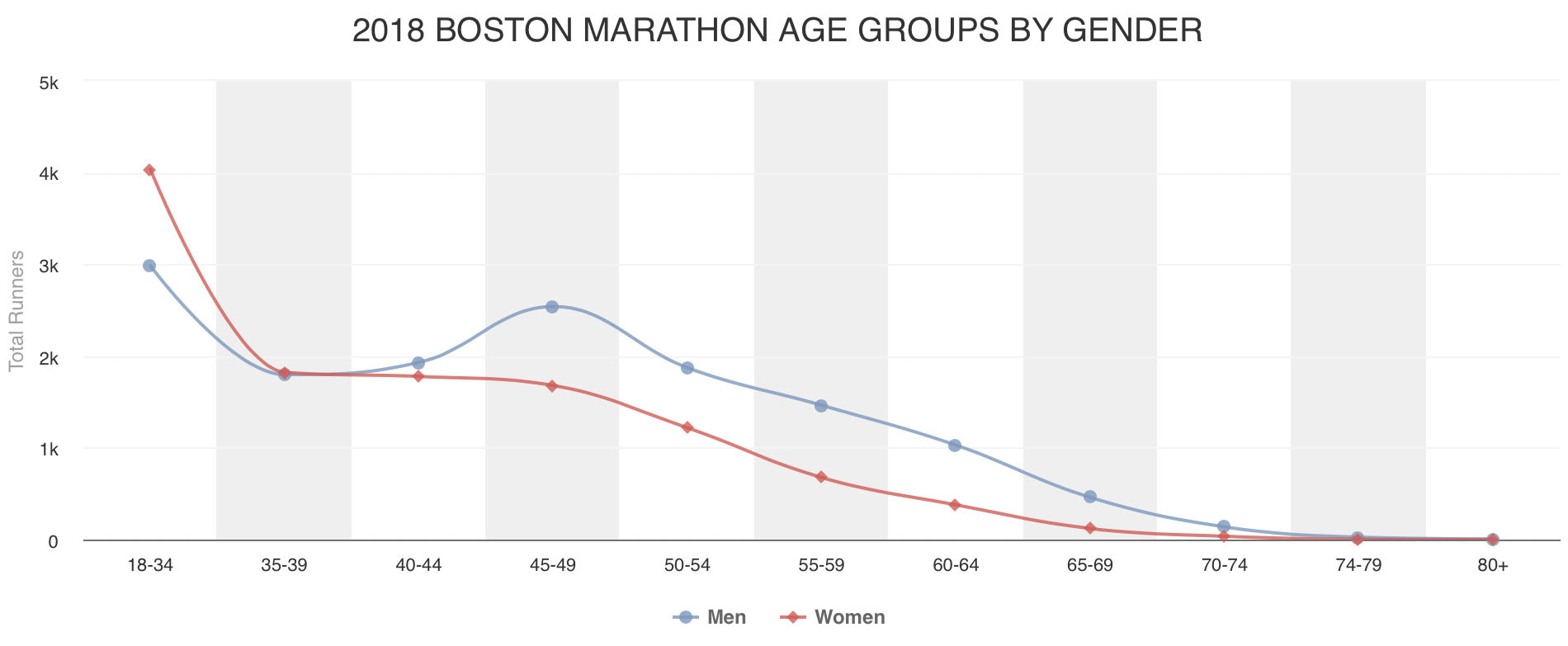
What is happening here? It might be tempting to conclude that younger females and middle age men represent some sort of physical peak in performance. I it more likely that the reasons have as much to do as social pressures as they do with physical abilities.
Now that we have a clear picture of what the Boston marathon field looks like, what happens in the actual race? Below is the distribution of runners across the field.
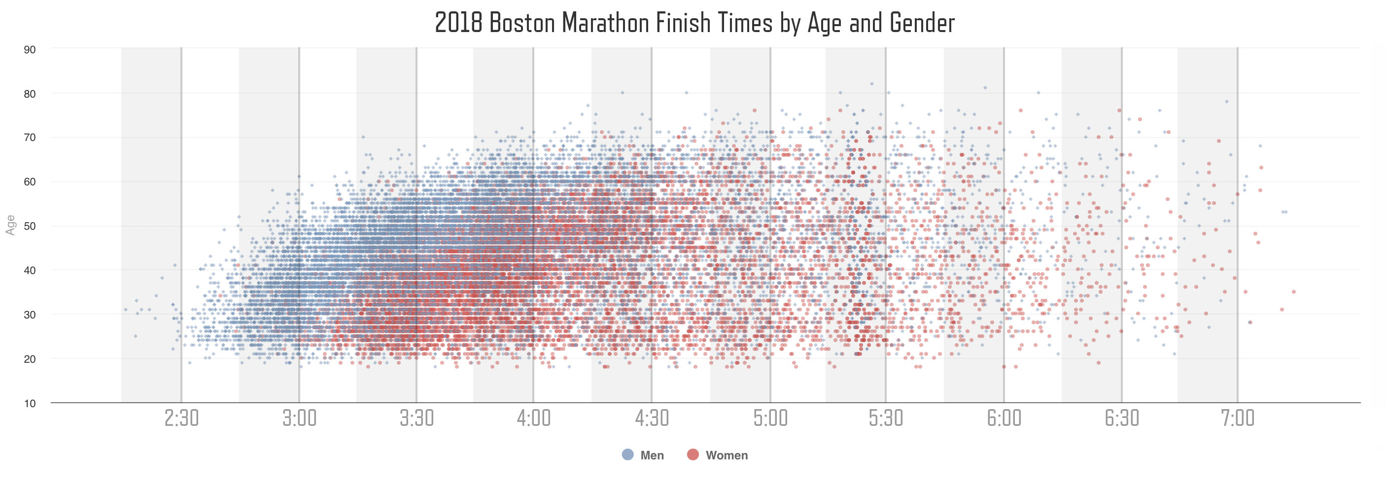
This is basically what we would expect based on the abilities of the athletes from their qualifying times. The athlete clusters move up and to the right showing slowing as age increases. The 18-34 year old female cohort is also visible on the lower edge of the cloud.
The chart below shows the change in finish time distribution from year to year. While the clusters mostly remain consistent, 2018 shows a wider spread of runners. I suspect this is most likely a result of the weather since the conditions for the race were so difficult in 2018.
It is also interesting to see how many people land on the right side of the 4:00 finish time line. Huge numbers of people seem to be failing to hit their qualifying time on race day. Why might this be? And can the answer be revealed by the data? Stay tuned for Part 2 where I try to answer those questions and dig deeper into the story behind the data of the Boston Marathon.
About Me
Thanks for reading. My name is Adrian Hanft. I am a runner from Colorado with a passion for data, design, and storytelling. You can follow my runs on Strava and my writing here or on Medium. If you enjoyed this analysis please share it with friends. Stay creative.