September 29, 2019
The U.S. Navy’s $100 Million Checkbox
How Bad Design Killed 10 Sailors and Wrecked a Destroyer
Two years ago a Navy destroyer was ripped open by the nose of a Liberian tanker. Ten sailors were crushed or drowned as their sleeping quarters filled with water after the collision.
At the heart of the tragedy is a single checkbox on a touchscreen. This is the untold story of how bad design caused a crew to lose control of the $1.8 billion John S McCain destroyer and the mystery around how designers manage to avoid blame when their creations cause death and destruction.
Before going any further, I want to make it clear that I am just a civilian piecing together this story from whatever information I can glean from the internet. I have trudged through hundreds of pages of technical documents and dense reports. Much of this documentation is intentionally vague, some of it has been redacted, and all of it has undoubtedly been scrubbed by lawyers and PR professionals. As a result, there are probably errors in my analysis and conjecture. However, with that disclaimer in mind, I believe the following story may be the clearest, most human-readable account of the McCain accident that you will find anywhere. It may also be the first and only public source of real design criticism ever written in the two years since the accident. I am not sure how the responsibility fell to me, but I am happy to describe the role that design played in this tragedy.
I have broken this story into four parts. First, I will describe the ship’s user interface (UI) and how the design of the controls contributed to the mistakes made by the crew of the McCain. Second, I will describe why better UI isn’t enough and how human-centered design could have prevented the disaster. In the third section I come to the defense of touchscreens. Finally, I conclude with questions about design literacy and why current conversations lack the ability to address the fundamental problems the Navy (and society in general) faces.
Part 1: UI Design
In order to dissect the user interface on the bridge of the McCain, you need to understand some fundamentals of operating a boat. Like a car, to operate a boat you control the speed and direction of the vehicle. To turn a boat you turn the rudder. To change speed you adjust the throttle which controls the thrust of the propellor. Simple.
Things get slightly more complicated on a boat the size of the McCain because there are two propellors. Since each propellor is controlled by a different motor it is possible to propel the ship with either motor. You can also run the propellors at different speeds, essentially giving you a second way to steer the ship. If the right propellor spins faster than the left, the boat will turn left. If the left propellor spins faster than the right, the boat turns right.
In older ships, speed is basically controlled by a forward/backward joystick. Push it forward and the ship accelerates. Pull it back and the boat slows or goes in reverse. Less than a year before the accident, the McCain’s controls were replaced by a digital system that swapped out manual controls with touchscreens.
When a physical control is replaced by a digital interface, it is the job of a designer to translate the functions of the controls into pixels. If designed well the UI is intuitive. When designed poorly, the interface is difficult to understand and causes users to make mistakes.
The image below is what the digital controls for the McCain’s throttle looks like. Like adjusting the volume on your computer speakers, the vertical sliders allows the user to drag the throttle up and down to increase or decrease speed. Sitting below these controls is our $100 million checkbox.
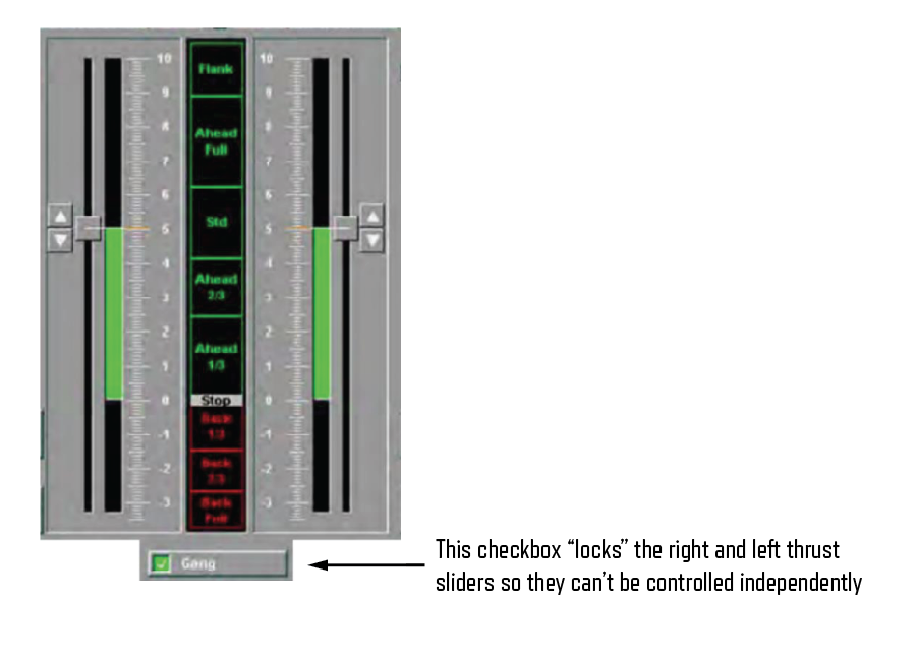
The label next to the checkbox says “Gang.” This is the term used to describe when the controls for the right and left propellors are connected. When this box is checked, the right and left sliders move together. When unchecked, you can move either slider without affecting the other. Perhaps “Gang” is the wrong word to describe this locking function, but let’s give the Navy the benefit of the doubt that sailors are familiar with this term.
The moment this box became unchecked confusion began to spread through the bridge. The crew believed they had lost control of the ship because they were relying on the main steering controls, the rudder, without realizing that the ship was turning because of the secondary steering method, propellors set at different speeds. During the three minutes of confusion, the destroyer veered into the lane of another ship where it was hit.
Two years after the accident, the National Transportation Safety Board (NTSB) released a report detailing the findings of their investigation. Conspicuously absent from their recommendations was any discussion about user interface design. Of their seven safety recommendations, six involve training. Rewritten in human-readable language they essentially said:
- Let the computer drive, and only let humans take control in an emergency.
- When your boat is out of control, use the radio to broadcast your emergency so other boats don’t hit you.
- Steering and thrust are important controls, so you might want to write down instructions so that people can learn how to use them.
- After you write those instructions, put them in the manual.
- Train sailors, then make them take a test to prove they know how to drive the ship. Don’t forget to train them on stearing and thrust.
- There are existing standards and certification processes for ships. Use them.
None of these address design. There was only one recommendation that could potentially point at a problem with the design of the ship’s controls. I will quote this one verbatim. It said,
“Ensuring design principles in ASTM International Standard F1166 are incorporated when modernizing complex systems such as steering and control systems within the Integrated Bridge and Navigation System.”
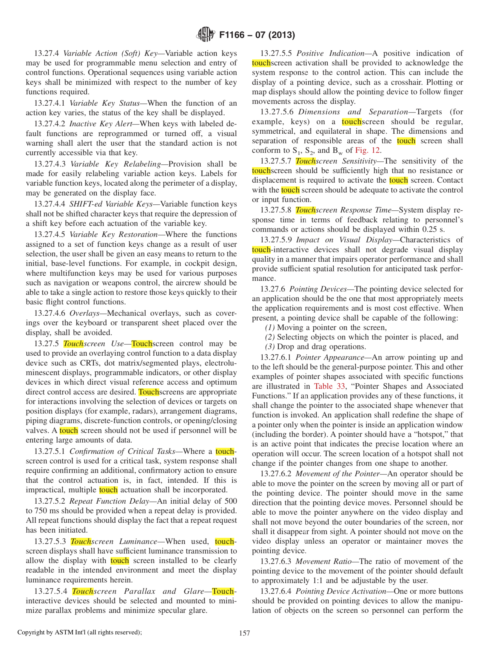
Hoping to find official guidance based on sound design principles, I tracked down the 228 page F1166 document. I was extremely disappointed. I will go into the shortcomings of this document more in section 3, but for now I will show you the international standard’s recommendation for checkboxes.
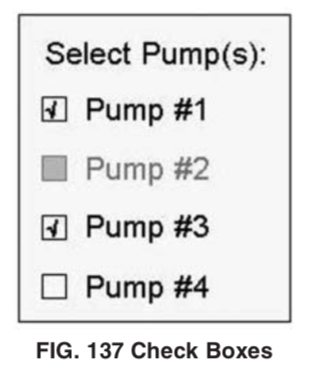
13.13.8 Check Boxes—Check boxes shall have two states, selected and unselected. Check boxes shall be provided if a user must be able to select any number, including all or none, of a set of options. Users shall be able to toggle selected and unselected states on a check box using either a pointing device or the keyboard.
13.13.8.1 Check Box Appearance—Labels shall be provided for each set of check boxes and the style and orientation should remain consistent for groups of check boxes within an application and across related applications. Check boxes shall be arranged in logical order so that the most frequently used boxes are at the top or at the left, depending on how the boxes are oriented. See Fig. 137, “Check Boxes.”
These specifications come from a document written in 1988. Although it was revised in 2007 and 2013, it is fundamentally a relic of Pre-Windows 95 design patterns. Tapping is not even listed as a method for toggling a checkbox because touchscreens didn’t exist when this spec was first written. I can’t confirm this, but my research leads me to believe that touch was the only method of input on these devices because there doesn’t seem to be keyboards or a mouse at any of the ship’s stations.
I doubt that the F1166 document was consulted when the McCain’s controls were designed, but even if they were, it is doubtful that it would have improved the interface. Design is more than covering your butt by following a specification document, it requires careful thinking and intentional decisions.
While a checkbox technically gets the job done, is it the best way to indicate that controls are linked? I am not going to redesign this here, but I would like to point out some of the questions that a designer should be thinking about in this tiny, but critical interaction.
How can I make it clear that when the sliders are ganged? Perhaps instead of being split to the right and left they become a single slider when ganged.
When unganged, how can I show the difference in thrust coming from the right and left? Could I give an indication that the mismatch is causing an imbalance that is pushing the ship right or left? Should this trigger a warning state, perhaps even broadcasting the information on the big screens at the front of the ship?
Could a single button instead of a checkbox reduce the cognitive load of unlinking the propellors? Is there a symbol that could represent ganging and unganging so that a sailor could understand the action without knowing the term “gang?” Where should this be placed so it isn’t confused by surrounding buttons and checkboxes?
As a designer weighs these ideas, prototypes different alternatives, then when a solution seems viable it gets tested. This usability test is crucial, because it validates that it works in the real world, not simply in the mind of a fallible designer. When usability testing is skipped, which is almost certainly the case with this interface, the risk of error is high.
Without an understanding of design, an inspection of the McCain’s user interfaces would conclude that everything functioned properly. The checkbox did its job, as did all the other sterile pieces of the interface. Designers are often mistaken for decorators who simply make things look better. This misunderstanding can lead to the exclusion of designers from critical decisions and results in interfaces that don’t take into account the humans at the center of the computer interactions. It wouldn’t be surprising to learn that the McCain’s controls were created without a designer’s input at all.
Part 2: Human-Centered Design
There were at least 14 crew members on the bridge at the time of the accident. The bridge contained at least nine screens displaying information about the ship’s situation. When the 18-year-old helmsman lost control of the ship, why was no one else in the room able to remedy the situation? It is hard to believe, but despite all these people and all this data, nobody could figure out who was steering the ship. This is a failure of design.
Good design isn’t simply choosing the right buttons or checkboxes. Creating a strong interface requires an understanding of the users and their environment. By empathizing with the person using the interface, a designer can prevent errors, reduce cognitive strain, and help people recognize and recover from mistakes if they should happen. This empathetic approach is called human-centered design. Let’s try to put ourselves on the bridge of the McCain and think about how design failed these sailors.
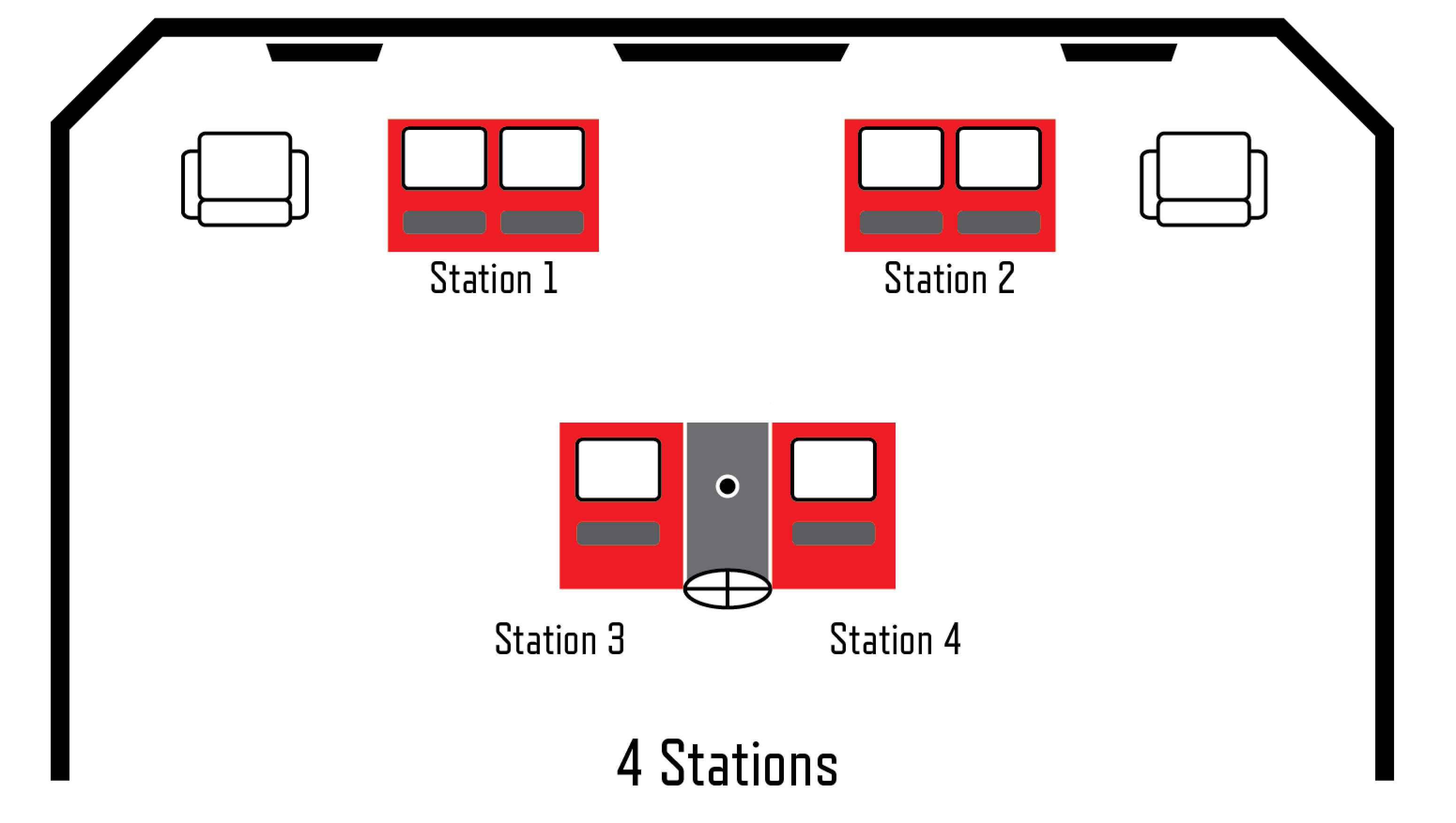
First, let’s understand the bridge layout. The highest ranking officers have seats at the front corners. There are two control stations in the front and two additional stations behind them. Touchscreen controls provide a feature unavailable to older ships constrained by physical levers, knobs, and buttons. Now anyone at any of the McCain’s four stations could take control at any moment. For emergencies there was also a physical wheel on the rear station.
How could a crew be fooled into thinking their ship is out of control? Imagine that you are starting your shift. To maintain a straight trajectory, the previous sailor may have set the rudder 5 degrees right in order to compensate for wind or water current. By design, when the steering controls are passed to your station, your defaults are applied and the rudder is set to zero degrees. From your perspective the boat should continue heading straight, but instead it starts turning left. This causes an illusion of loss of control. Add inexperience, insufficient training, and lack of sleep to the situation and you have a recipe for disaster. Your tiny error gets magnified and compounded as mistakes spread through the crew.
Shouldn’t there be processes to reduce this confusion? Yes, and they are already in place. To avoid a situation where five people are adjusting steering at the same time, procedures exist to transfer controls from station to station. Steering control can be requested by a station or it can be assigned to a station. In either case, the transfer has to be accepted by the other station. This little two-step dance ensures that you don’t send control to an unmanned station and that you don’t receive control of the steering unknowingly. In the case of emergency, there is a big red button that you can press to bypass everything and force everything into manual mode. More on that later.
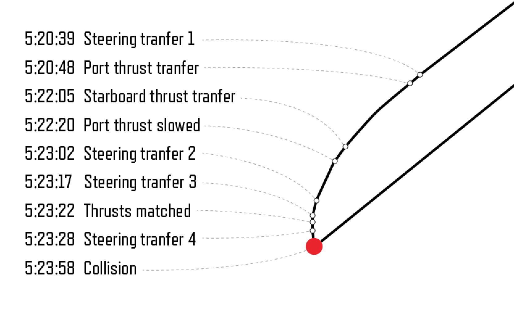
In the minutes prior to the collision steering on the McCain was transferred four times. Above is the timeline showing how in three minutes the ship’s trajectory got worse instead of better with each adjustment the crew made. Below is the user interface that allows the transfer of steering between stations.
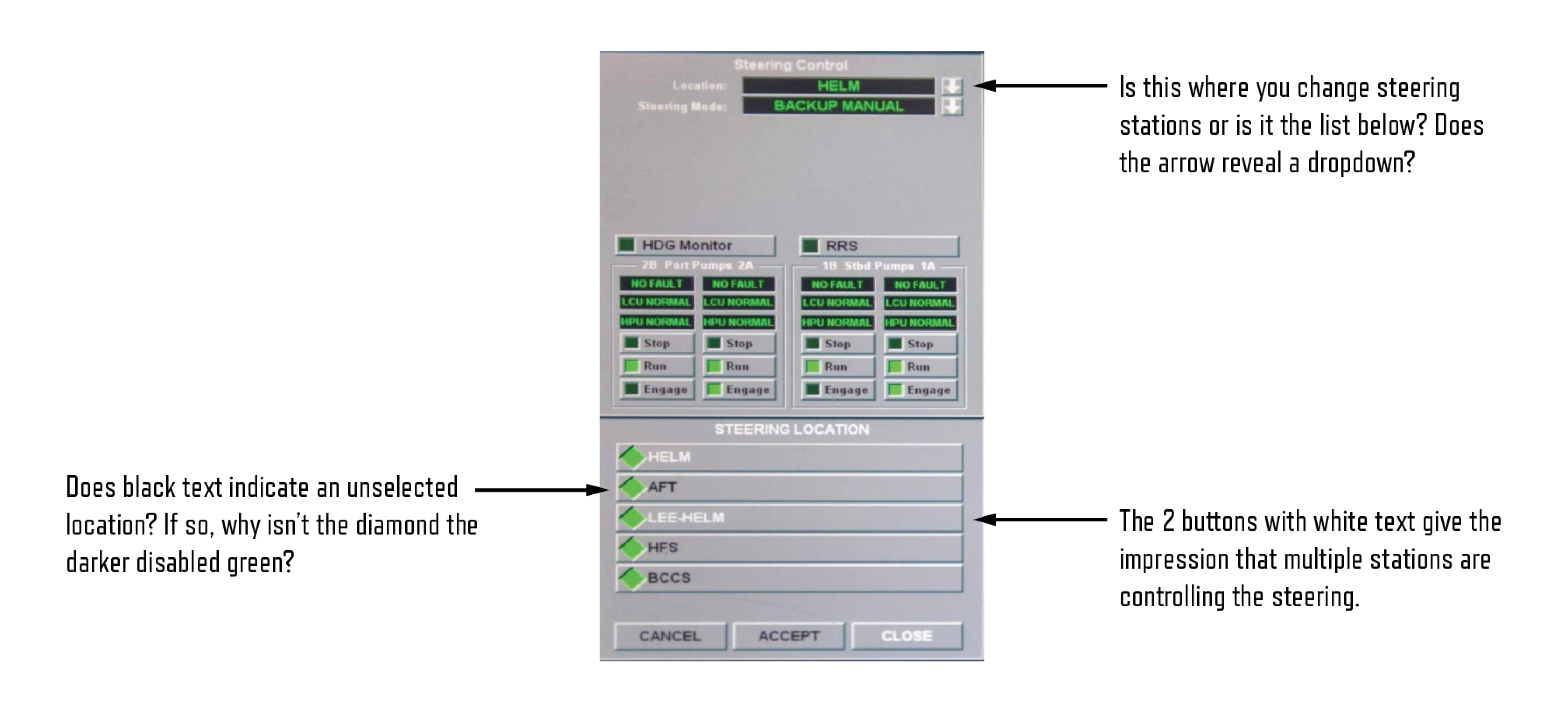
This interface deserves some criticism. It is unclear whether the transfer of steering control is achieved by the field at the top (is that supposed to be a dropdown menu?) or the options at the bottom (are those green diamonds checkboxes or radio buttons or something else)? Does white or black text indicate the steering location is selected? It appears that multiple steering locations are active (white) which probably isn’t possible.
It is hard to even comment on the controls in the center because they are so cryptic and confusing. Perhaps this is describing the conditions of the right/left propellors. Even assuming the acronyms and terminology is understood by a sailor it is unclear what would happen when the buttons are tapped. If I tap “engage” does an action occur instantly or do I have to tap “Accept” below first? Why is the close button the primary option?
The three buttons at the bottom are unnecessarily confusing. What is the difference between cancel and close? Does the accept button apply the settings I have just changed, or am I accepting settings that someone else has transferred to my station?
It is also important to note that this screen introduces a new concept that we haven’t discussed yet. Notice the second menu where a “steering mode” can be chosen. There are five modes that offer varying degrees of computer assistance from autopilot down to backup manual mode. Not every station can support every mode. Confusion is inevitable because when you receive control at your station you need to understand what level of computer-assistance you are also inheriting along with the transfer.
Despite being recommended only for emergencies, commanders say they are more comfortable in backup manual mode. As a result computer assistance is often turned off completely, as was the case on the McCain. A dangerous side-effect of operating in backup manual mode is that it turns off the two-step process where control of the ship must be requested and accepted be both stations. Put more simply, in manual mode anyone can receive control of the ship at any moment without warning.
Like a game of hot potato, steering controls get tossed around blindly. Just like in your car, to confirm that your steering wheel is working, you turn the wheel right and left. This was attempted by the sailors as they tested the only physical steering wheel at the rear station. This proved that the wheel wasn’t active, but it unfortunately left the wheel in a turned position. In the final seconds when control was passed to this manual wheel it turned the ship in the opposite direction from where they wanted to go.
Confusion around steering eventually caused somebody to give a command to reduce speed. Because the throttle controls were still unganged (and probably spread across two stations) the speed was only reduced on one engine. This caused the ship to turn even more sharply. Confusion turned to panic as the boat seems to slip further out of control.
As the sailors were trying to figure out who was steering the ship, the real reason the ship was turning was under their noses. The speed of the propellors was mismatched. How could they miss this? Let’s understand how thrust controls are transferred.
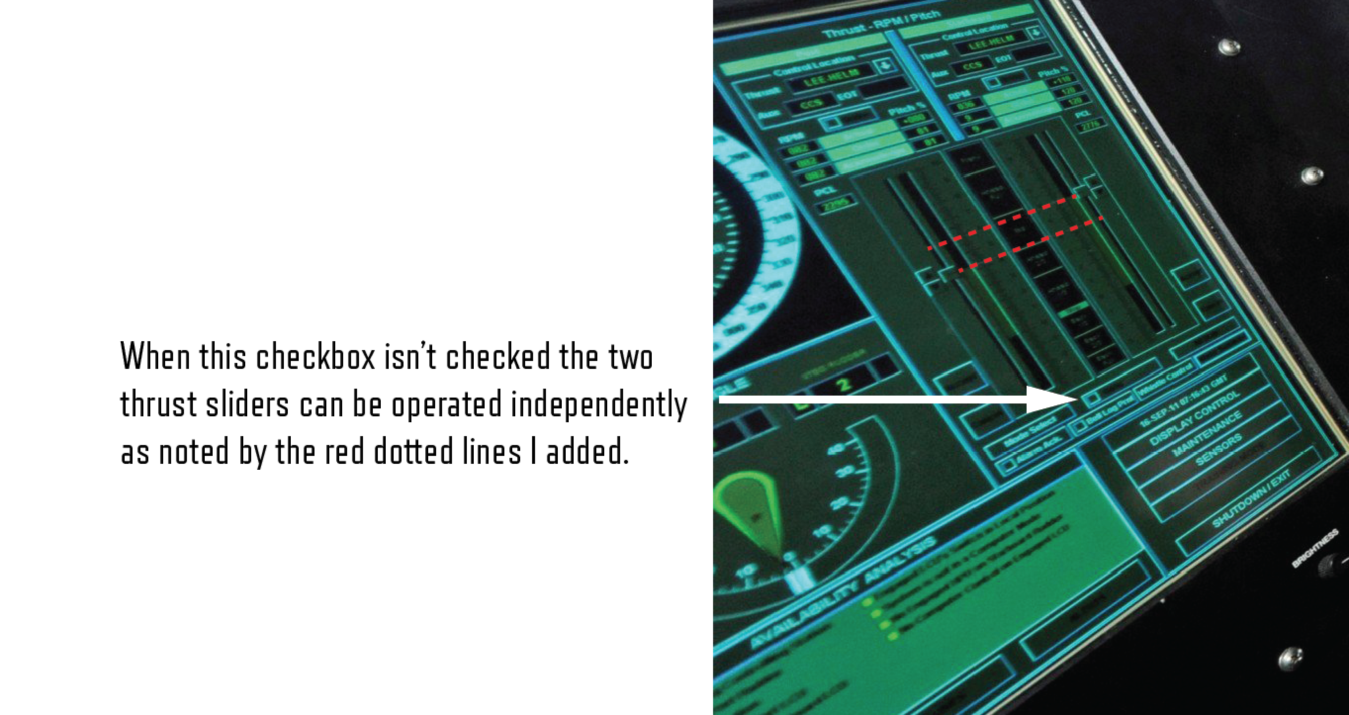
Similar to the transfer of steering to different stations, the thrust of the boat could likewise be passed around. The transfer of thrust comes with an additional level of complexity because the propellors must be transferred one at a time. Half way through a transfer the boat is in a situation where one propellor is controlled by one station and the other is controlled by someone else. At this moment the checkbox labeled “Gang” is automatically unchecked. It wasn’t a human who mistakenly unchecked a box, it was designed to work this way.
It is unclear how the screens appeared in this state, when the thrust controls are spread across two screens. Did half the controls become disabled? Did the gang checkbox disappear? If the checkbox was visible could you tap it? If you could tap on it, would the other station have to approve your request to take full control? This is the moment when good design could have rescued the ship. Blindly adding a checkbox to a screen may meet technical requirements, but without a human-centered design approach the nuances of life-or-death decisions are unlikely to be addressed when the interface is being built.
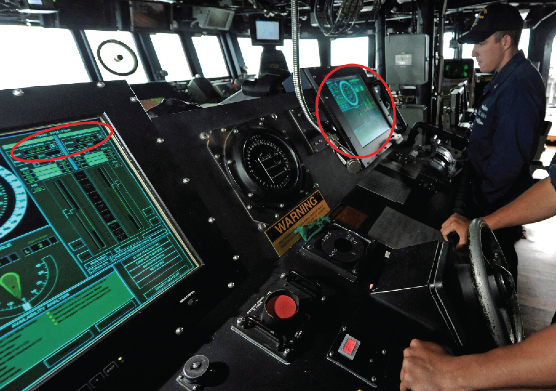
The photo below is not from the McCain, but it does give some clues to how confusion about which station has control could arise. In this picture we can see that the “Lee Helm” is in control of both thrust sliders. The screen on the station to the right appears to display the same information, a mirror of the first screen. If you don’t know or forget which station is the Lee Helm (and the stations don’t appear to be labeled) it is impossible to know which station has control.
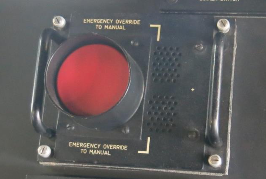
As mentioned earlier, there is also a big red button in the center of the rear control stations. While it is technically called the “Emergency Override To Manual Button” crew members call it the “big red button.” I find it noteworthy that in the midst of so much nautical jargon, sailors occasionally speak like humans. The irony of this button is that it forces the ship into manual mode, the same mode that the ship was already operating under. So it should come as no surprise that even though everyone on the bridge knew there was an emergency, there was no operational benefit to hitting the big red button. Presumably, the big red button might initiate additional emergency functions, perhaps sending a radio message to nearby ships that the boat was in distress, but my research has not verified this assumption. The big red button might as well have been for decoration.
After three minutes of confusion, the throttle is finally unganged and steering is recovered. Unfortunately the crew didn’t have enough time to maneuver out of the way of the oncoming ship. Repairs to the McCain were estimated at $100 million dollars, a price tag that ballooned to $223 million after additional damage was caused during transit to the repair facility.
Part 3: In Defense of Touch Controls
The Navy recently announced they are abandoning touchscreens in their fleet in favor of physical controls. While normally I am opposed to the touchification of everything, I find myself in the odd position of defending the touchscreens.
The decision to revert to physical controls was not made because usability tests had discovered flaws in the touchscreens. It wasn’t the result of a design audit or suggestions by design experts. Instead, the decision seems to largely hinge on the results of a single survey. Admiral Bill Galinis described the process as “_doing some fleet surveys and whatnot._” I hesitate to judge Galinis on a single quote, but this doesn’t sound like somebody who appreciates the importance of user research. To further pick on Galinis, listen to how much nuance his description of the Navy’s technology conveys:
“We really made the helm control system, specifically on the DDG 51 class, just overly complex, with the touchscreens under glass and all this kind of stuff.”
This apparent lack of design vocabulary scares me to the bone. Again, I want to give Galinis the benefit of the doubt, but this is one of the few quotes I can find where somebody publicly acknowledges that maybe design played a part in the McCain accident. Which brings me back to the F1166 document mentioned earlier.
The F1166 is the only design specification mentioned in the reports following investigations into the McCain accident. In the 57 page marine accident report filed by the National Transportation Safety Board (NTSB) titled Collision between US Navy Destroyer John S McCain and Tanker Alnic MC, the NTSB has this to say about touchscreens:
The NTSB concludes that the design of the John S McCain’s touch-screen steering and thrust control system increased the likelihood of the operator errors that led to the collision. Therefore, the NTSB recommends that the Navy ensure that the modernization of complex systems, such as steering and control systems within the IBNS, incorporates the design principles set forth in ASTM International Standard F1166, Standard Practice for Human Engineering Design for Marine Systems, Equipment, and Facilities.
Based on this glowing endorsement of the F1166, let’s see what the international standards are for touchscreens. Included below is page 157, which is the nearly the entirety of its advice for designers implementing touchscreens. Remember, this is the international standard for human engineering design for boats.
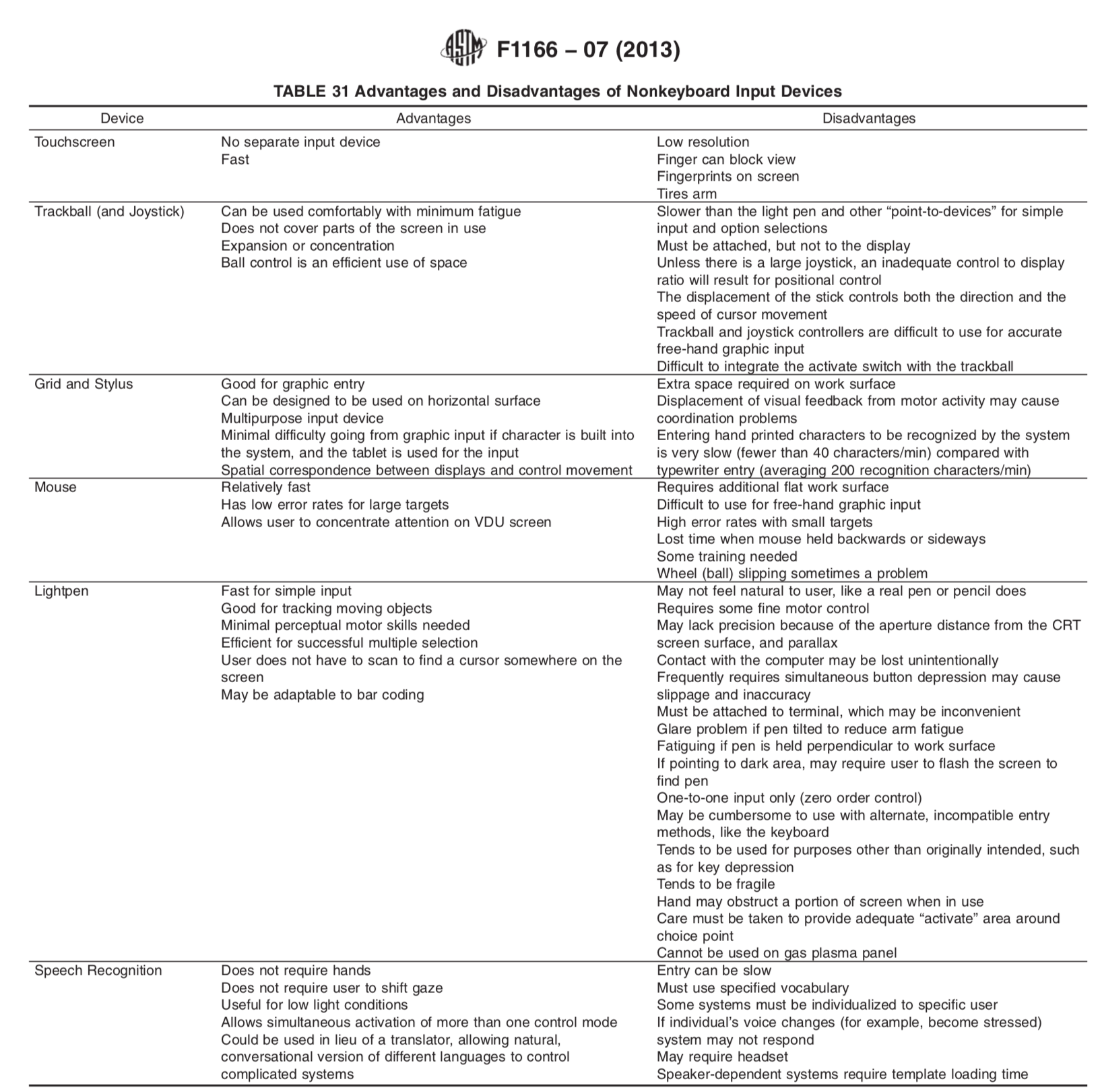
The only other mention of touchscreens comes in a table weighing the pros and cons of non-keyboard input devices. It lists the advantages as not needing a separate input device and being fast. The disadvantages are low resolution, a finger can block view, fingerprints on the screen, and it tires the arm.
I don’t need to explain how much touchscreens have evolved since 1988. To allow this document to remain as the only guidance cited for interface design is an invitation to disaster. I am forced to speculate here, but just like with the checkbox specification, even if the F1166 was referenced by the designers of the McCain’s controls it would have done nothing to prevented the accident.
We should remember that the goal is not better documentation of design rules, the goal is a better, safer end product. That is why I put so much emphasis on human centered design. As I review the documents, quotes, and recommendations post-McCain, what I am really looking for is evidence that there is a culture where design thinking is present. That is very hard to find.
Design criticism is completely absent from the 96 page Strategic Readiness Review. The 177 page Comprehensive Review of Recent Surface Force Incidents (CRR) comes closest to acknowledging the important role design plays in ship safety. In a section titled Human Systems Integration (HSI) and Human Factors Engineering (HFE) it admits:
“In IBNS, the selection of control types (e.g., discrete controls, such as physical levers, buttons, and knobs, versus touch screen controls), their spatial arrangement and density, as well as use of color schemes to clearly indicate out-of-normal conditions were inconsistent with best practices in industry for safety critical control panels.”
It goes on to confirm my suspicions that usability testing was neglected:
“For safety critical controls interfaces, issues like these should be prevented through upfront analysis of human-machine-interface requirements and validated through qualification testing in advance of equipment delivery. If thorough human factors assessments, land-based testing, and design qualification are considered too expensive or time consuming, then modernization of these controls systems should not be undertaken.”
And I applaud this insight even if it is written in lawyer-speak:
“When considering the effects on operator cognitive loading, ability to make decisions with an uncalibrated degree of trust in automation, and potential increases in frequency of error, even modernization only intended to improve reliability can have the opposite effect when the whole human-machine system is assessed.”
But while these statements finally hit the mark, they are only a few paragraphs lost among hundreds of pages of dense documentation. The vocabulary of design professionals doesn’t appear anywhere in the post-accident reporting. The term “user experience” isn’t used once. The term “usability” isn’t used once. The term “design” is used, but only in the generic sense.
Design thinking appears to be the needle lost in the haystack. One of the distinct advantages of touchscreens over physical controls is that they can be iteratively improved. Most of the flaws of the touchscreens could be just one software update away. And yet, instead of iterating to a better design, the Navy will abandon touchscreens based on a preference test. Here is Admiral Galinis again,
“We got away from the physical throttles, and that was probably the number-one feedback from the fleet – they said, just give us the throttles that we can use.”
When surveyed, it should surprise nobody that responses overwhelmingly preferred physical controls over the digital screens. All they know is that the software was confusing, opaque, and required additional training. Given a choice between the existing experience and the old system, what would you expect sailors to say? Somehow the fact that software can be improved doesn’t seem to be an option. Even the survey was poorly designed, because the sailors weren’t asked whether they wanted better designed interfaces.
Without a chance to improve the digital interfaces, touchscreens are going to be replaced or augmented by physical throttles. This puts the designers who are called upon to design the new controls (if they are even included in the process) in a tough position. Rather than address the true causes of user error (visibility into the system, error recovery, confusing UI, etc.) the new interfaces will be forced to combine the digital and physical. It is quite possible that their solution will end up with a situation similar to the big red button. The physical controls may be redundant, and unused. Meanwhile, the underlying design flaws could remain unaddressed.
There is one potential glimmer of hope hidden in the CRR:
Naval Surface Warfare Center Dahlgren was identified as a center of excellence for human factors engineering within the Navy design community. Discussions with their leading experts revealed they had not been involved in specific reviews during modernization of Bridge system.
Apparently there is a Navy design community and conversations are happening that might lead to improved design literacy across the fleet. I wouldn't hold your breath.
Part 4: Design Literacy
I started this essay with a question about why designers have managed to escape criticism in the aftermath of the McCain disaster. Why are ship captains publicly disgraced, their photos publicized for all to condemn, while designers are never even mentioned as coconspirators? My hypothesis is that lack of design literacy has hidden the problem from the very people who are looking for answers.
Without words to describe something, it is essentially invisible.
Because bad design was invisible, the crew, Navy’s leadership, independent investigators, and the media all lacked the skills to describe, let alone fix the problems that caused McCain’s accident.
The teenager at McCain’s controls was undoubtedly proficient with his smart phone, but he probably couldn’t explain why the touchscreen of the ship tripped him up. The best excuse he could find was to blame his training.
At his court-martial, the McCain’s commander, Alfredo Sanchez accepted blame for the 18-year-old’s actions. He said, “I did not put him in a position to succeed.” Sanchez lacked the ability to foresee how the flawed equipment could lead to destruction. In hindsight, all he could point to was lack of training.
As already described, the reports and post-mortem documentation lacked the vocabulary used by design professionals to measure the effectiveness of user interfaces. When making recommendations, only one of the seven suggestions even hinted at design while everything else pointed at training.
The media reports following the accident are satisfied to highlight incompetence of the crew, or to blame big Navy for mistakes. I don’t think the coverage is lazy, instead I believe they literally can’t see the story because of their low design literacy. Take for example an article titled, USS McCain collision ultimately caused by UI confusion, published on Ars Technica. This is one of the only stories that directly implicates bad UI design. Unbelievably, the story fails to backup the headline, somehow forgetting to describe how or why UI contributed to the accident. The best it can come up with is, “the user interface of the bridge’s central navigation control systems certainly played a role.” This writer wants to talk about UI but doesn’t have the vocabulary or design literacy to follow through.
If you don’t have the vocabulary to describe a problem it is unlikely that you will be able to fix it. Without a shared vocabulary to discuss the importance of design, without appreciation for the fundamental ability of design to reduce human error, we blame the victims of bad design. We resort to stereotypes. We blame Big Navy. We create villains out of patriots. Instead of making our ships better we invest in additional training, stupidly assuming that the interfaces will become less confusing if only people try harder. We create rules enforcing mandatory sleep requirements stupidly believing that we can eliminate the potential for a user of the system to be drowsy while at the controls.
Meanwhile, the fixable problems remain broken. Designers escape blame. Hopefully this story helps uncover the role that bad design played in the McCain tragedy and perhaps raises the question of how many other tragedies have design flaws invisibly hidden at their center. If you are a designer, I hope you share this story and join me in evangelizing the critical role design plays in our everyday lives.
If you enjoyed this analysis, I am writing a book about potentially deadly aspects of ordinary life that are invisible to you. It will be titled, User Zero and I invite you to join my mailing list so you can be among the first to discover the dangerous world hiding in plain sight. Stay creative
If you would like to learn more or verify my sources, here are links to additional information about the McCain accident.
The US Navy will replace its touchscreen controls with mechanical ones on its destroyers , The Verge
USS McCain collision ultimately caused by UI confusion, Ars Technica
Comprehensive Review of Recent Surface Force Incidents (PDF), Department of the Navy
Strategic Readiness Review (PDF), Department of the Navy
Standard Practice for Human Engineering Design for Marine Systems, Equipment, and Facilities (ASTM F1166), ASTM International Standards Worldwide
Insufficient Training, Inadequate Bridge Operating Procedures, Lack of Operational Oversight Led to Fatal Ship Collision, National Transportation Safety Board
NTSB Accident Report on Fatal 2017 USS John McCain Collision off Singapore, USNI News
Navy Reverting DDGs Back to Physical Throttles, After Fleet Rejects Touchscreen Controls, USNI News
Former CO of USS John S. McCain Pleads Guilty to Negligence in Collision Case, USNI News
USS John S. McCain Collision, A Year Later, USNI News