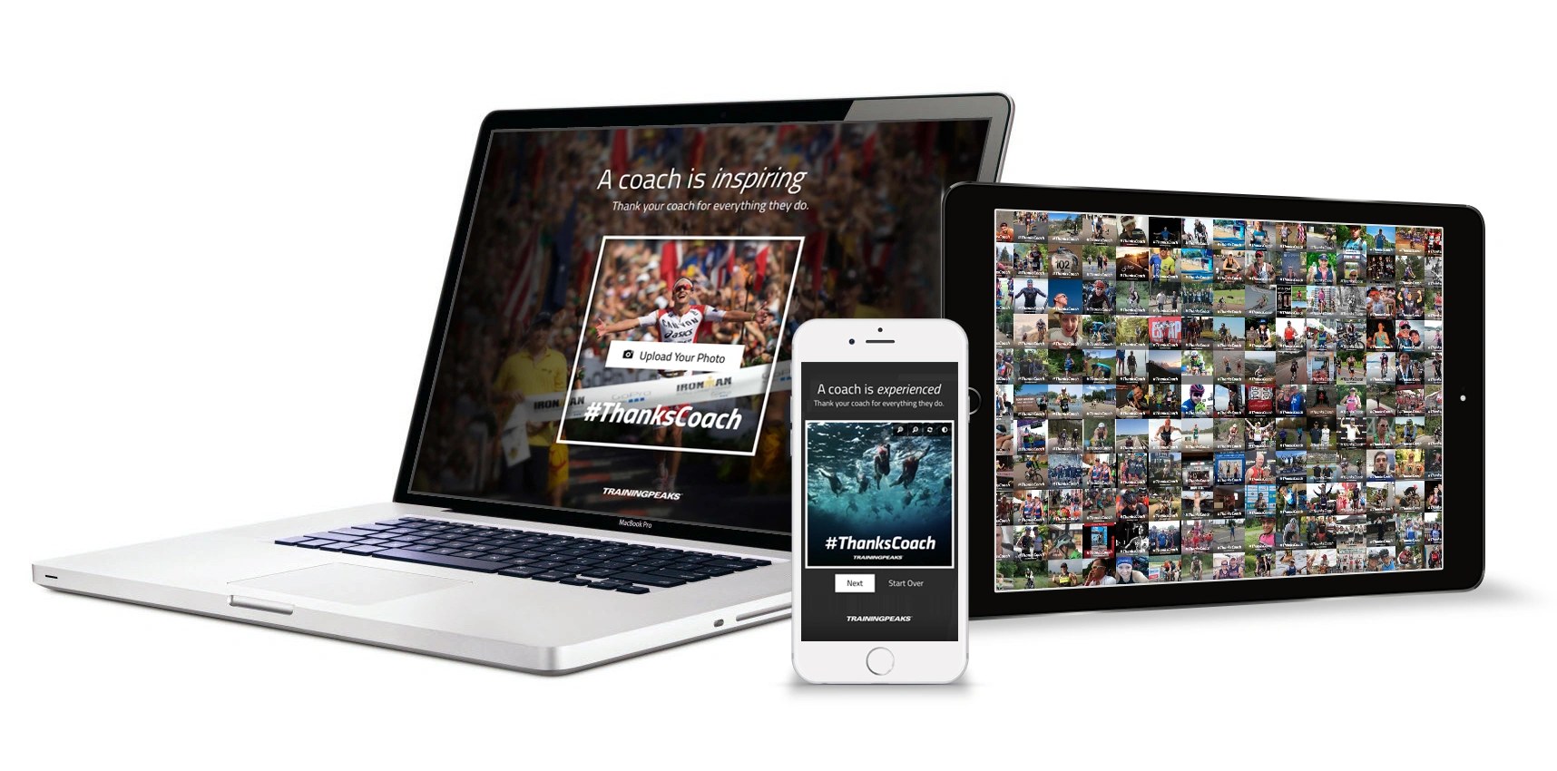
#ThanksCoach: A Viral Tool for Celebrating Coaches
Role: Concept, design & development
Company: TrainingPeaks
When: 2016
Reach: 5,000+ user-generated images
Introduction
Everything TrainingPeaks does sits on one relationship: the one between an athlete and their coach. So when we wanted a campaign that would get athletes talking about us, the most authentic angle wasn’t to talk about our software — it was to celebrate the coaches. The idea was #ThanksCoach: a little web tool that let any athlete build a personalized image thanking their coach and share it to social media in a few clicks. I designed and built the whole thing — the brand direction, the interface, and the code that generated the images.
It worked. Athletes made and shared thousands of them, and along the way the campaign quietly doubled as a discovery funnel for our Coach Match Service. It remains one of my favorite examples of a principle I keep coming back to: the best way to prove an idea is to ship it.
1. The goal: make something people actually want to share
A “share your gratitude” campaign is easy to describe and hard to execute. The hard part isn’t the sentiment — it’s producing an image that’s clean and striking enough that someone is proud to post it to their own feed. If it looks like a corporate ad, no one shares it.
So I set a few constraints up front:
- The output had to be an uncluttered, beautiful image — the kind of thing that looks good on a personal timeline, not a banner ad.
- The tool itself had to be quick to done. Upload, tweak, share. No accounts, no friction.
- And we had to decide how much of the TrainingPeaks brand to impose. Tightly branded would reinforce us; a looser, more unexpected look would feel more like the athlete’s own expression — and, ironically, get shared more widely.
2. Early experiments: real photos break beautiful designs
My first designs looked great on the carefully chosen photos I used to mock them up. Then I applied them to the kind of photos real athletes would actually submit — and they fell apart. A name banner landed across someone’s face. Busy race backgrounds swallowed the type. Low-resolution phone shots looked rough next to crisp studio imagery.
This is a lesson I’ve learned over and over: design for the messy real input, not for the demo. A tool that only looks good when the user does everything right isn’t finished. I needed a treatment forgiving enough to make almost any photo look intentional.
3. Three directions, one decision
Rather than guess, I developed three complete directions and walked the team through the trade-offs:
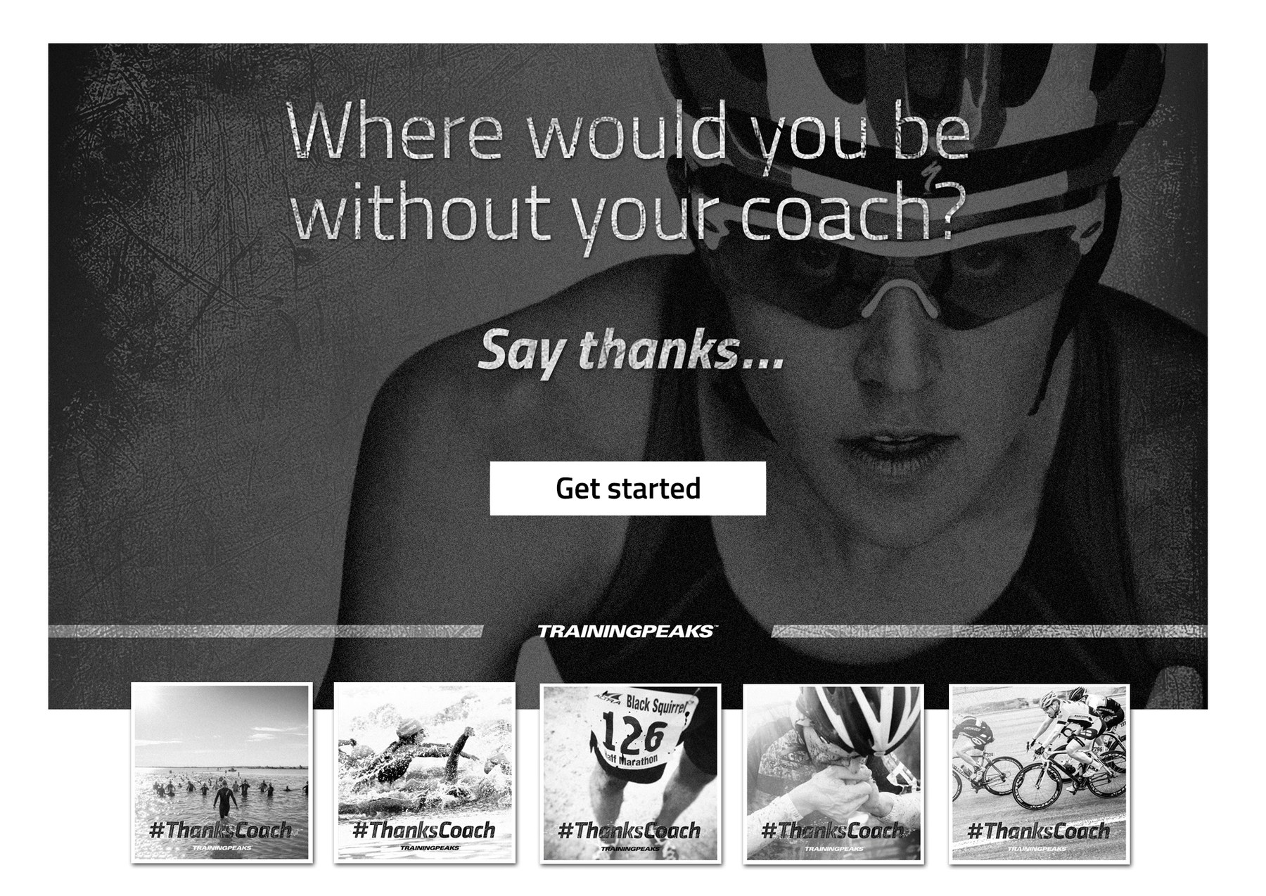
- Gritty and unbranded — rich black-and-white, distressed type, no TrainingPeaks colors and no coach’s name cluttering the frame. Less about us, more about the raw emotion of the sport. Because this direction wasn’t bound by our brand guidelines, it had room to feel like the athlete’s own statement.
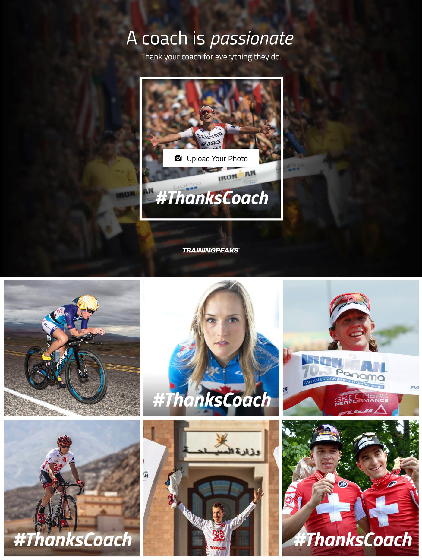
- Color and minimal — keep the photos in color, give the user almost nothing to adjust, and let a bold #ThanksCoach do the work.
- Fully brand-compliant — built on our existing responsive templates and styles, the safest and most “on-brand” option.
We chose the gritty black-and-white direction. The high-contrast, monochrome treatment did exactly what I needed: it unified wildly different source photos into one consistent, share-worthy look, and it put the feeling — gratitude, grit, the bond with a coach — ahead of the logo.
4. The tool I built
The experience was deliberately short. Upload a photo, nudge and crop it to taste, add a short message to your coach, and share it straight to Twitter or Facebook — or download it to post anywhere.
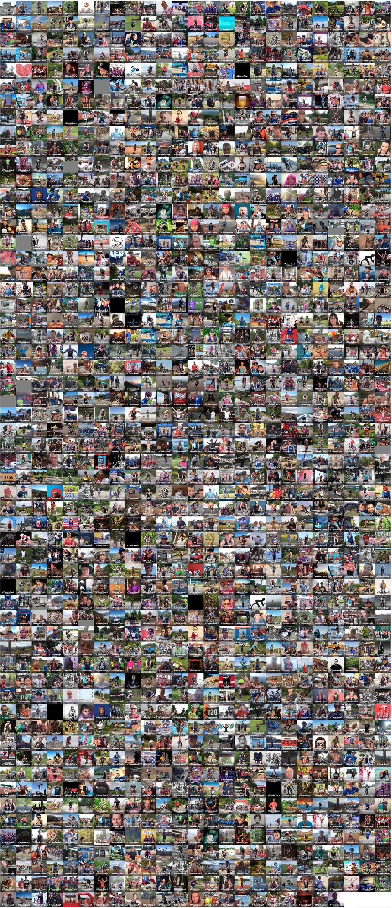
Under the hood I built it as a self-contained microsite. The image was composed right in the browser on an HTML canvas (using Fabric.js and Handlebars), so the athlete saw their creation update live. A small PHP backend saved each finished image — and automatically generated a second, social-optimized wide version so the shares looked right in a Twitter or Facebook card. The home page then pulled every submission into a living mosaic, and folded in a promo for our Coach Match Service so an athlete inspired by someone else’s coach could go find one of their own.
5. Thousands of thank-yous
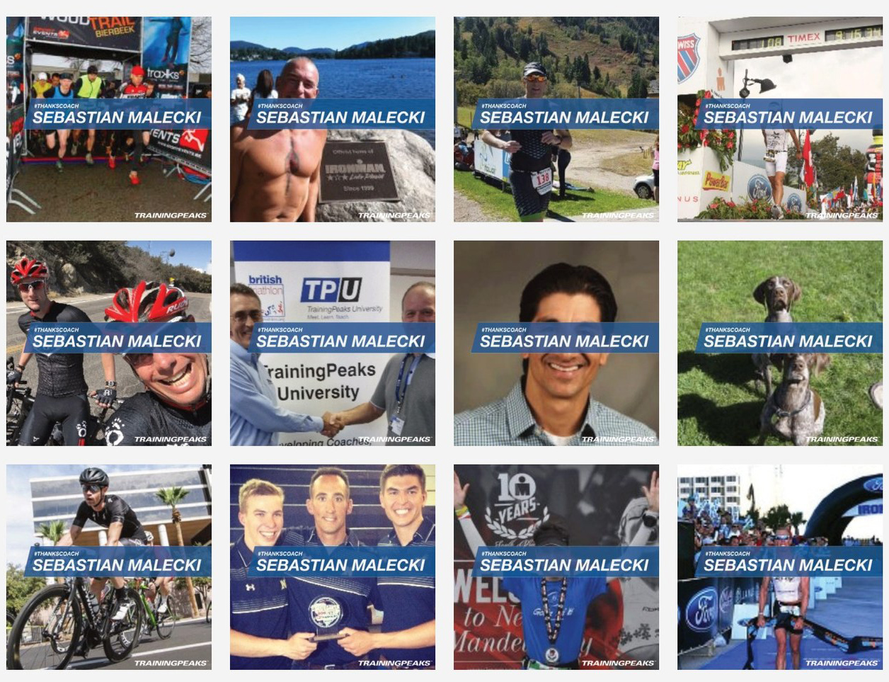
Athletes ran with it. The tool generated more than 5,000 #ThanksCoach images — finish-line hugs, podium shots, long training rides, the occasional dog — each one a public, personal thank-you to a coach, and each one carrying the TrainingPeaks name into a feed we’d never have reached with advertising.
That was the real win. The campaign didn’t ask people to care about our product; it gave them a reason to celebrate the person who got them to the start line, and let our brand ride along with the gratitude. And every share quietly reinforced the marketplace I’d been designing — turning a moment of thanks into a doorway to finding a coach.
What it taught me
#ThanksCoach pulls together a few threads that run through my work. It was self-built end to end — concept, brand, interface, and code — in the same spirit as the Ghost-O-Meter, proof that the fastest way to validate an idea is to make the real thing and put it in people’s hands. It was an exercise in designing for unpredictable real-world input rather than the polished demo. And it was emotion-first branding: by stepping back from our own logo and putting the athlete-coach relationship at the center, the campaign earned a reach that a more self-promotional approach never could.
It also sits right alongside the rest of my TrainingPeaks work — the Coach Marketplace it helped feed, and the broader decade of fitness-tech design it belongs to.