OnForm: Branding a Video Coaching App
Role: Freelance brand identity & website design.
Client: OnForm — a video analysis tool for coaching
When: 2019
Scope: Visual identity, marketing site, app-store presence

Introduction
OnForm is a video analysis training platform that helps athletes and coaches analyze and improve their form. It uses video capture and form assessment to identify the exact point where an athlete’s form breaks down. This information is critical because it allows a coach to show athletes exactly where they can improve.
As the concept for this app was just taking shape, I was brought in to create the visual identity that would introduce it to the world.
When I design a logo I like to apply it across a website, an app icon, and a hero image — so the team could “try them on” and imagine what the OnForm brand could grow to become.
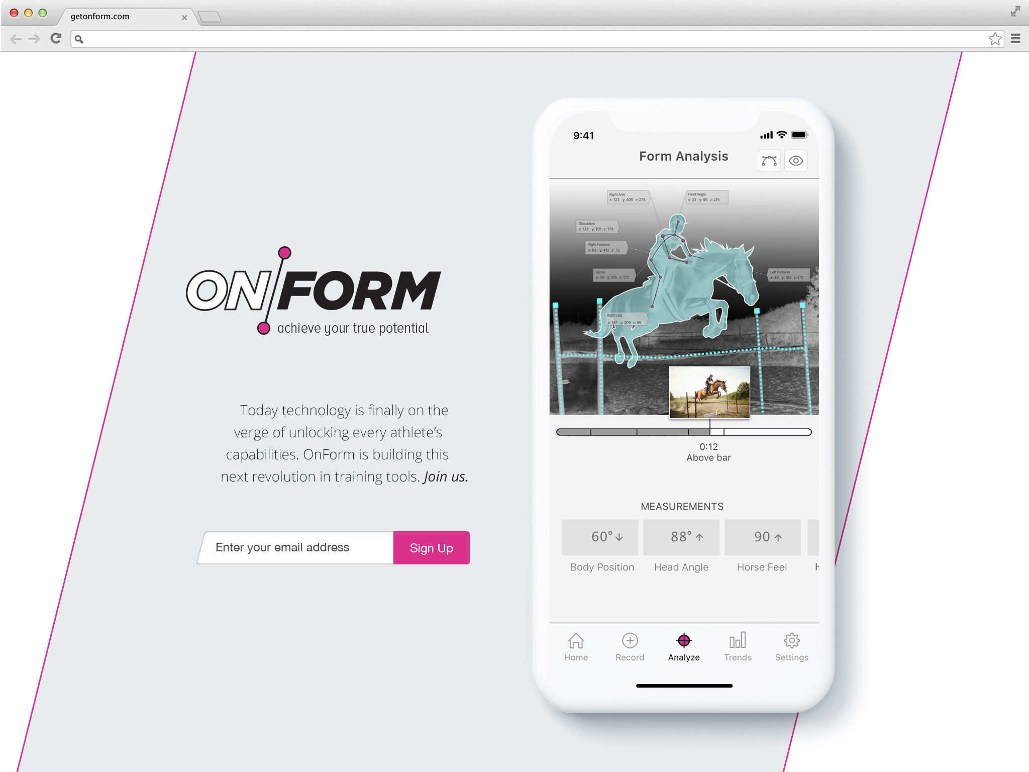
The wordmark connects “ON” and “FORM” with a line and a pair of node points — a direct nod to the motion-tracking and pose analysis at the app’s core, which works by connecting points across an athlete’s body. The mark is the product’s logic: points, connected. A single accent dot doubles as the universal symbol for record — the first action every user takes.

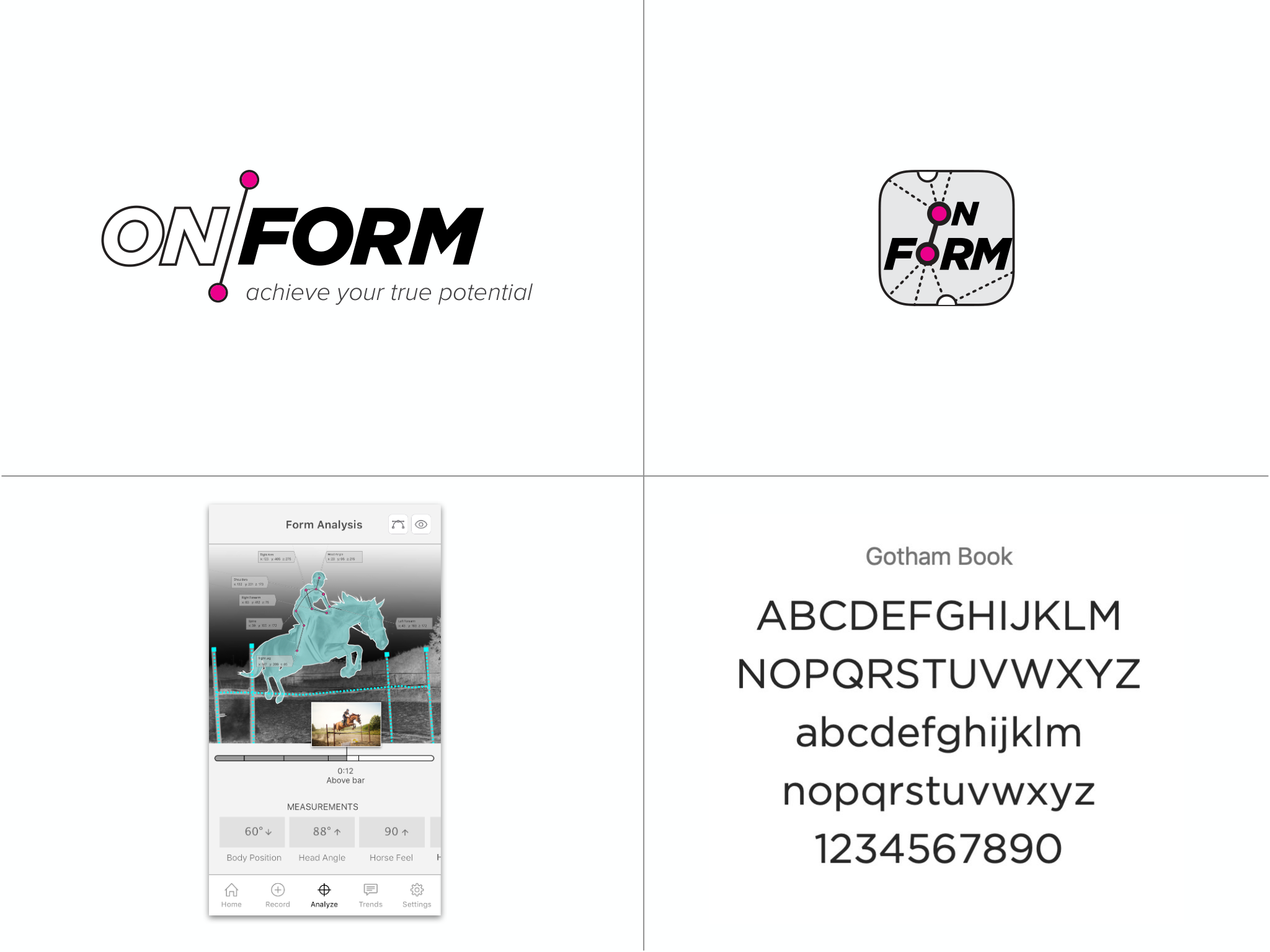
A logo only matters once it becomes a system. I extended the chosen direction into a full identity — the wordmark and its “achieve your true potential” tagline, an app icon that wraps the mark in the motion-tracking node pattern, and Gotham Book as the typeface: a geometric sans that reads as athletic and modern.
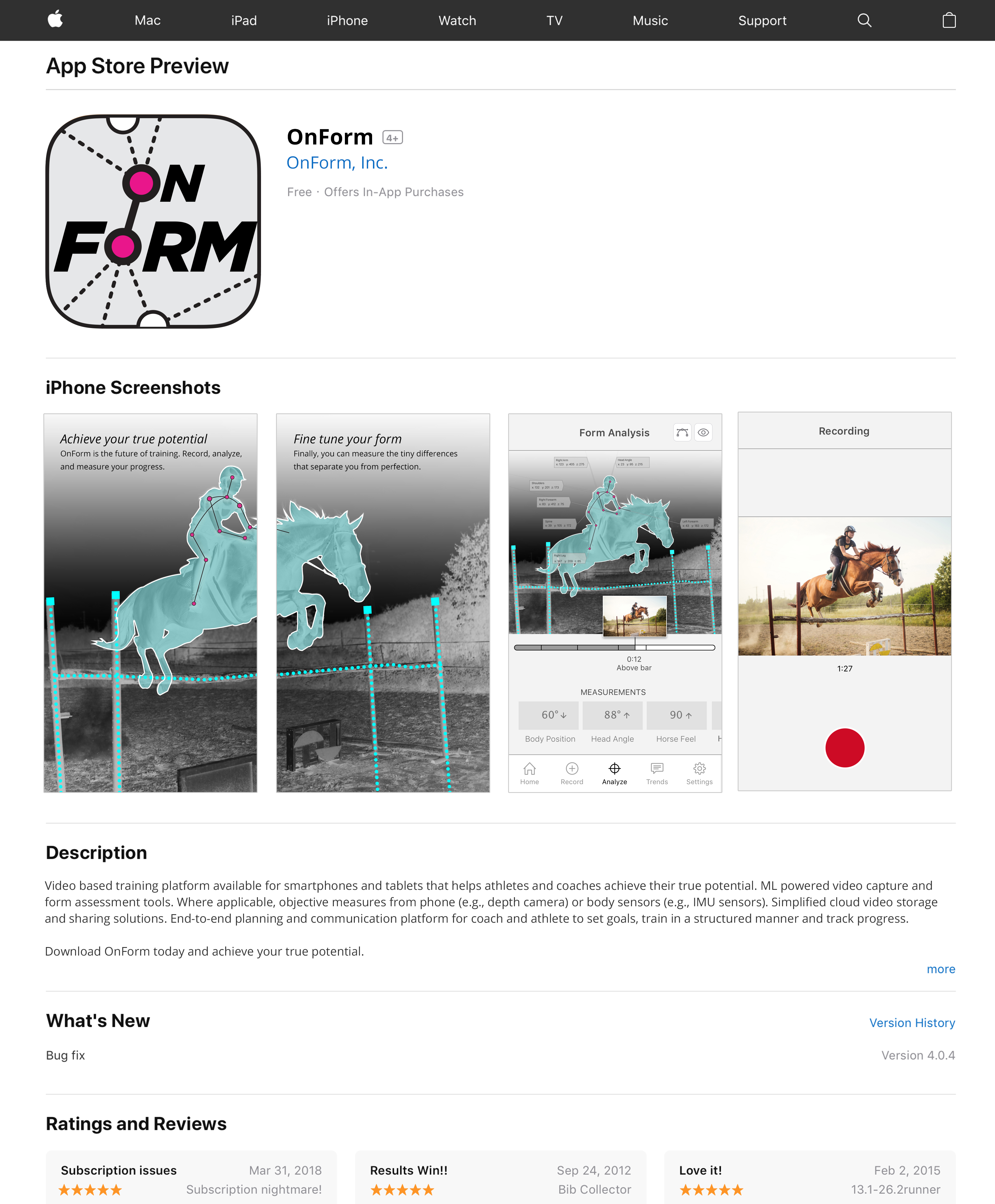
A brand lives or dies at the point of download, so I designed OnForm’s app-store presence around the same system: a bold app icon carrying the record-dot motif, and screenshots that show the product doing its real job — analyzing an equestrian rider’s position, scoring body position and head angle, capturing a recording in the field.
The same treatment carried into marketing imagery across sports, so the brand felt coherent whether you encountered it for tennis, running, golf, or equestrian.

Conclusion
OnForm’s brand has evolved in the years since I proposed this initial art direction, and the identity I designed is no longer the one the app wears today. The job of an early-stage brand is to give a young product a face confident enough to take it to the next phase. It did that and helped a promising idea look ready for the world.