Rebranding Zila: One Identity Across 16 Medical Products
Role: Creative Director, Zila
When: 2012–2014
Scope: Brand identity, packaging, product launches, and product photography for a dental & medical-device company
Introduction
When I joined Zila as Creative Director, the company made dental and medical devices — instruments, diagnostics, and consumables — but it didn’t look like one company. Sixteen products had drifted into sixteen looks, and the brand had lost any sense of a shared identity. Over two years I led a full rebrand: a new identity for Zila and its sub-brands, the system to keep it consistent, and the packaging, launches, and photography that brought it to market — all under the constraints of a regulated medical-device industry.
1. The Problem
One company that looked like sixteen
A medical-device catalog is sprawling by nature, and Zila’s had grown without a unifying hand. Each product line had its own logo, color, and packaging conventions, so nothing on a shelf or in a sales kit signaled that these products came from the same trusted manufacturer. For a company selling to dental and medical professionals — an audience for whom trust and credibility are everything — that inconsistency was a real liability. My mandate was to give Zila a single, confident identity and then make it stick across all 16 products.
2. A New Identity
A mark built from a single idea
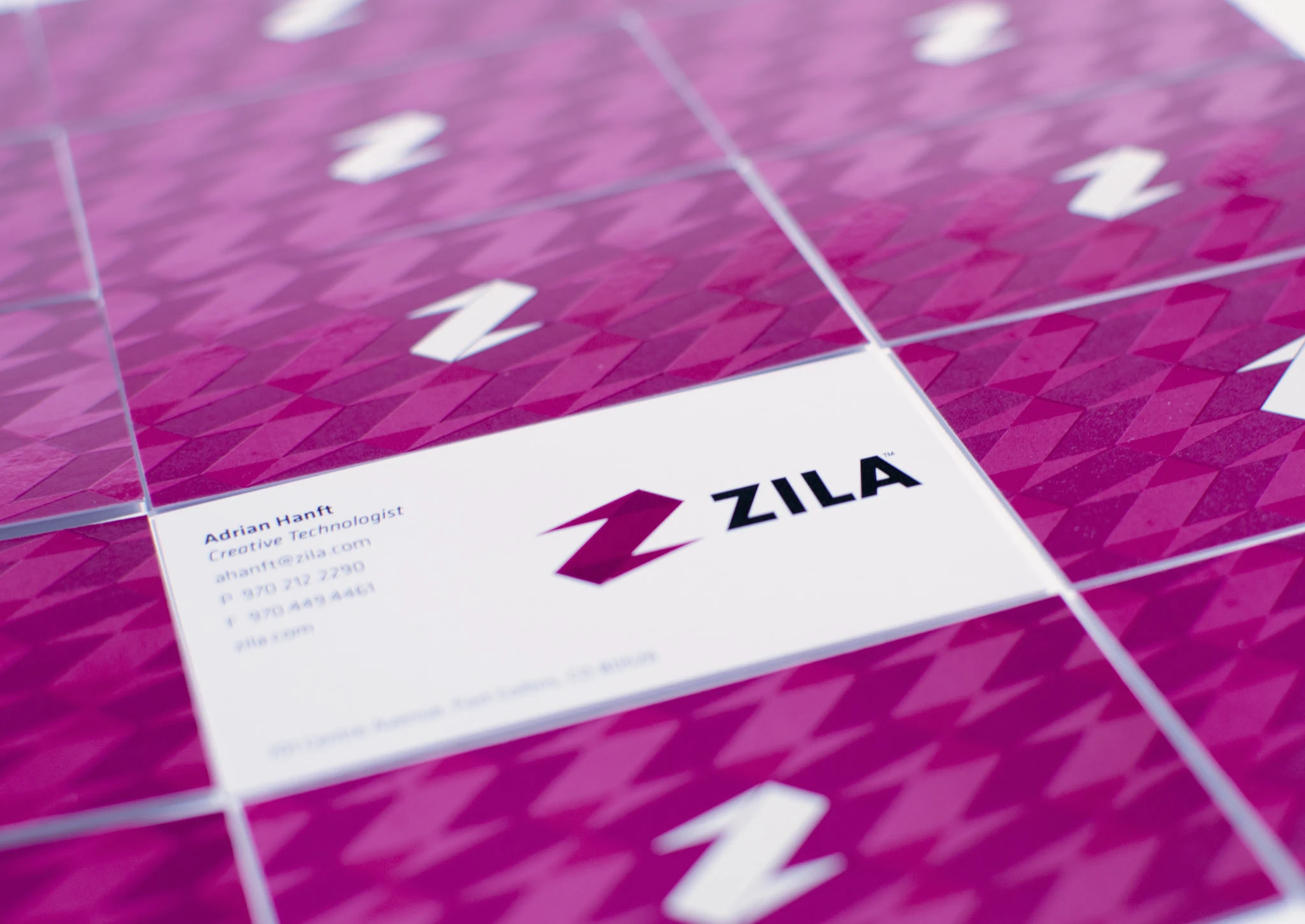
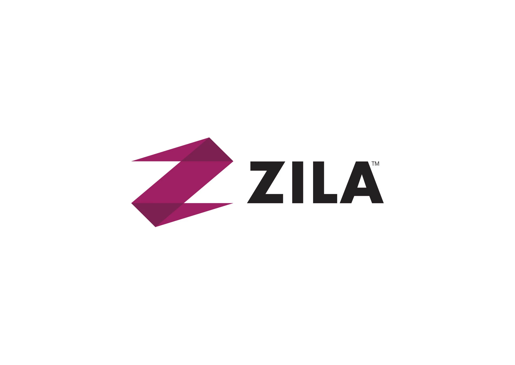
The rebrand centered on a new Zila logo: an angular, faceted “Z” in a confident magenta, paired with a clean, modern wordmark. The geometry of the Z became a flexible system — it could fold into a houndstooth-style pattern for collateral, anchor a business card, or scale down to a product mark.
3. A System, Not Just a Logo
Guidelines that let a brand survive contact with the real world
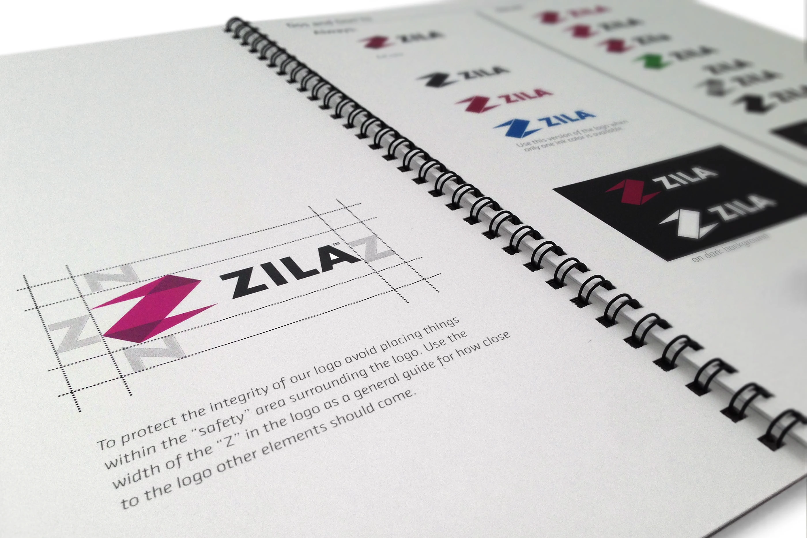
A logo is only as strong as the rules that protect it, especially in a company where dozens of people — and outside printers and vendors — would be applying it. So I produced a full brand identity toolkit: a style guide covering logo construction, clear-space, color, typography, correct and incorrect usage, and how the system extends to sub-brands.
4. Bringing Products to Market
Creative direction for launches and packaging
With the system in place, I defined the creative direction for major product launches — and designed the brochures and packaging (in InDesign) for multiple product lines, coordinating with printers and vendors to get them produced. Sub-brands kept their own product identity while clearly belonging to the Zila family. The biggest of these was the relaunch of Rotadent Contour, which earned its own end-to-end campaign — see the Rotadent Contour launch case study.
Because these are regulated medical devices, none of this happened in a vacuum: I worked directly with the regulatory and legal departments to make sure every design — every claim, label, and packaging element — conformed to government standards before it shipped.
5. Showing the Products at Their Best
Product photography
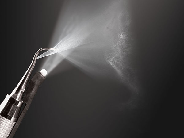
A medical instrument has to look precise and trustworthy. I created and art-directed product photography across the catalog, collaborating with photographers to give Zila’s instruments a consistent, high-end look — clean studio lighting, dramatic detail, and a visual language that matched the new brand.
Conclusion
Over two years I rebranded Zila and brought visual consistency to all 16 of its products, built the guidelines and toolkit that kept the identity intact, directed its product launches and packaging, art-directed its photography, and did it all within the guardrails of a regulated industry — while managing the creative team’s projects and mentoring a junior designer. Zila went from sixteen disconnected products to one credible brand.