Rotadent Contour: A “Do the Math” Product Launch
Role: Creative Director, Zila
When: 2013
Scope: Brand identity, packaging, website, advertising, and the full launch campaign for a relaunched electric toothbrush
Introduction
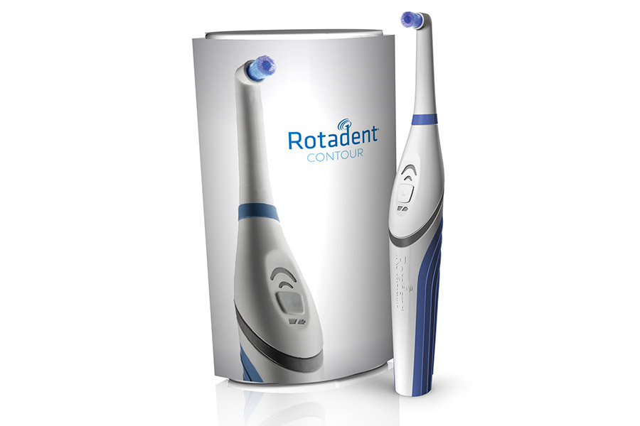
Rotadent isn’t a drugstore toothbrush. It’s a professional, dentist-sold electric brush with a 25-year history and a genuine cult following among the hygienists and patients who swear by it. In 2013, Zila completely redesigned it and relaunched it as Rotadent Contour — and as Creative Director I led the launch design across every touchpoint. The whole campaign hung on a single, simple idea: “Do the Math.”
1. A Cult Brand, Reborn
Honoring 25 years while signaling something new
The challenge with relaunching a beloved product is respecting its loyalists while convincing the market it’s genuinely new. The refreshed Rotadent Contour identity kept the trusted name and a clean, clinical blue palette — credible to dental professionals — while the new brush-head mark and modern wordmark signaled that this was a real redesign, not a reskin.
2. The Idea: “Do the Math”
Let the numbers be the hero
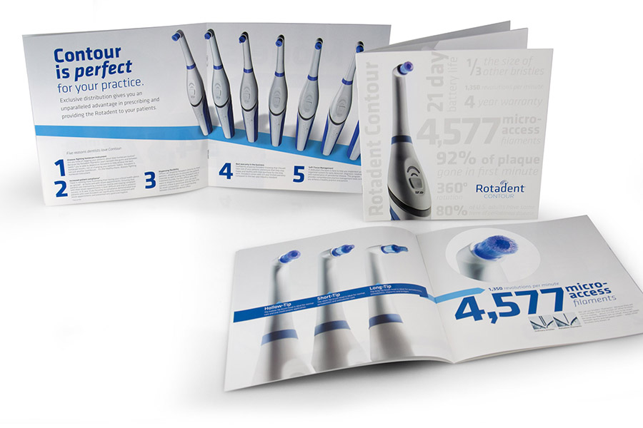
Most toothbrush marketing is interchangeable. Rotadent’s advantage, though, was genuinely quantifiable — so instead of vague claims, we made the numbers the campaign. Rotadent Contour is the only brush that can claim 360° rotation, over 4,500 micro-access filaments (4,577, to be exact), and 1,350 revolutions per minute — removing 92% of plaque in the first minute. “Do the Math” turned those specs into the through-line that connected every piece of the launch, from packaging to the website.
3. A Full-Funnel Launch
One idea, every touchpoint
A product relaunch lives or dies on consistency, so Zila’s in-house marketing team produced the entire campaign as one coherent system — and I led the design across it, working with launch partners including Moxie Sozo, Definite Productions, Cambon Studios, and Syncroness.
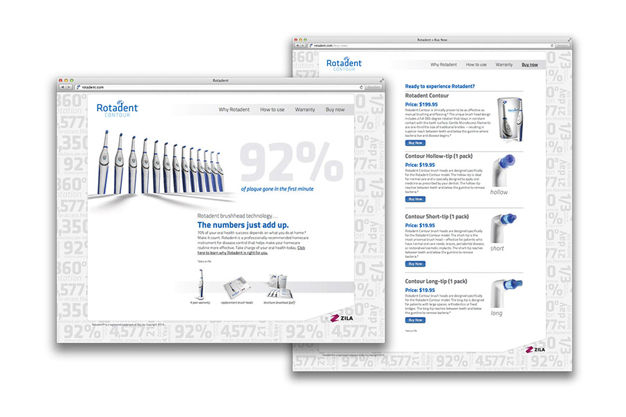
The website made “the numbers add up” literally, leading with “92% of plaque gone in the first minute” and a clean path to purchase.
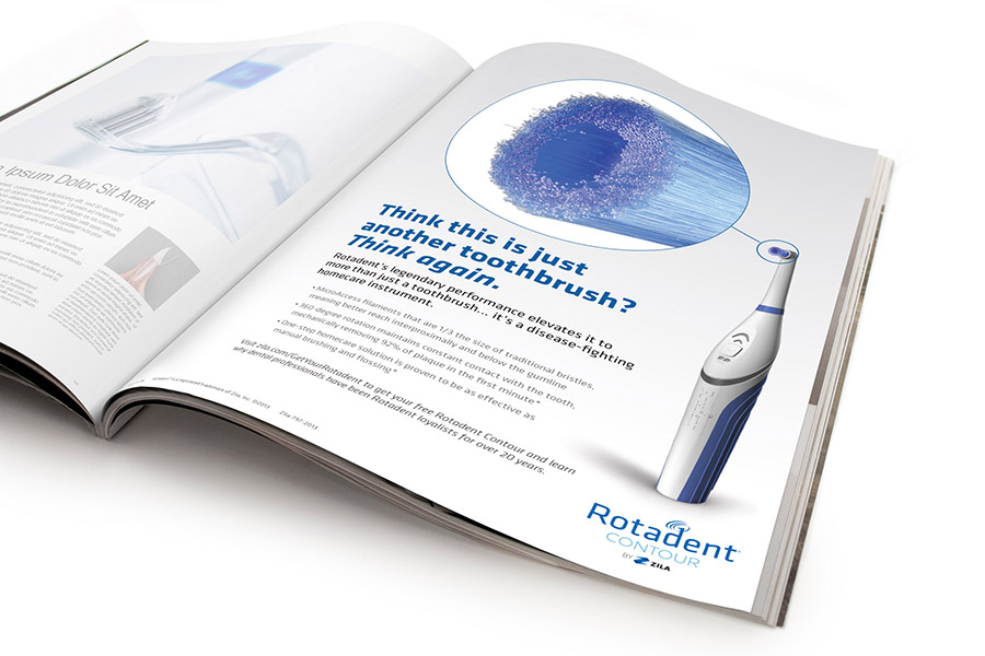
Advertising ran in dental trade press, reframing the brush as more than a toothbrush — “Think this is just another toothbrush? Think again.”
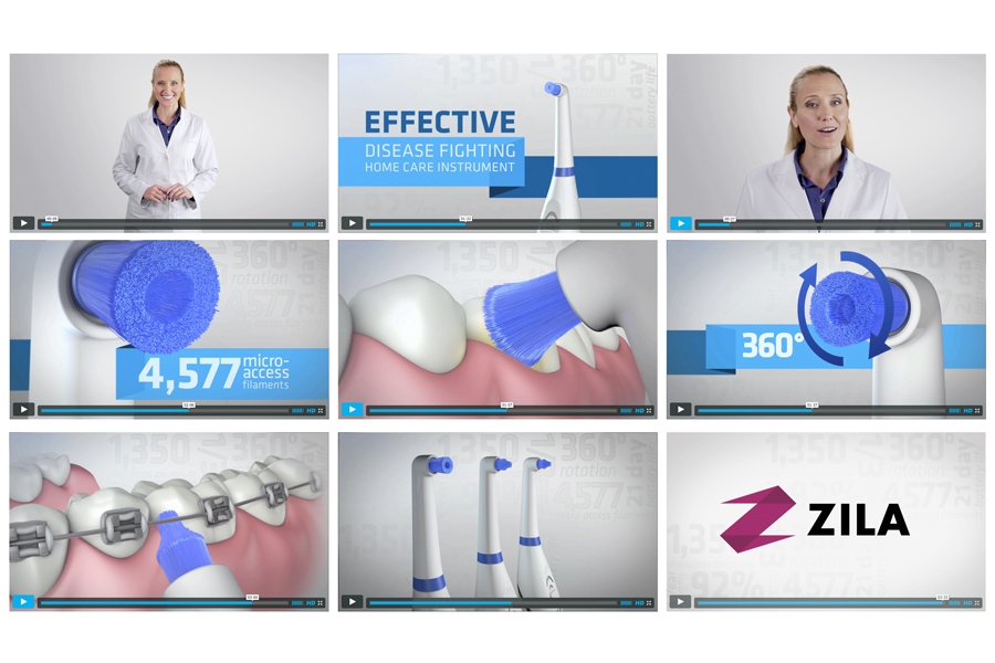
A product video with 3D animation showed what words couldn’t — the 360° rotation and the micro-access filaments reaching where ordinary bristles can’t, around braces, implants, and the gumline.
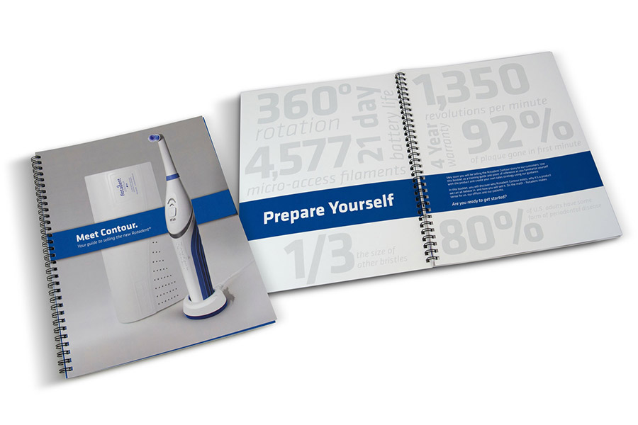
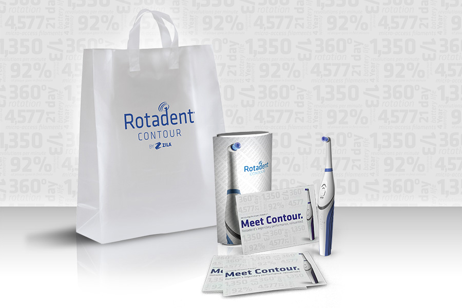
Because Rotadent is sold through dental practices, the launch also had to equip the people selling it. We produced a training manual to help reps and practices sell the new Contour, and launch kits, direct mail, shirts, and tradeshow materials that carried the “Do the Math” numbers all the way to the booth.
Conclusion
Relaunching a 25-year-old product to a loyal professional audience is a balancing act: honor what people love, prove what’s new. “Do the Math” threaded that needle by letting Rotadent Contour’s own measurable advantages carry the story — one idea expressed consistently across identity, packaging, web, advertising, video, sales tools, and the tradeshow floor. It’s the kind of end-to-end launch where the design is only as strong as its weakest touchpoint, so every touchpoint had to add up.