Red Rocket: Building the Brand of a Web Agency
Role: Creative Director, Red Rocket Web Specialists
When: 2009–2011
Scope: Company rebrand, creative strategy, and art direction for dozens of client websites
Introduction
Red Rocket Web Specialists was a Northern Colorado web agency, and as Creative Director I had two jobs at once: shape the work that went out the door for dozens of clients, and shape how Red Rocket itself showed up in the world. This case study is about the second one — rebranding the agency and defining its creative strategy — because an agency’s own brand is the clearest proof of what it can do for everyone else.
1. The Mark
A name you can actually draw
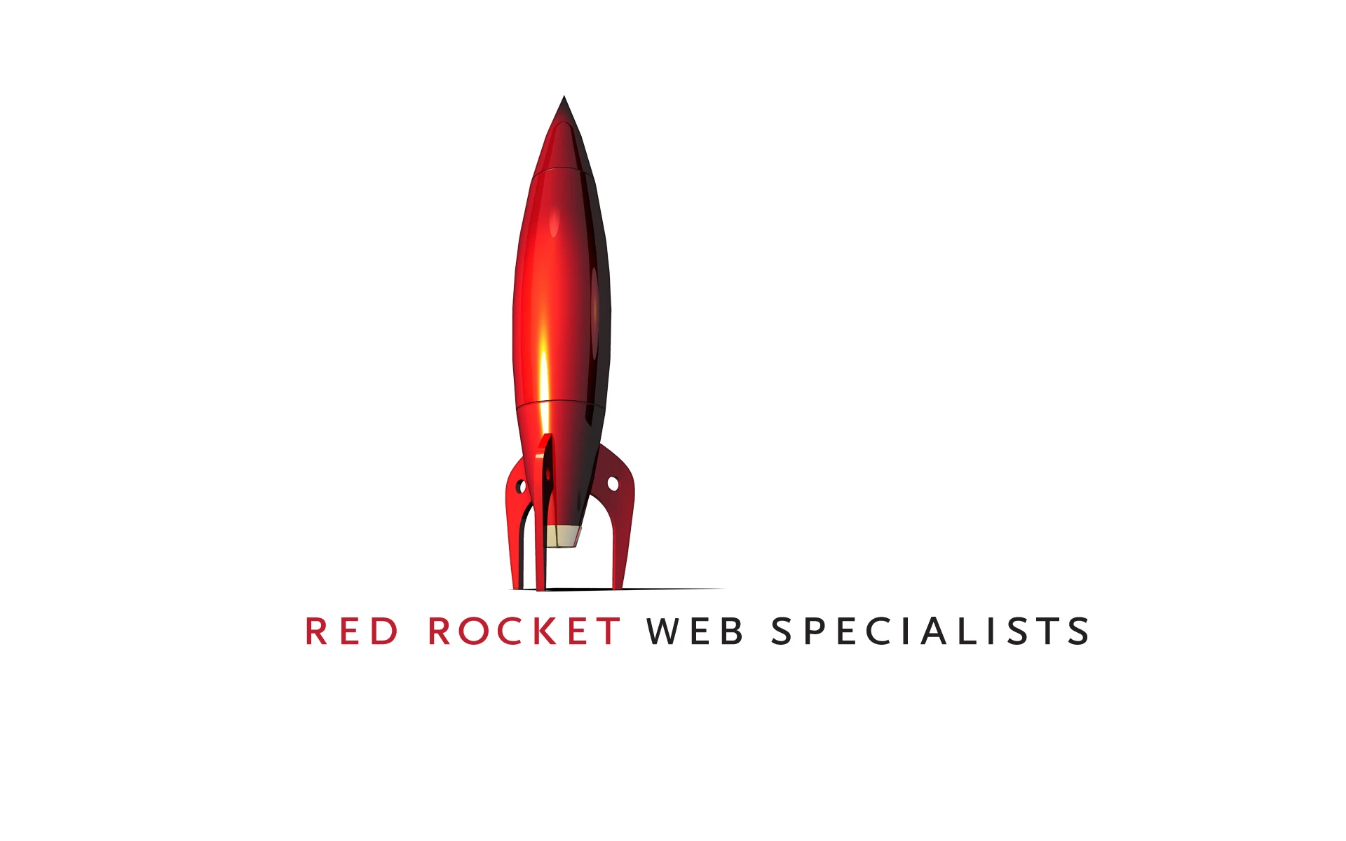
“Red Rocket” is a gift of a name — it’s concrete, energetic, and instantly visual. I leaned all the way into it with a glossy, dimensional red rocket as the centerpiece of the identity, paired with a clean two-weight wordmark that lets “RED ROCKET” pop and “WEB SPECIALISTS” recede. A compact “RR” monogram handled the small spaces — favicons, the site header, social avatars — where the full rocket wouldn’t fit.
2. A System With Personality
One identity across every touchpoint
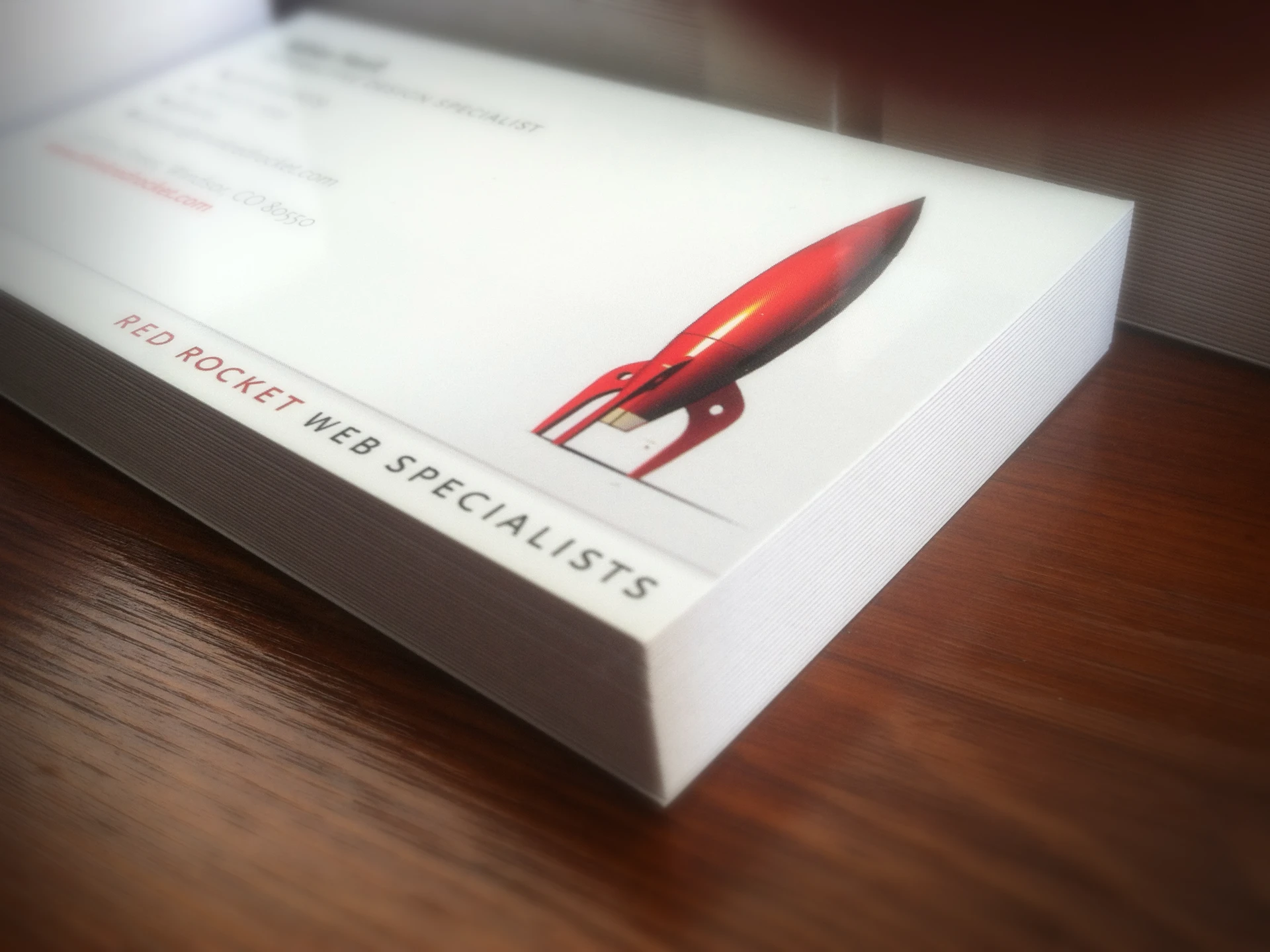
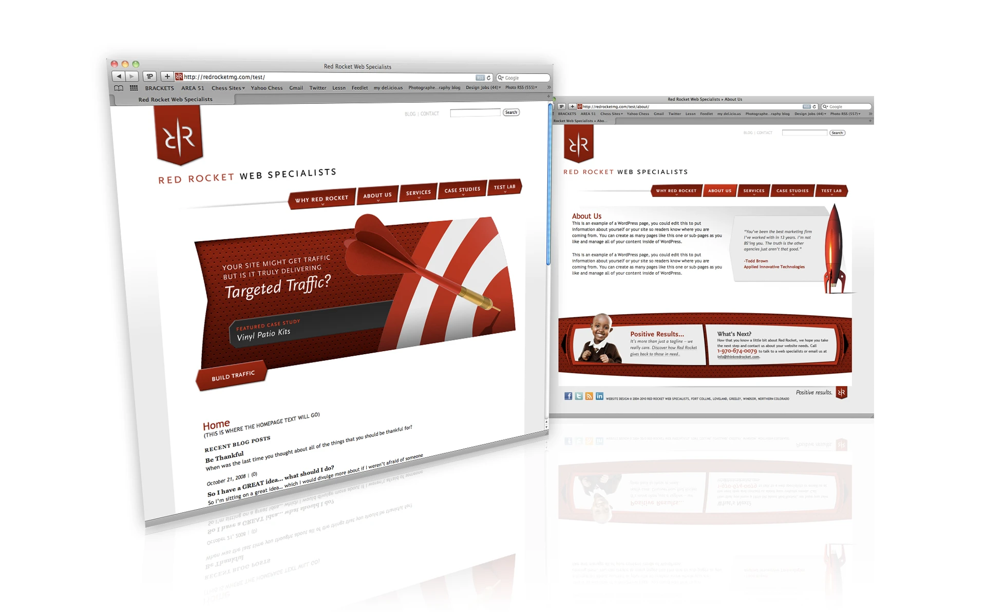
A brand isn’t a logo; it’s everything the logo touches. I built out Red Rocket’s identity across the full set of agency touchpoints — business cards, the website, advertising, email templates, envelopes, and social profiles — so the agency looked consistent and confident everywhere a prospect might find it.
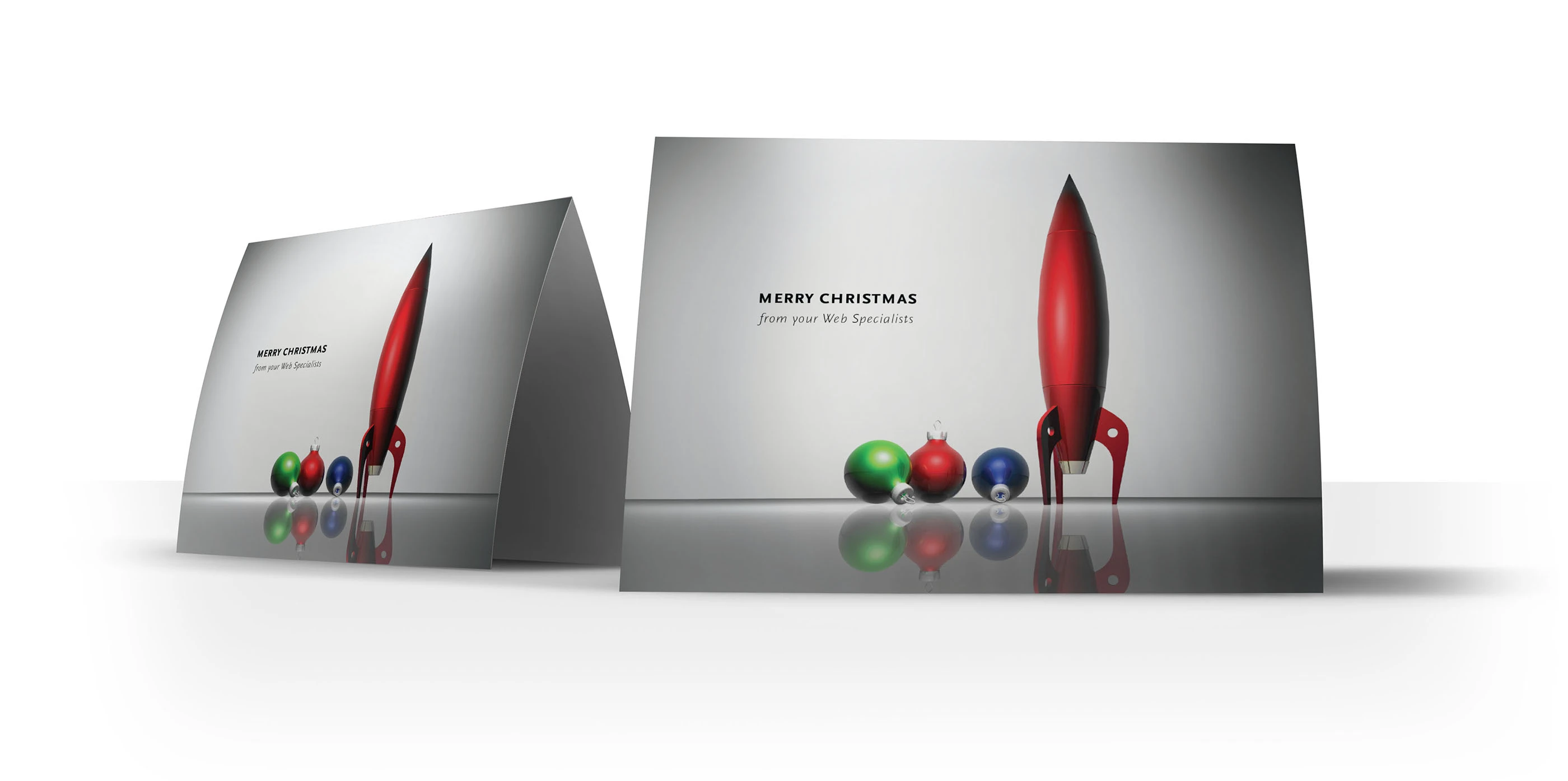
The same system left room for personality. The agency’s holiday card turned the rocket into a tongue-in-cheek ornament — the kind of small, human touch that makes a B2B brand memorable.
3. Defining the Creative Strategy
Positioning the agency around results
Beyond the visuals, I helped define the creative strategy of the company — the story Red Rocket told about itself. We positioned the agency around outcomes rather than decoration: “targeted traffic” and “positive results,” backed by lead-generation tools like a free website analysis to turn the site itself into a pipeline. I also pushed the agency to practice what it preached on emerging channels, including a focused, three-month social-media experiment with our interns to research, test, and track what actually worked — so our advice to clients came from real experience, not buzzwords.
4. The Client Work
Art direction across dozens of sites
All of this sat alongside the core of the job: designing and art-directing websites for dozens of Northern Colorado clients, overseeing the web developers, assisting with WordPress theme development, and working directly with clients to define project scope and creative direction. That body of client work has its own showcase — see Red Rocket: Selected Client Work — while this case study focuses on the agency’s own brand as the throughline that tied it together.
Conclusion
An agency lives or dies on credibility, and the fastest way to earn it is to look the part. By rebranding Red Rocket around a bold, memorable mark, extending it into a consistent system with real personality, and grounding the agency’s story in results, I gave Red Rocket a brand that matched the ambition of the work it did for its clients.