The Employee Dashboard: The Right Message, in the Right Place, at the Right Time
Role: Senior UX Designer, Nutrien Ag Solutions
When: 2019–2020
Focus: The Employee Experience Hub (EXH)
Introduction
When we set out to build the Employee Experience Hub — “EXH” — for Nutrien’s sales force of more than 20,000 crop consultants, the goal was that the first screen every user saw held important, actionable information. This dashboard was critical to get right and it required us to identify what actually mattered to our users. This is the story of how we figured out what belonged on that screen.
1. The Problem
What do you build first?
A crop consultant’s day is full. They’re managing dozens of growers, juggling weather, inventory, paperwork, and relationships that go back decades. So the question I kept in front of the team wasn’t “what do we want to show?” It was simpler and harder: what would actually make a crop consultant’s life better the moment they open this thing?
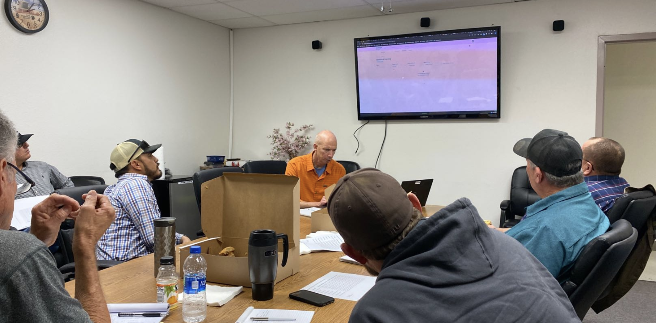
We could have guessed. Plenty of dashboards are designed by deciding internally what looks impressive and arranging widgets to fill the space. But the people in the field knew their needs far better than we did. The real design problem was figuring out how to get that knowledge out of their heads and onto the screen.
2. Research
Build your own dashboard
I ran a study where I let crop consultants build the dashboard themselves. Each participant started with an empty page and a stack of 19 cards — one for every widget or piece of information we could imagine offering: accounts, sales reports, weather, alerts, crop plans, the product catalog, nutrient advisor, and more. I also handed them blank cards and asked them to invent widgets we hadn’t thought of. As their page filled up, I watched what they reached for first, what they ignored, and asked why.
To make sure the findings weren’t an artifact of one method or one room, I paired that hands-on, moderated card sort with a larger remote click test asking the same question: what belongs on the first screen?
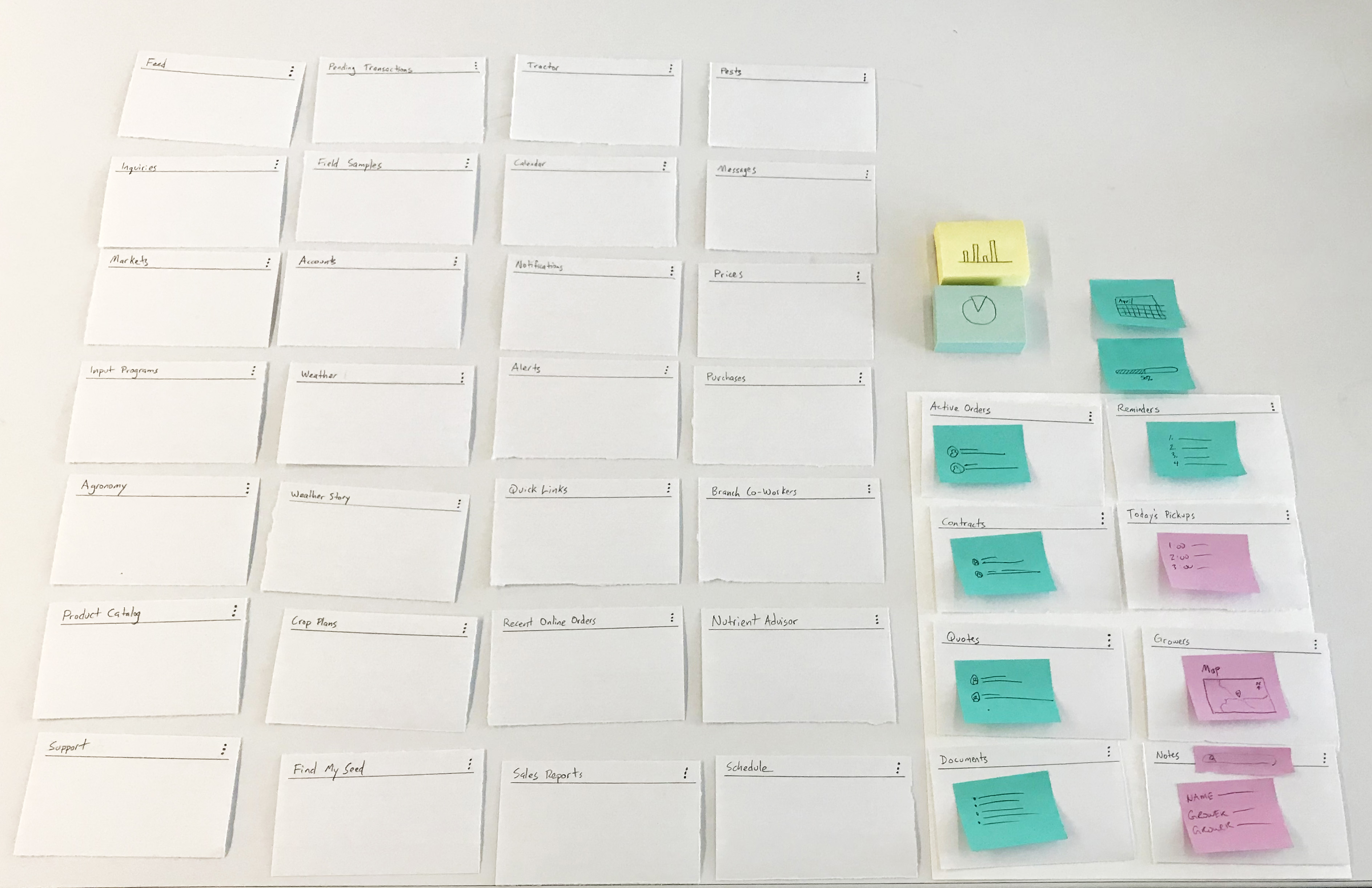
Letting users assemble their own priorities turned a matter of opinion into a matter of evidence. Across the 24 participants, 63% reached for Accounts, 58% wanted a Sales Report, and 50% put National Weather on their page — and in the hands-on card sort, every single participant put Pending Transactions on their dashboard. Just as useful were the widgets people didn’t choose and the custom cards they wrote by hand. The research also exposed a lot of overlap: a sprawl of nineteen candidate widgets really wanted to be consolidated into a meaningful few — folding sales report, sales activity, purchases, and online orders into one; reminders, schedule, and notifications into another; field samples, insights, and nutrient advisor into a third.
3. The Concept
A message, not a menu
The exercise reframed the dashboard for our team. Crop consultants didn’t want a control panel of every feature we’d built. They wanted to see the few things that needed their attention today. So the organizing idea became the right message, in the right place, at the right time — a screen that surfaced timely, specific data rather than a static grid of tools.
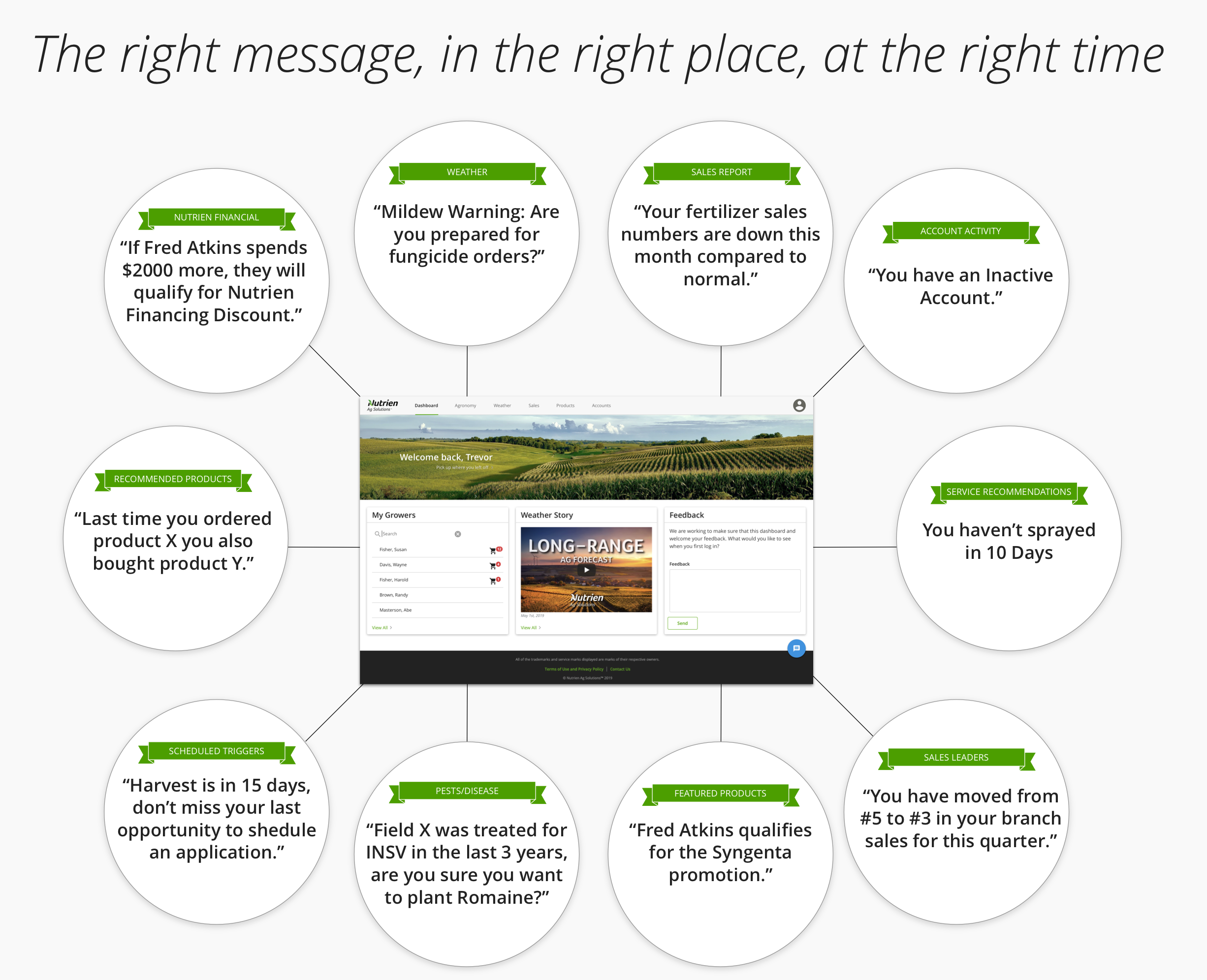
The dashboard’s job was to tell a crop consultant at a glance what was worth doing.
4. The Outcome
A dashboard built around the user
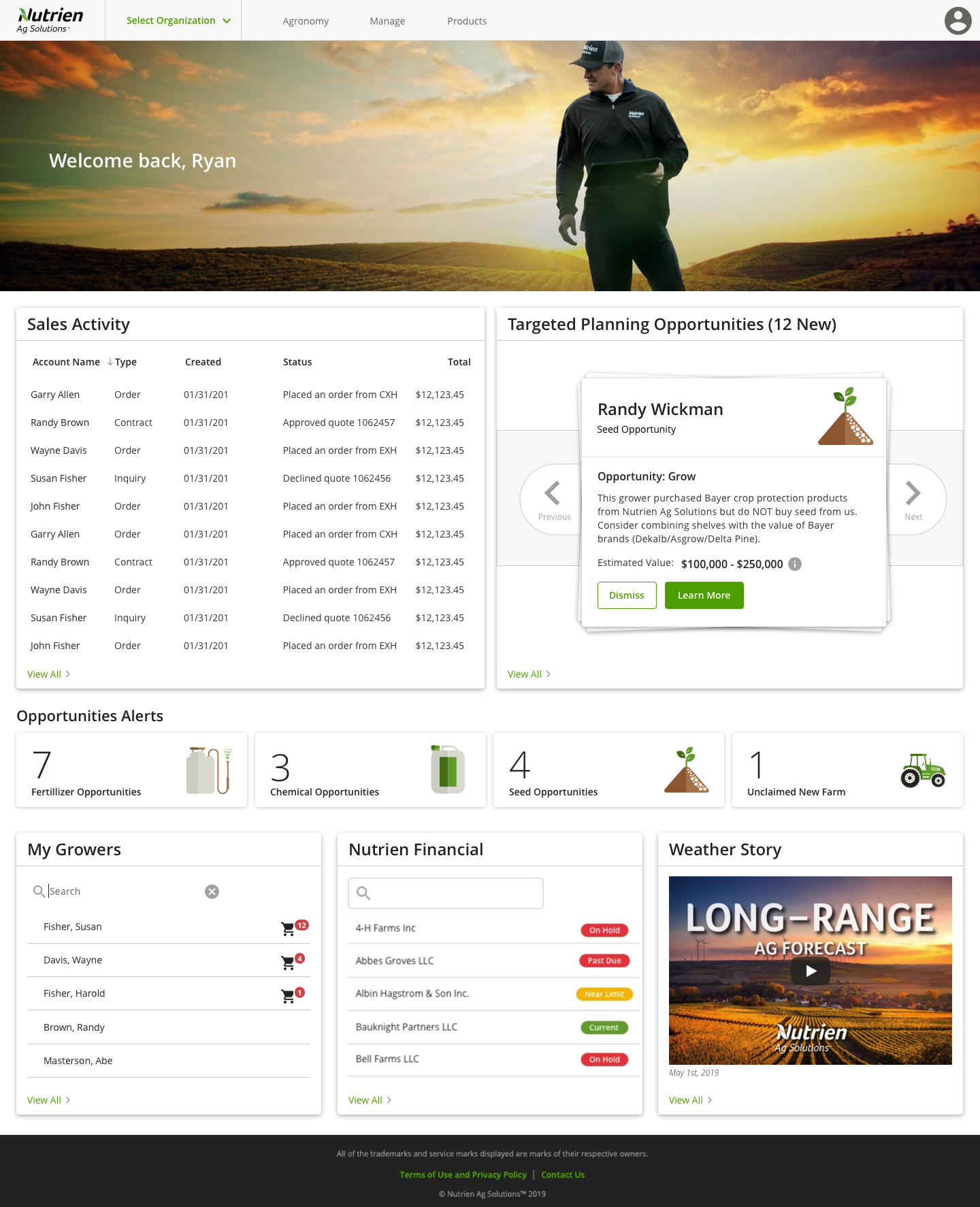
The shipped dashboard showed the crop consultant’s actual work: sales activity, the growers they manage, financial standing, a long-range weather story — and their Targeted Planning Opportunities. The widgets that earned their place in research earned their place on the screen.
What I valued most about this project was that every decision on that dashboard could be traced back to a crop consultant who told us, in one way or another, that it mattered.
Conclusion
It’s tempting to design a home screen around everything a product can do. The harder, better discipline is to design it around what the user needs to know right now. By letting crop consultants build their own dashboard, we turned the most contested screen in the product into one of the most grounded — and gave people a reason to open it every morning.